Pekka Buttler, February 2021 – June 2022
Welcome to part 3 of the JAPB comparison of nine fast fifties. This is a big article, that has been subdivided into several parts for convenience and the sake of humane loading times.
This is Batch I of JAPB’s comparison of fast fifties. Have a look also at the ‘cover page’ of the entire fifties -comparisons here.
Table of contents
• Part 1: Introduction, the lenses: pedigree and handling
• Part 2: IQ-comparison I – The Brick wall test
• Part 3: IQ comparison II – Urban vistas (you are here)
• Urban Vistas
• One thing about urban vistas…
• Sharpness at medium and long distances
• Medium distance definition
• Distant targets
• Extreme-contrast settings
• Part 4: IQ-comparison III – Bokeh and blur
• Part 5: IQ-comparison IV – Night-time vistas
• Part 6: Summary and conclusions
Urban Vistas
Back in the days when cameras actually worked without batteries, lenses were made of only metals and glass, and photographers were real photographers (and not just people shooting for ‘like’s), the ‘kit lens’ (by which I mean the lens that typically came attached to an interchangeable lens camera) was not a zoom, but was a fifty. Granted, unless the camera was a heartfelt congratulation from a affluent and childless aunt or uncle, that kit fifty was not a fast fifty, instead sporting only a maximum aperture in the league of f/1.8 to f/2.8.
There are basically two, overlapping realms of reasons for why these kit lenses were fifties – the more economically compelling being that for an SLR with a mirror box and demand for a long back focus distance, the fifty was the widest lens that could be manufactured to be both relatively bright and not too expensive to manufacture. Lucky for generations of first-SLR owners then, that the fifty is also a relatively versatile lens: Take a few steps closer and you have a very nice portrait lens, take a few steps back (but don’t fall into the pool) and you could even capture some context. Obviously, the fifty would never satisfy the seekers of grand vistas nor the stalkers of shy wildlife, but the fifty offered enough potential use-cases to make carrying that complex and still-not-quite-familiar opto-mechanical marvel along on a trip seem a less than ludicrous idea.
And boy, did those fifties see the world. We’ve all seen them – hordes of travellers pouring out of airplanes, buses and tour boats, bent over by the weight of their SLR hanging by their necks. Or I should say, those of us who are old enough have seen that sight, because today those same pic-happy tourists are walking around with their smartphones at their ready, but back in the days it was the tourist, their SLR sporting a fifty and the tourist feverishly trying to remember the sunny 16 rule …
The point is, that fifties and urban vistas are no strangers. Therefore, I think it is fitting that many a test shot here should feature the kinds of sceneries shot by many a fifty over the decades of consumer interchangeable lens photography. As noted earlier, we’ll aim for a balance, looking at both medium and long distance shots and using both low-contrast and high contrast settings.
One thing about urban vistas…
One important thing about urban vistas is that – unlike brick wall or other test shots – we are decidedly not dealing with a subject arranged in a flat plane perpendicular to the lens’ optical axis. Instead, in real life urban vistas, it is highly typical for you visual subjects to be arranged at very different distances. In some situations this is welcome, because it allows you to separate your subject from a background. In others (when you want to be able to record an entire vista) that layering of subjects becomes a challenge to be overcome – a challenge that cannot be met without closing down the lens – not in order to combat spherical (and other) aberrations – but in order to maximise depth-of-field. An illustration is in order.

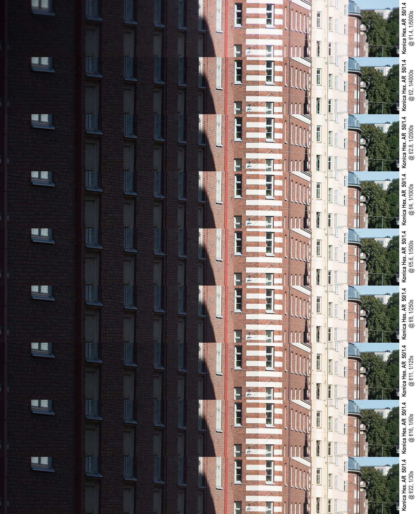
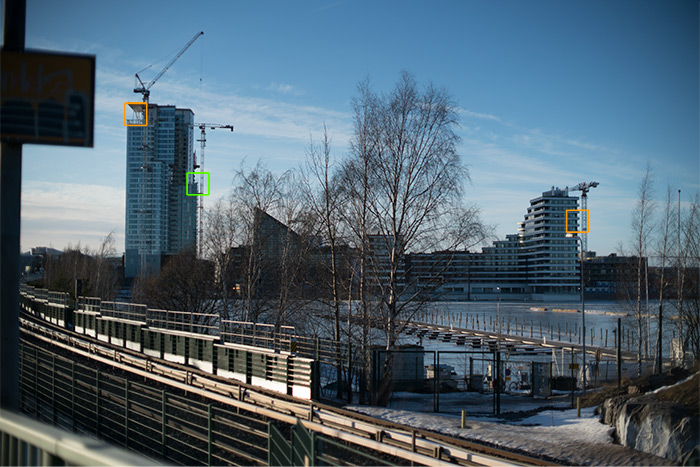
Konica Hexanon AR 50 mm f/1.4 @ f/5.6, 1/500 s, ISO 100, WB 4650, Sony ⍺7R2. Rotated, cropped and resized but otherwise unprocessed.
Orange rectangle shows focus spot, green rectangle shows source of excerpts.
The picture above is a fairly typical urban vista in that it combines subjects at various distances in one scene. While the facade at the extreme left is only some 10–15 meters from the focal plane, the white building sticking up from behind the trees beyond the end of the street is some 250 meters distant. Assuming the photographers intention would be to select their focusing distance so that (with a suitable aperture) the line of subjects in the green frame would be sharp, the photographer should focus on a subject 1/3 of the way to their most distant subject. As my intention was to use the line of facades on the left-hand-side of the street to illustrate depth-of-field, I chose to focus on the streetlamp (orange rectangle). The following collage of excerpts will tangibly show the effect aperture has on depth-of-field. Or will it?
(right-click to open in own tab for bigger version).
If you enlarged that collage into a new window, you will have noticed a number of things:
• at f/1.4 all frames show a noticeable loss of definition due to spherical aberration.
• at f/2 and f/2.8 those areas farther away from from the focus point (street lamp) show some softness, but
• from f/4–5.6 the trees at the end of the street and the house beyond look sharp.
And, indeed, for moderate enlargements, using the f/4 or f/5.6 images would be totally sufficient. But today, in the age when viewing an image at 1:1 zoom is as far away as the push of a button, we can easily see that there could be more to be had… So – before we go on – let’s have a look at some 100% crops from the same scene:
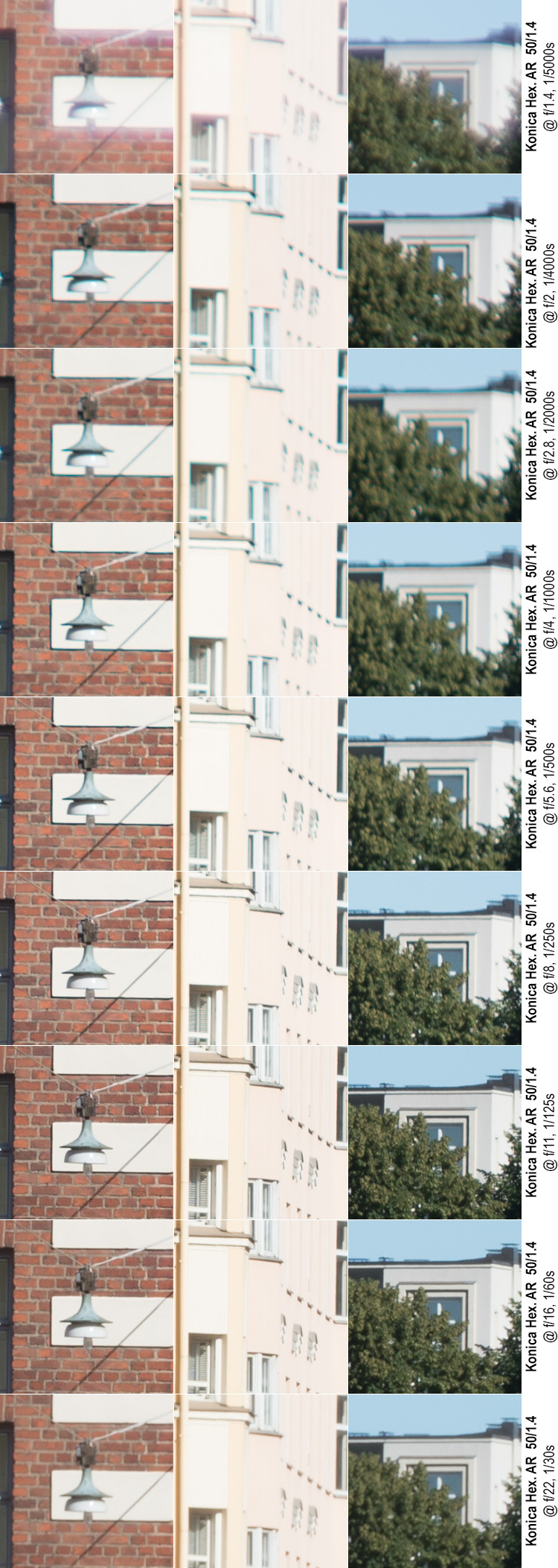
If you now take a closer (1:1) look at the same images, you’ll notice the significance of depth-of-field on 1:1 resolution.
Left-hand column: (the street lamp was the point of focus).
• f/1.4 shows massive spherical aberrations (not more than most other lenses). And while the image is certainly usable for small (max 30×20 cm) prints, the result is not flattering.
• f/2 shows a great improvement, but there still are significant chromatic aberrations (that don’t really go totally away before f/5.6), that leave the image looking less than tack sharp.
• f/5.6–f/11 are basically flawless. Peak definition is at f/8.
• f/16–f/22 diffraction starts eating into definition significantly.
Centre-column: (≈ 40 meters behind focus plane)
• f/1.4 shows massive spherical aberrations (not more than most other lenses) combined with being out of focus.
• f/2–f/4 Out of focus (gradually getting better) combined with chromatic aberrations.
• f/5.6 chromatic aberrations gone, but still not tack sharp as out of focus.
• f/8 finally in focus, but still room for improvement.
• f/11 peak sharpness.
• f/16-f/22. Diffraction starts affecting definition. f/16 is not yet really bad (about on par with f/8, albeit different), but f/22 already shows a significant deterioration.
Right-hand column: (≈200 meters behind focus plane)
• f/1.4 shows spherical aberrations (not more than most other lenses) combined with being badly out of focus.
• f/2–f/4 Chromatic aberrations are there, but not very visible as seriously out of focus (but gradually getting better).
• f/5.6–f/8 chromatic aberrations gone, but still not in focus.
• f/11 Finally in focus. Peak sharpness.
• f/16 Diffraction starts affecting definition, and f/16 is worse than f/11 but also clearly better than f/8. f/16 beats f/8 both in minor structures (foliage), but especially in coarse structures (roof-line, chimneys).
• f/22 already shows a significant deterioration due to diffraction.
Now, in case you’re wondering about the point of this detour, there are two central takeaways – one for you to consider when shooting urban vistas, another for when you look at the subsequent test shots:
Firstly, if your aim is maximum sharpness, do not let yourself be fooled by what you see in the camera monitor/electronic viewfinder, even on max. magnification: Depth-of-field is significant, and – at 1:1 zoom – far less forgiving than you’d think. Even in a situation such as this where the focal distance (≈40 meters) already is far closer to your lens’ infinity mark than the next mark (typically 10 meters) you must not expect that a medium aperture (≈f/5.6) will guarantee infinity sharpness. While the depth-of-field markings found on many legacy lenses sure are a nice reminder, they simply are no match for the modern photographer’s ability to pixel peep.
Secondly, when looking at the subsequent test shots, keep in mind that distance-to-target is not trivial. I’ve tried to select my test crops so that they’re in the vicinity of where the focal plane should lie, but even so some crops may be nearer than the focus point and some may be faster away. Further considering the effects of field curvatures, any point not focused on is not guaranteed to be in optimum focus.
Moving on…
Sharpness at medium and long distances
n.B! With the samples in the following test setups, one should be aware of the limitations the 58 mm Minolta is labouring under: Due to a misaligned focusing ring, this lens simply does not reach infinity (its infinity hard stop focuses at about 40 meters). Hence, the results of the Minolta 58 are not entirely comparable. Even so, I will leave the images here but will not comment on the samples.
First, before going on to look at some 1:1 crops, lets discuss the images those crops come from:
Medium distance definition
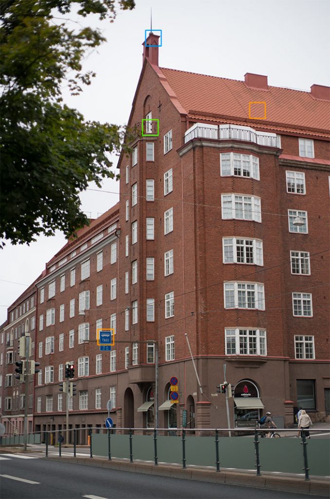
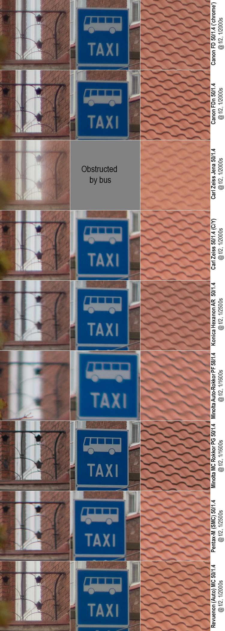
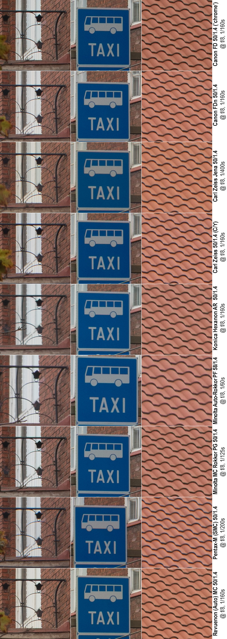
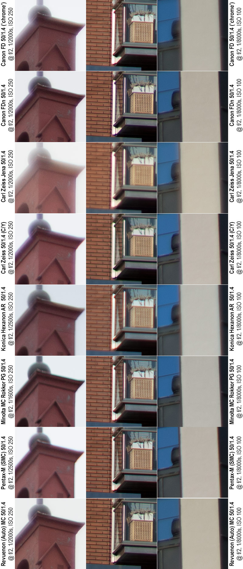
Carl Zeiss Planar 50 mm f/1.4 @ f/2, 1/2500 s, ISO 250, Sony ⍺7R2, WB:Cloudy
This shot is from what for Helsinki locals is known as “Tiili-Töölö” (Red-brick Töölö) – a few dozen city blocks in the Helsinki district of Töölö built in the 1910’s–20’s using mostly unembellished red brick facades. It’s one of my favourite motif’s for lens tests not only because it is on my daily commute, but also because red brick facades make for a grand test subject (The Brick wall test shots as well as the “Oksasenkatu” imagery above are from less than 200 meters away).
The green rectangle indicates the crop corresponding to the point focused on. The lower orange rectangle (bus and taxi lane sign) indicates a crop very close to the focusing plane (if it is level), while the upper right orange rectangle (brick roof) is another crop from very close to the focusing plane. The blue rectangle indicates a crop used in a later, high-contrast test.
Somewhat problematically, this location is a bit susceptible to distractions, and a few of the test shots failed due to obstructions (buses in the nearer lanes), that I only noticed after the fact. Also, traffic in the lower part of the image did turn out to have a distinct effect on metering results and therefore on the overall exposure of some frames.
Again, before we jump into looking at 1:1 crops, let’s recap the basic situation: All images combine the ideal case (tripod=>longer exposures & low ISO, no shake), and deliberately brutal: at 1:1 and screen resolution, the real-life size of these (huge) Sony ⍺7R2 files is roughly 2 meters by 1,3 meters (≈6 by 4 feet).
Test statistics: All shots were taken in one go, in stable outdoors lighting conditions (overcast, some metering quirks produced by passing vehicles). All shots taken in RAW on a Sony ⍺7R2, with ISO 250, IBIS off and WB cloudy. All excerpts below are unprocessed (ACR default) crops. Distance to subject ≈ 40 meters.
Focus was always nailed on railing of balcony (left column crop) on maximum magnification at wide-open aperture (no refocusing after aperture change). Other crops come from areas relatively near the focal plane (assuming it is level). Unlike the brick wall shots, the focus point is not in the image centre (actually, none of the crops are from the centre).
@ f/1.4
At f/1.4 all these lenses are at the outer limits of their abilities. Therefore, what you really want to look for are:
• left column (focus point) definition and contrast
• overall contrast
• glow and other signs of spherical aberration
• given that none of the crops are from the image centre, some lack of definition is to be expected in all crops
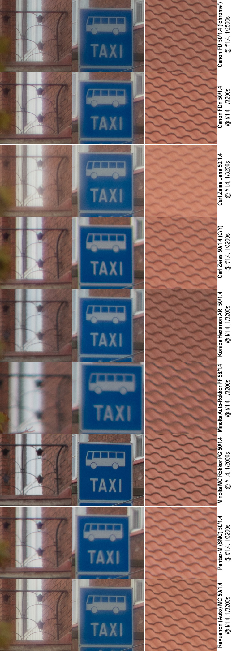
Quick comments (@ f/1.4)
The railing (left crop): All lenses show spherical aberration (glow), with many lenses showing field-relevant chromatic aberrations. The clear top three is made up of the Canon FD (chrome nose), Minolta 50 and Revuenon (!), Followed by the Canon FDn (which loses simply because of its excessive CA’s). These are followed by the Zeiss Planar and Pentax, that are otherwise clean but show a lack of detail. The Hexanon, Minolta 58 and Carl Zeiss Jena suffer variously: The Hexanon is simply soft while the Carl Zeiss Jena combines good definition with dismal contrast (‘dreamy’ is a word that comes to mind).
The traffic sign: First, keep in mind, that definition (or lack of it) here is very likely partially a symptom of varying field curvatures. That said, the Minolta 50 wipes the floor with the opposition, and while the Revuenon and Canon FD (chrome nose) manage to put in a decent performance, they both show signs of lower contrast. Somewhat surprisingly, the Carl Zeiss Jena makes a good show (good definition, weak contrast), as do the Hexanon and Canon FDn. The rest (Zeiss Planar and Pentax) show not only lack of contrast but blurry lines.
The brick roof: Being a low-contrast setting, visible CA’s are not an issue, therefore highlighting definition and contrast. The two Canons, the Hexanon, the Minolta 50 and Revuenon make up the top-five with very little difference between them. The Zeiss Planar is somewhat soft but shows decent contrast, while the Carl Zeiss Jena shows decent definition but very little contrast. The Pentax is somewhat weak in both categories.
@ f/2
At f/2 all lenses should show a mild improvement in definition and a significant improvement in contrast.
Quick Comments (@ f/2)
The railing: There is a clear top-three in the Revuenon and the two Canon’s, with the Canon chrome nose showing more spherical aberration, the Canon FDn leaning towards chromatic aberrations, but the Revuenon being on balance the best. The Minolta 50 takes fourth place, followed by the Zeiss Planar. Next, it’s a question of preference as the Carl Zeiss Jena shows good detail but remains dreamy, while the Pentax shows decent contrast but less detail (as contrast can be more easily tweaked in post, I’d maybe side with the CZJ here). The Hexanon is overall soft.
The traffic sign: Very similar to f/1.4, The two Canon’s, the Minolta 50 and the Revuenon make up a top four. Zeiss Planar, Hexanon and Pentax make up the second tier.
The brick roof: Minolta 50 and Canon FDn battle for first place, with the older Canon and Revuenon having a similar fight for third place. Hexanon and Zeiss Planar are similarly good, but very different. Pentax is soft, while CZJ is dreamy to the point of yawn-inducing.
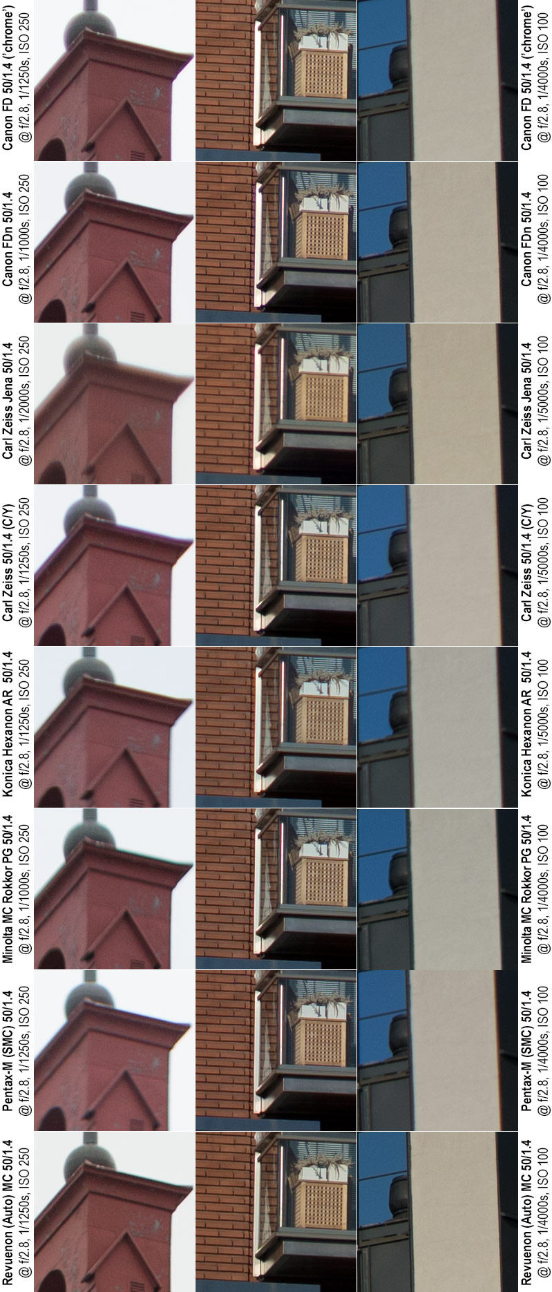
@ f/2.8
At f/2.8 one would expect a good legacy lens to be sharp and contrasty in the centre, but as none of these crops are from the centre of the frame, some level of softness can still be acceptable.
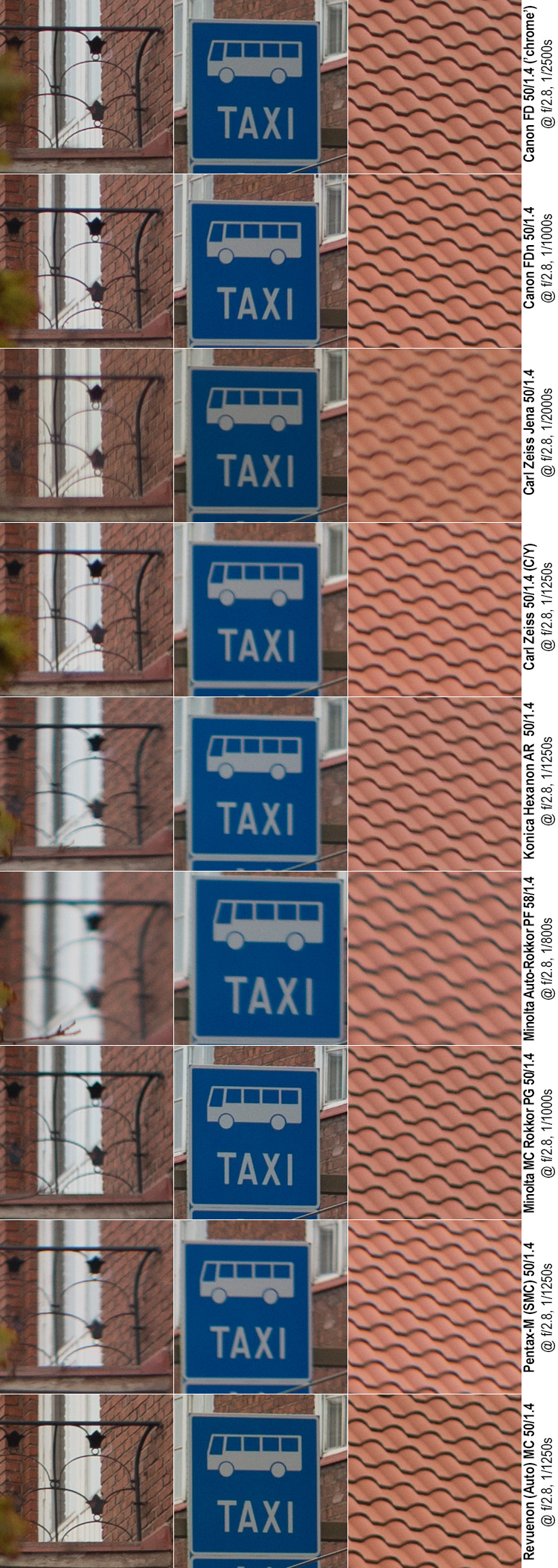
Quick comments (@ f/2.8):
The railing: Revuenon and the two Canon’s stay at the top, all showing basically flawless (for f/2.8) performance: good definition, good contrast and the lack of obvious aberrations. The Carl Zeiss Jena takes fourth place with very good definition (even though contrast is not on par), before the Zeiss Planar and Minolta 50 (both of which show decent contrast, but are a bit soft. In the cellar, the Pentax comes in ahead of the Hexanon.
The traffic sign: Very similar to f/1.4 and f/2, The two Canon’s, the Minolta 50 and the Revuenon make up a top four. Carl Zeiss Jena shows good edge definition, but its contrast is not quite on par with the top four. Zeiss Planar, Hexanon and Pentax make up the stragglers.
The brick roof: The two Canon’s, the Minolta 50 and the Revuenon are essentially flawless, with the Hexanon managing to best the Zeiss Planar (both are decent). Pentax is soft and while CZJ is no longer as dreamy as earlier, it remains very weak in the contrast-section.
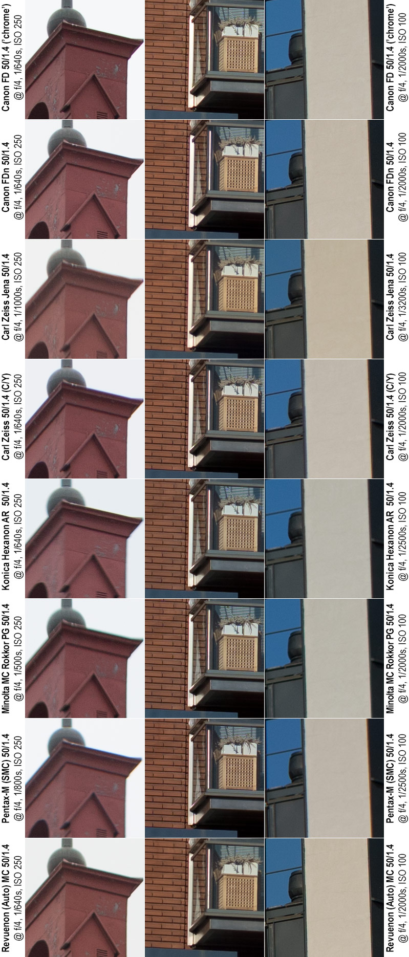
@ f/4
Again, at f/4 we would expect … if not pin sharpness, then at least the feeling sharpness is only one more step away (given that none of the crops are far from where the focal plane “should” be and are also not extreme corner crops). Let’s see.
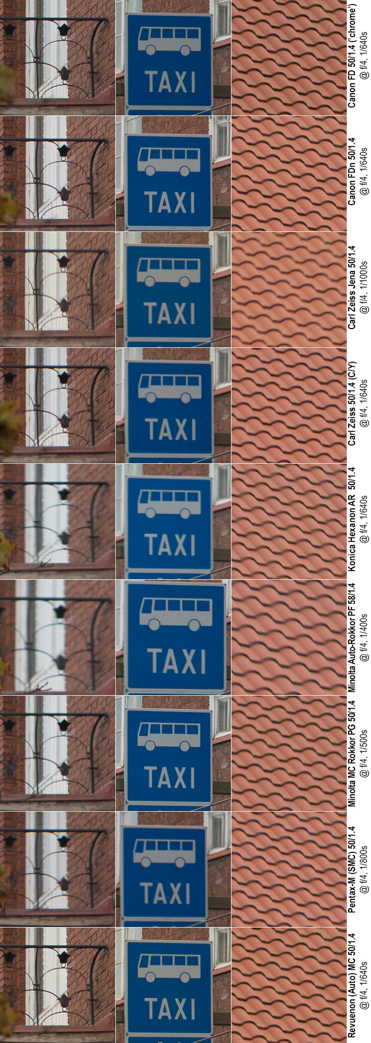
Quick comments (@ f/4):
The railing: Revuenon and the two Canon’s continue at the top, all showing basically flawless (for f/4) performance: good definition, good contrast and the lack of obvious aberrations. Whether you would rate the West or East German Zeiss’ to take fourth spot depends largely on whether you rate contrast (Zeiss Planar) over definition (CZJ), but both come in ahead of the Minolta 50. At the bottom end the Pentax is a cut above the Hexanon.
The traffic sign: Unchanged at the top: The two Canon’s, the Minolta 50 and the Revuenon make up a top four, followed by the two Zeiss’. Hexanon and Pentax still show blurry edges.
The brick roof: The two Canon’s, the Minolta 50 and the Revuenon are essentially flawless, but now with the Zeiss Planar being the runner up. Hexanon and Pentax show less clearly defined edges and while CZJ is no longer dreamy (and shows good detail), it still shows weak contrast.
@ f/5.6
f/5.6 should be like f/4, except better. Given that we’re dealing with off-centre crops and a motif unlike a brick wall, perfection is not in the cards, but …
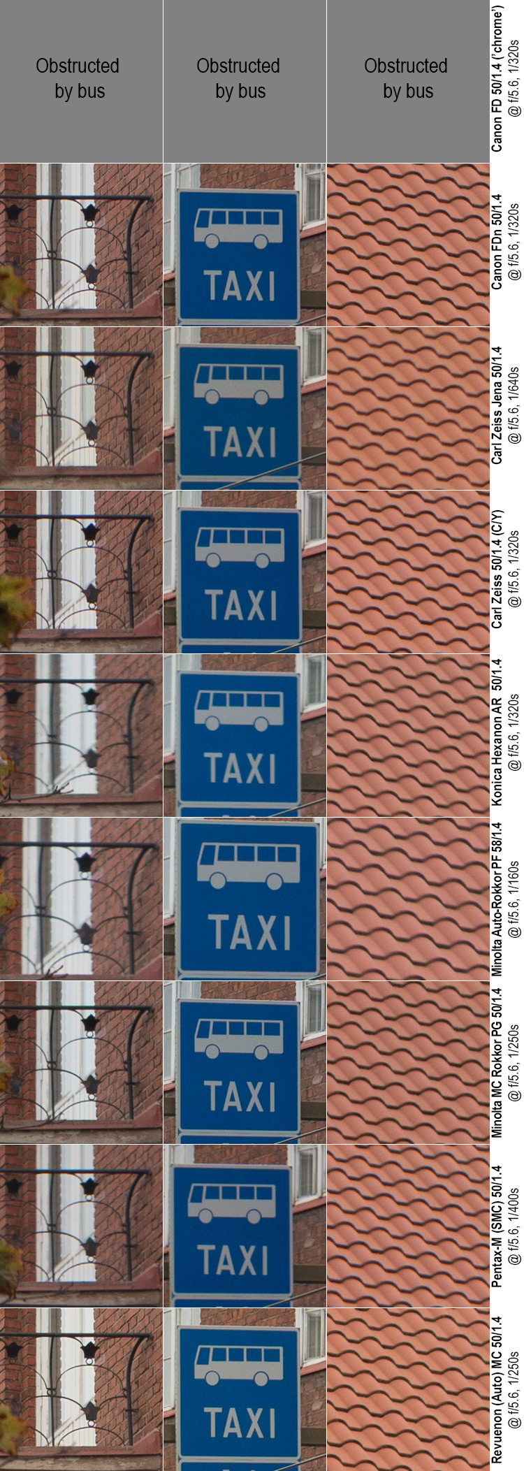
Quick comments (@ f/5.6):
The railing: Revuenon, Canon FDn, Zeiss Planar, Minolta and Carl Zeiss Jena are essentially flawless (but the Jena lens has a different approach). The Pentax is slightly softer and still shows some CA’s, but is still better than the Hexanon.
The traffic sign: At f/5.6 we’ve reached the point where all but two lenses show basically flawless performance: the Pentax and Hexanon remain a bit blurred, but TBH, in all but big blow-ups this would not be evident.
The brick roof: Unless mentioned separately: the result is essentially flawless. The CZJ remains less contrasty, and the Pentax and Hexanon lack the tack sharpness of the rest.
(The Canon chrome nose lens does sadly not have a sample at this aperture due to a pesky bus, but there’s little doubt it would be equivalent to its younger sibling).
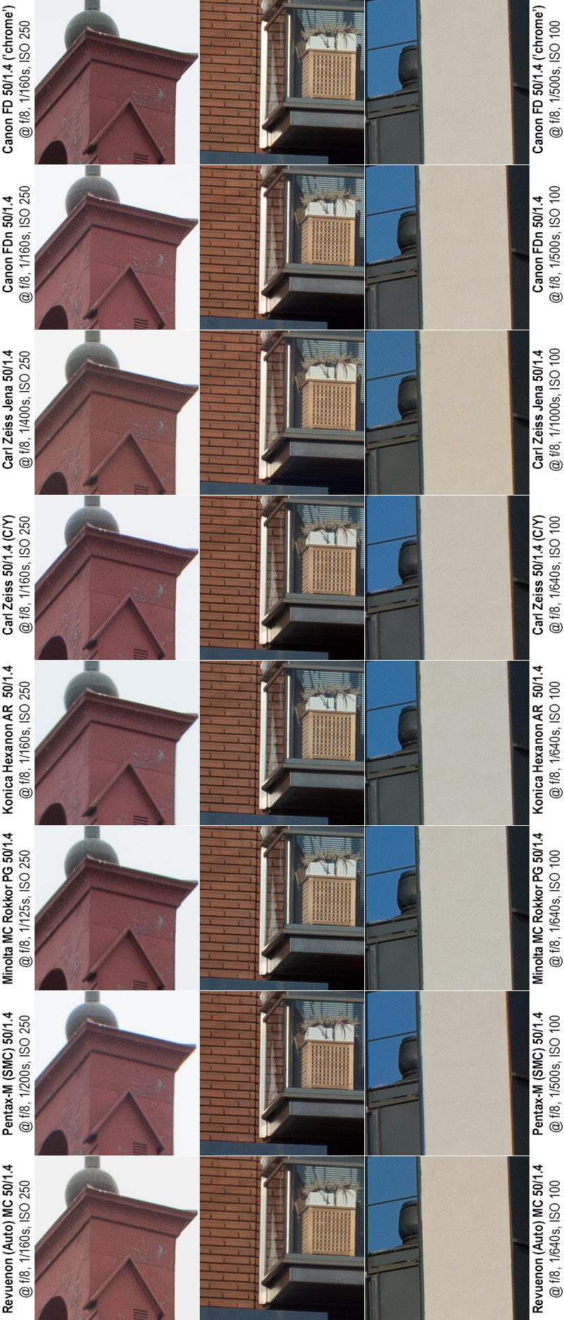
@ f/8
At f/8 the depth-of-field has reached the point where it is actually reasonable to expect that each of these three crops (given that none are in the extreme corners) would be essentially flawless – even with a relatively pronounced field curvature…
Or to say it in another way: If you’ve previously suspected I’ve inadvertently mis-focused some of lenses, even a relatively serious mis-focusing (e.g. focusing on 30 instead of 40 meters) should no longer matter at f/8
Quick comments @ f/8
All but the Pentax and Hexanon are essentially flawless in all samples and the two mentioned lenses are not far behind. In fact, at f/8 all lenses produce enough detail to withstand inspection in a very large print. Question is – is there still room for improvement?
@ f/11
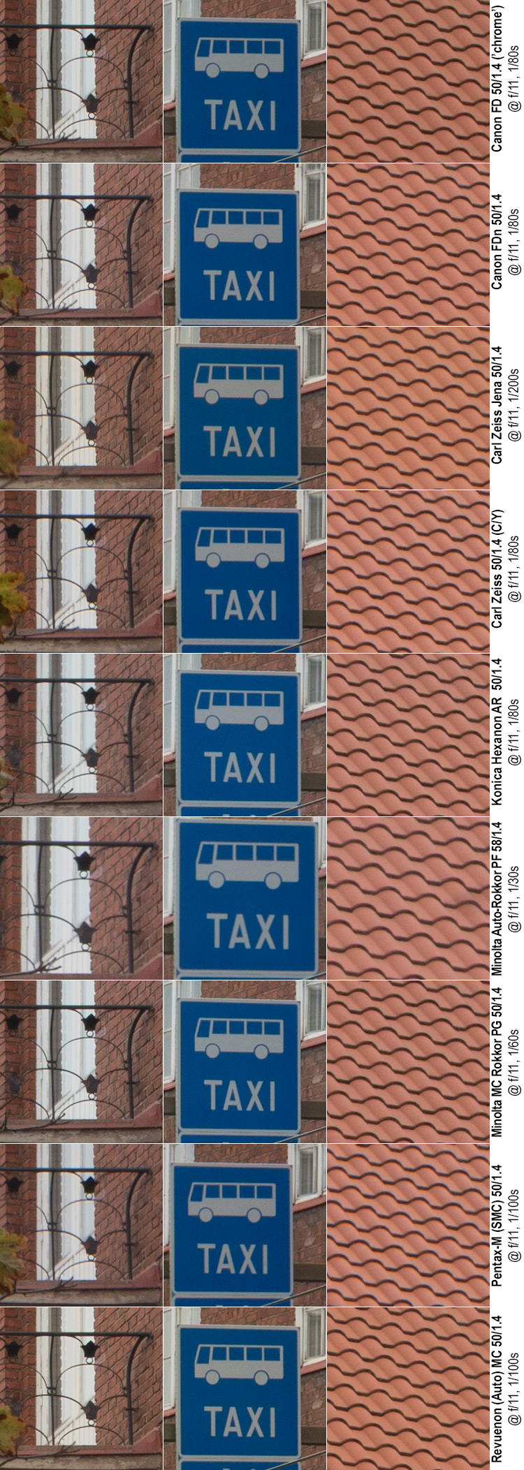
Quick comments @ f/11
And the short answer is – based on these crops is – no. The Hexanon still shows a minor increase in definition going from f/8 to f/11, and the Carl Zeiss Jena stays unchanged, all other lenses show a minor drop in detail. So on one level, going beyond f/8 makes little sense, except that in some scenes the added depth-of-field may make a difference.
@ f/16
At f/16 we’re solidly in the area where diffraction starts making serious inroads.
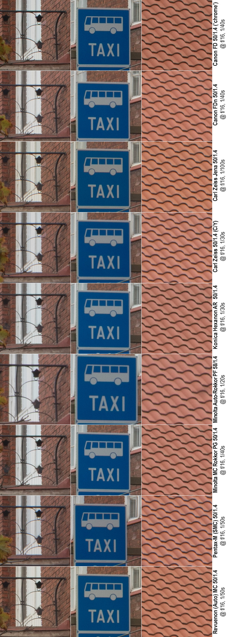
Quick comments @ f/16
At f/16 all lenses show somewhat worse performance than at f/8–f/11. This drop in performance is due to diffraction that produces an all-pervasive loss of contrast and a drop in definition. Except for the Hexanon and Carl Zeiss Jena, f/16 is even worse than f/5.6 (yes, the drop is that significant). Going forward, it’s pretty evident what to expect.
@ f/22
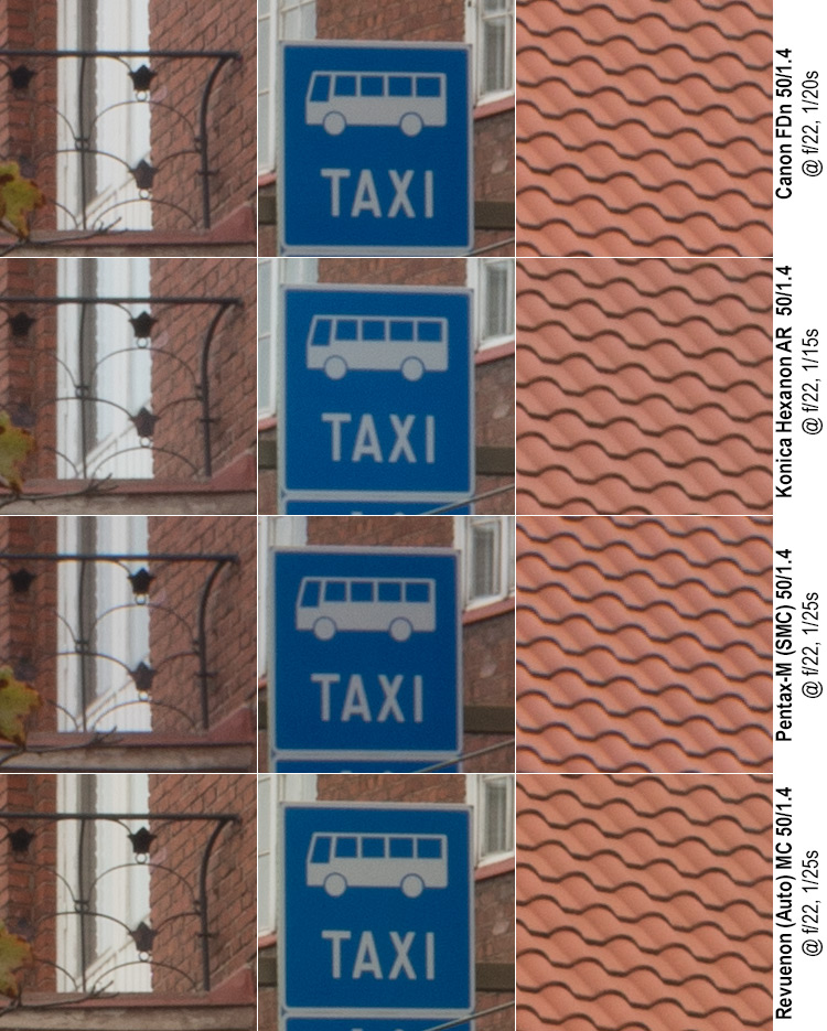
Four of these lenses also allow going for f/22, but going for f/22 is justifiable only when maximal depth-of-field is paramount.
Before moving on:
To summarise the imagery above:
– A number of lenses consistently outperformed the rest, and even at f/8 when the “field” was at its most even those same four lenses (Canon FD, Canon FDn, Revuenon and Minolta 50 mm) were a touch better than the rest
– Simultaneously, a number of lenses (Hexanon, Pentax), consistently underperformed. The fact that they were lagging even at f/8 and f/11 shows that a simple misjudged focusing hardly is a sufficient explanation. Moreover, two of these three lenses performed at least decently in the earlier brick wall tests.
– The Carl Zeiss Jena lens seems to be a ‘think different’ -lens, as it (in this test as well as the earlier brick wall test) seems to emphasise definition over contrast and be unabashedly dreamy at larger apertures.
– The Minolta 58 has, as repeatedly said, its issues.
I want to emphasise one more aspect: The Revuenon shone in this test, while the Pentax-M evidenced altogether lacklustre performance. In the previous (brick wall) test those roles were reversed. There might be several reasons for this. One might be testing error (possible, but unlikely given how much care I take), another might be in that the lighting was different and that this has a significant effect. A third explanation – the one I believe in based on my experience – is that legacy, unit-focusing lenses can either be designed to offer as even performance as possible throughout the range (while sacrificing a sweet spot of maximal definition), or be designed in way that is optimised for a specific range. And in the later case, not all lenses are optimised for the same distance.
So let us next look at something even farther away…
Distant targets.
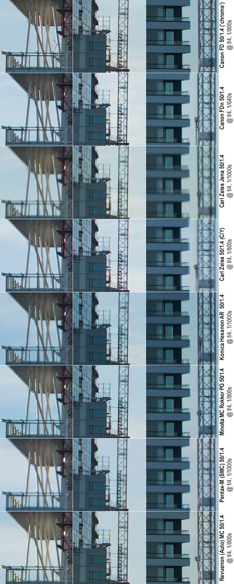
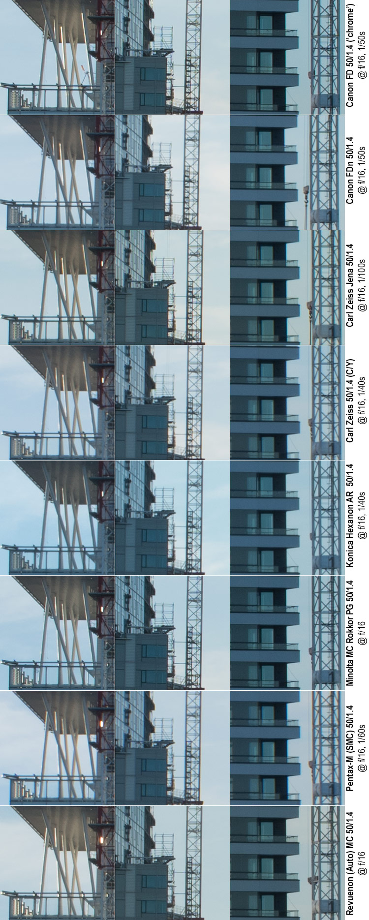
Minolta MC 50 mm f/1.4 @ f/2, 1/3200 s, ISO 100, ⍺7R2, WB:Sunny
Kalasatama is a new (under construction) city district of Helsinki situated on the eastern edge of the peninsula. It is named Kalasatama (the fish harbour) in accordance with its historic use. This motif was selected as it is one of the few easily accessible, high-detail vistas allowing for a significant focusing distance (≈ 450 meters, as photographed from neighbouring Kulosaari island). Again, the green rectangle indicates the focused point, whereas the orange rectangles signfify the crops: Both the left and right orange crops are very near the focusing plane (again, assuming it is level). Sorry for the birches and metro rail in the foreground, but this (a motorway onramp) was the only non-private location that allowed an elevated vista towards Kalasatama.
Again, before we jump into looking at 1:1 crops, let’s recap the basic situation: All images combine the ideal case (tripod=>longer exposures & low ISO, no shake), and deliberately brutal: at 100% zoom, the real-life size of these (huge) Sony ⍺7R2 files is roughly 2 meters by 1,3 meters.
Test statistics: All shots were taken within a 15 minute interval in the late afternoon (but several hours before sunset) thereby giving reasonably stable outdoors lighting conditions. Neither the motorway (behind the photographer) nor the subway-line produced any relevant tremors. All shots taken in RAW on a Sony ⍺7R2, with ISO 100, on a tripod, IBIS off and WB sunny. All excerpts below are unprocessed (ACR default) crops. Distance to subject ≈ 450 meters.
Focus was always nailed on lattice of the tower crane’s mast (green rectangle) (centre column crop) on maximum magnification at wide-open aperture (no refocusing after aperture change). Other crops come from areas relatively near the focal plane (assuming it is level). Note please that the focus point is not in the image centre (nor are the other crops), therefore it is quite possible that all of the crops are from outside the lens’ sweet spots.
@ f/1.4
Again, at f/1.4 all these lenses are at the outer limits of their abilities (and no sane person would shoot a landscape as this wide open). Therefore, what you really want to look for are:
• centre column (focus point) definition and contrast
• overall contrast and signs of chromatic aberrations
• glow and other signs of spherical aberration
• given that none of the crops are from the image centre, lack of definition is to be expected in all crops
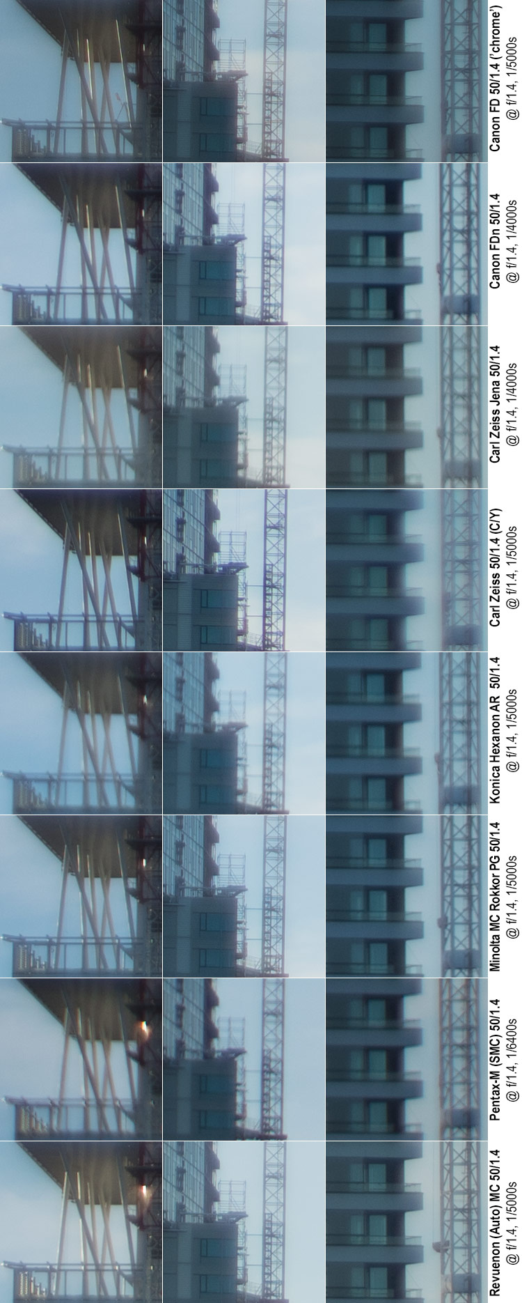
Quick comments @ f/1.4
Left & Centre column: All lenses suffer significant loss of contrast due to spherical aberration. That said, Revuenon, Canon FD (chrome nose) and Minolta 50 mm (in that order) show relatively high definition and a remarkable lack of longitudinal chromatic aberrations, while the Zeiss Planar has very high definition, but is plagued by a relatively high level of CA’s. The Canon FDn and Hexanon also suffer CA’s but have decent definition. The Carl Zeiss Jena is basically free of CA’s but is (consistently) dreamy wide open. The Pentax can only be characterised as ‘soft’ (CA’s, low definition, bad contrast).
Right-hand column: Very similar to the other crops, with some noteworthy additions: The Canon FD (chrome nose) still manages to produce a remarkably crisp image, but suffers somewhat more vignetting than the other lenses. The Zeiss Planar shows an unusual combination: on one hand, the lens resolves detail very nicely, and with decent micro contrast while simultaneously showing massive CA’s and spherical aberrations that utterly ruin the image’s macro contrast (look at the border between sky and dark walls between balcony levels).
What can I say? The Revuenon clearly aces this test with the Canon FD, Minolta 50, Carl Zeiss and Canon FDn also producing good results.
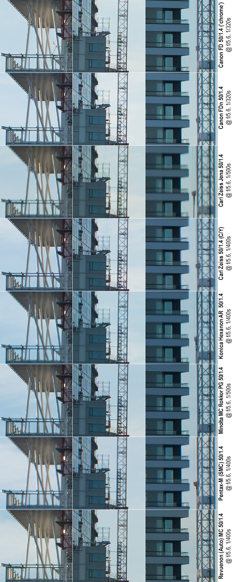
@ f/2
f/2 is still not nearly the kind of aperture you would normally use for landscape photography. Even so, it is reasonable to expect f/2 to be significantly less aberrant than wide open. Especially, it would be reasonable to expect:
• significantly less spherical aberration, less glow and increased contrast,
• a moderate improvement in CA’s especially in off centre areas, together resulting in
• improved definition and vastly improved contrast.
Let’s see…
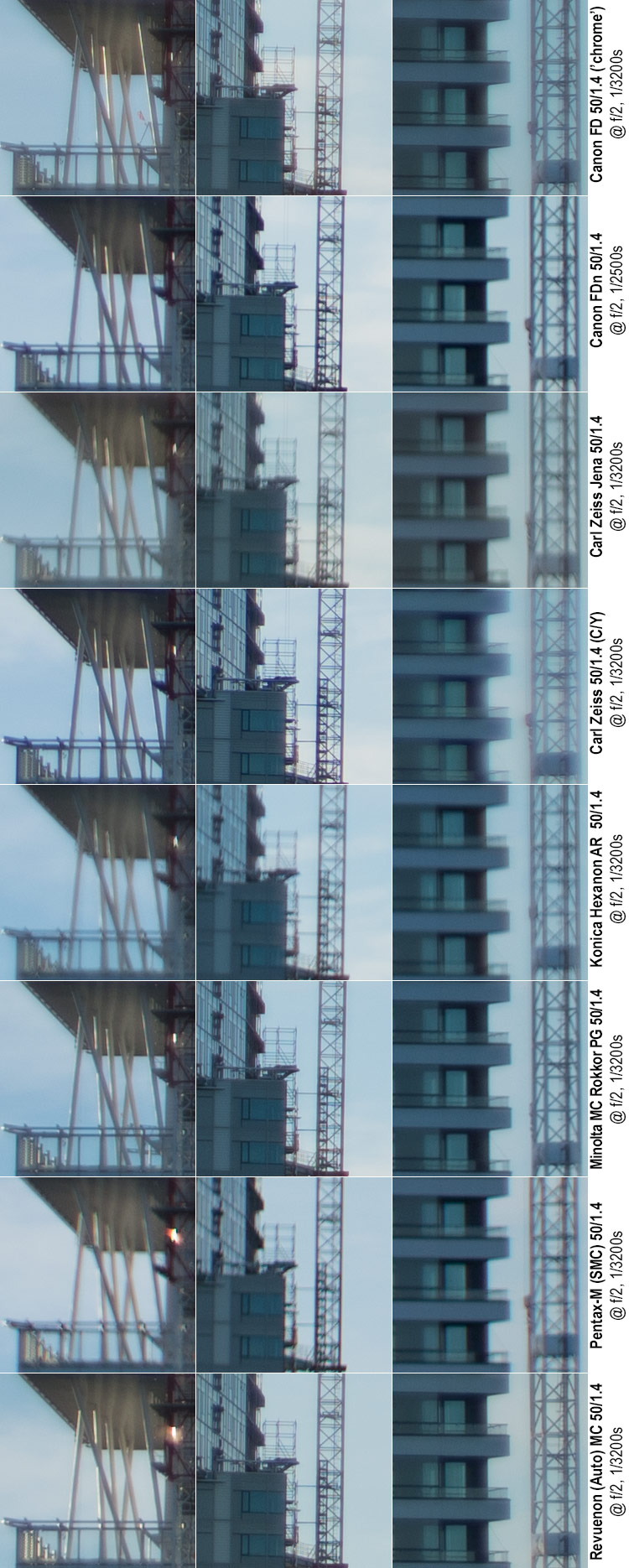
Quick comments @ f/2
Left & Centre column: Indeed, all lenses show an improvement from wide open, but that does not mean they would end up even. There is a clear top-five in the (top-to-bottom order) of the two Canon’s, the Zeiss Planar, the Minolta 50 and the Revuenon. Which of these lenses perform best is somewhat dependent on whether you value definition, contrast or freedom from CA’s most: FDn, Zeiss Planar and Minolta 50 produce very good contrast, while in raw definition they are left behind the Revuenon and FD chrome nose. Also, the FDn and Zeiss Planar show more CA’s than the others. The Carl Zeiss Jena is basically free of CA’s and remains dreamy while showing good detail. The Pentax has improved a lot, but is nowhere near the top five (low definition, low contrast, some CA’s). The Hexanon has significant CA’s while also not having good definition.
Right-hand column: Again, similar to the other crops, with some additions: The Zeiss Planar still shows an unusual combination: on one hand, the lens resolves detail very nicely, and with decent micro contrast while simultaneously showing massive CA’s and spherical aberrations that significantly affect the image’s macro contrast (look at the border between sky and dark walls between balcony levels). Interestingly, this affects most lenses to some degree, but while the Canon FDn looks very clean (and most lenses show some degree of this), the Planar suffers badly.
@ f/2.8
At f/2.8 one would expect a good legacy lens to be sharp and contrasty in the centre, but as none of these crops are from the centre of the frame, some level of softness can still be acceptable. Even so, most crops should show significant improvement and aberrations such as longitudinal CA’s should mostly be gone.
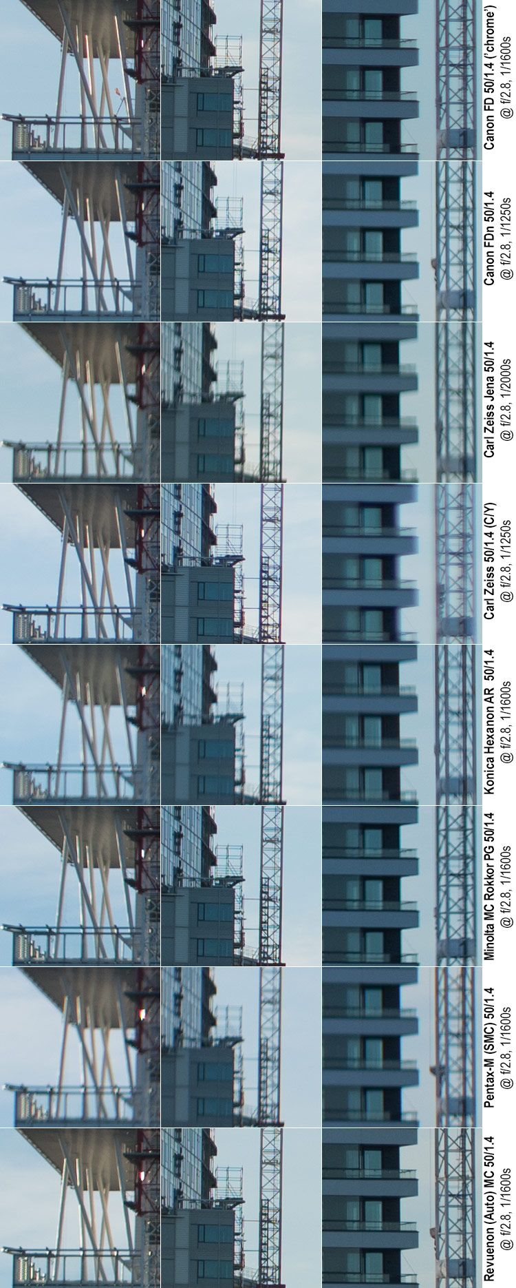
Quick comments @ f/2.8
And indeed, all lenses show marked improvement (all judgments relative to being at f/2.8):
The Canon FD ‘chrome nose’ shows a remarkably balanced and clean overall result, with very good definition, very good contrast and almost no CA’s. Some corner vignetting remains.
The Canon FDn is not bad either, but not on par with its older sibling, mainly due to the (in such a high contrast situation) relatively pervasive effect of CA’s.
The Carl Zeiss Jena is not the sharpest pencil. Not only is the image not very contrasty, the definition is simply not on the level of the best.
The Zeiss Planar has very good definition and good contrast, but still suffers severely with Chromatic Aberrations, especially in the right-hand side crop.
The Hexanon also disappoints. Contrast is decent, but definition is lacking. While CA’s are not a big problem, some elements in the crops (lack of definition in meridional subjects) hint at astigmatism possibly being part of the issue.
The Minolta 50 is good. Good detail, strong contrast, but there are some CA’s which make the result far from clean (and detract from definition potential). Definitely a top-5 finish, maybe even top-3.
The Pentax on the other hand continues to show sub-par definition (it is one of the four lenses that have not yet managed to resolve the horizontal structures in the light vertical ‘bar’ in the centre crop).
The Revuenon puts in another very solid performance: Very good detail, fine contrast, low CA’s, and deciding whether it beats the FD chrome nose is like flipping a coin.
@ f/4
Again, at f/4 we would expect … if not pin sharpness, then at least the feeling sharpness is only one more step away. Let’s see.
Quick comments @ f/4
If we were not dealing with some very harsh contrasts here, I would say that we have here five lenses (Both Canon’s Zeiss Planar, Minolta 50 and Revuenon) with substantially perfect results, but in these crops some differences are nevertheless obvious: The Canon FDn shows significantly more CA’s than its older sibling, and while the Zeiss Planar shows quite fantastic detail in low-contrast situations (e.g. lower left of centre crop), it suffers badly closer to high-contrast transitions (very evident in the right-hand crop). The same applies (though in a significantly lesser degree) to the Minolta 50. The Revuenon on the other hand produces a crisp and clean image.
In the cellar, Hexanon and Pentax still struggle with definition, and the Carl Zeiss Jena remains contrast-handicapped.
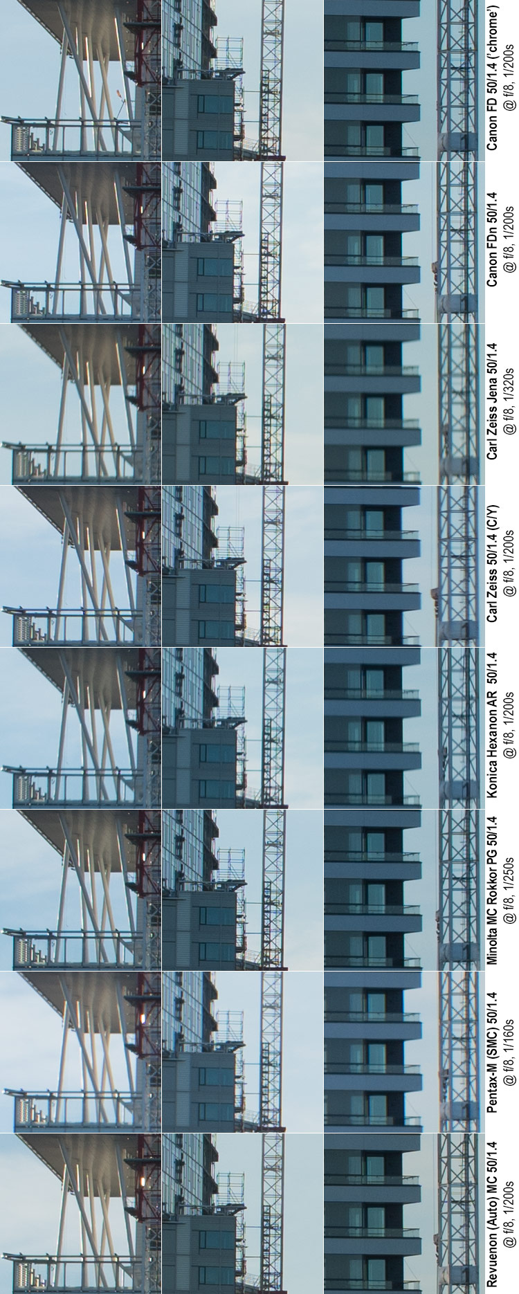
@ f/5.6
At f/5.6 all crops should be better that at any earlier point, but given that none of the crops are from the image centre, perfection is not an expectation every lens can fulfil. Even so, from now on, the commentary will be somewhat abbreviated.
Quick comments @ f/5.6
All lenses show improvements: Those four lenses (the Canon’s, Minolta 50 and Revuenon) that were substantially perfect at f/4 all show some improvement, but relatively little. The Zeiss Planar continues to shed CA’s, taking it ever closer to the top.
Hexanon and Pentax also continue improving, and for the first time the gap between these and the top five is no longer miles-wide (but still clearly there). The Carl Zeiss Jena continues to show decent detail, but indecent contrast (in all likelihood exacerbated by the high-contrast motif), and while the Minolta 58 made another great jump forward, it remains decidedly subpar.
@ f/8
At f/8 we are closing in on peak definition.
Quick comments @ f/8
And with the top-5 showing only minor improvements (except the Zeiss Planar which finally got rid of the CA’s), but the rest continuing to improve in strides, the gap keeps narrowing. But even so. We’re clearly dealing with 5 very good lens samples, and three less good…
@ f/11
At f/11 some lenses are liable to start to show the effects of diffraction. Let’s see.
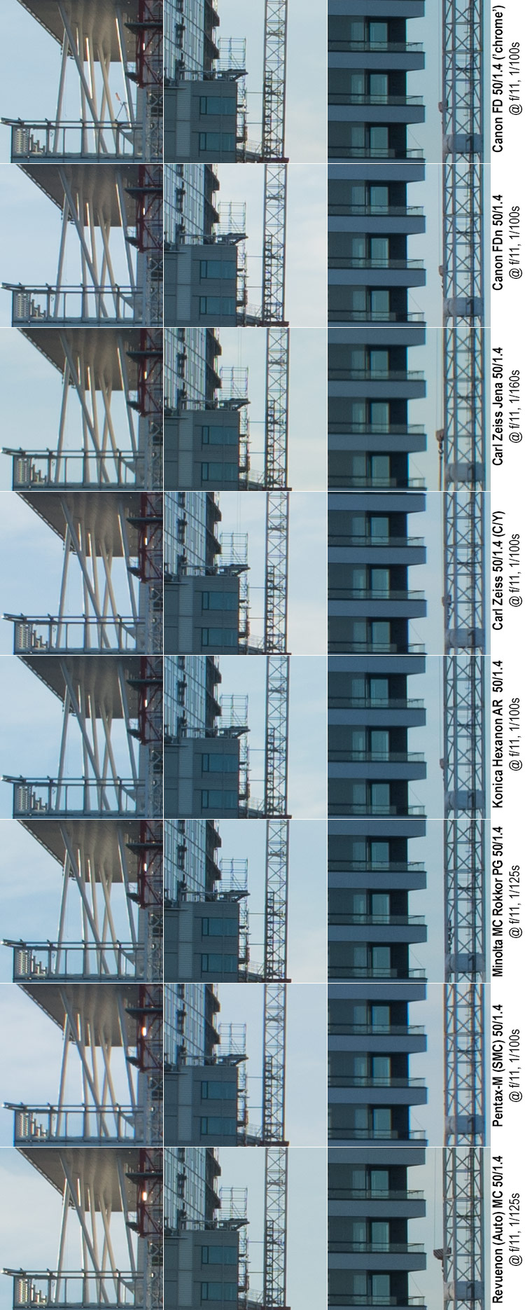
Quick comments @ f/11
And as expected the top-5 lenses show a mild deterioration in definition going from f/8 to f/11 (due, no doubt, to diffraction), those lenses which have previously struggled, keep making improvements – some major (Carl Zeiss Jena) and some less major. While the Hexanon and Pentax do not manage to reach the level of the top 5, the Carl Zeiss Jena now – in my eyes – produces comparable results.
@ f/16
Quick comments @ f/16
Entirely according to expectations, all lenses show a deterioration in detail at f/16…
No! Wait. What? The Carl Zeiss Jena actually manages a minor improvement.
Actually, I’ll quit the theatrics, because it is quite evident that this specific sample of the Carl Zeiss Jena Prakticar 50 mm f/1.4 lens suffers from an aperture that does not close down exactly as it should. In other words, when the lens’ aperture ring says f/16, we’re in all likelihood not yet at f/16. Looking at the kinds of shutter speeds the CZJ lens has recorded, we’re more likely to be at a real aperture value of f/11, even f/10.
Now, back in the days of wide-open metering on a Praktica B SLR, this malfunctioning aperture would have produced significant overexposures at small apertures, but with mirrorless digital cameras that rely on real-time metering, this is less of an issue – unless the problem gets worse (what if the aperture stops closing down beyond f/4).
Whether we’re seeing the result of lame springs or oily blades I won’t hazard a guess at, but if I ever find sufficient reason to have the lens fixed, I might report back.
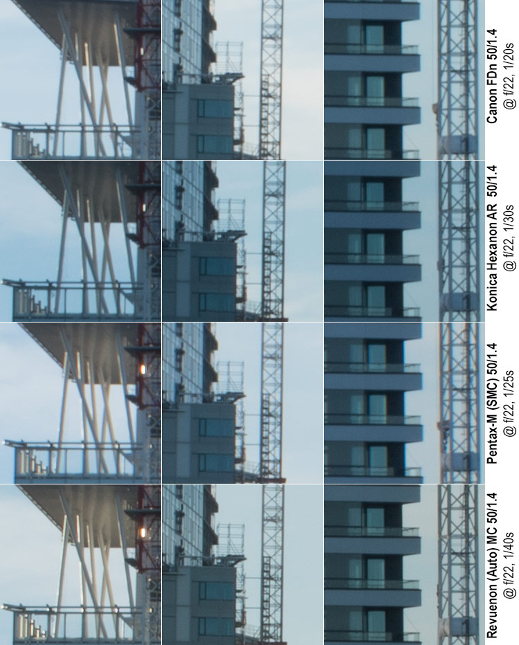
@ f/22
I’ll just post this here for completeness (without analysis or comment).
In sum…
To summarise the imagery above:
– It was interesting to notice, that two lenses (Canon FD ‘chrome nose’ and Revuenon consistently performed very well.
– These two lenses were (at varying apertures) accompanied by the Canon FDn, the Carl Zeiss Planar and the Minolta 50.
– That said, while there was a clear and consistent top-2, third, fourth and fifth placed varied considerably aperture to aperture.
– The issues plaguing the Carl Zeiss lens in this test (massive CA’s in right-hand side crops) could indicate decentering, but I’ve since tested the lens for decentering, and could not find anything significant. One has, therefore, to assume that the lens (sample) simply is liable to evidence such behaviour in specific circumstances.
– The Carl Zeiss Jena lens seems to be a “think different” -lens, as it (in this test as well as all earlier tests) seems to emphasise definition over contrast and be unabashedly dreamy at larger apertures. That said, in these – at times – harsh contrast situations, that dreaminess/lack of contrast was somewhat accentuated, which in turn might indicate that its coatings are not on par with the other lenses.
– Hexanon and Pentax consistently underperformed. The fact that they were lagging even at f/8 and f/11 shows that a simple misjudged focusing hardly is an insufficient explanation. Moreover, these lenses performed at least decently in the earlier brick wall tests.
These test however highlight an aspect seasoned photographers have known for (virtually) ages, namely that while a lens may manage to produce brilliant, highly defined imagery in low-contrast setting, it might very well struggle in a decidedly high-contrast setting. That is why we’ll have to look at yet some more crops.
Extreme-contrast settings
Some of a lens’ failings are especially well visible in high-contrast transitions (which is why we like to investigate them in detail). Moreover, as many types of photography feature high-contrast settings, seeing how a lens behaves in these circumstances in not only of academic interest. The following samples will focus on looking at these kinds of situations.
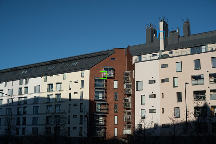
Canon FD ‘Chrome nose’ 50 mm f/1.4 @ f/5.6, 1/1000 s, ISO 100, Sony ⍺7R2, WB: Sunny
Another one of my favourite test motif’s are the two city blocks adjacent to the ‘Baana’ (a cyclist’s superhighway), in the Helsinki district of Kamppi, because of the kinds of high-contrast scenarios easily achieved here and the long distance distortion test allowed (the various rooflines match perfectly, as per city planning). Incidentally, the housing companies in this block are all named after entertainment awards (Emmy, Grammy, Oscar, etc.), which is why I refer to it as the Glamour-block. The green rectangle indicates a focal point crop, while the blue one is an off-centre crop not far from the (imaginary: flat) focal plane. Furthermore, the leftmost crop comes from an earlier test motif (the red-brick building used as a medium-distance test), where the crop comes from marginally behind the (hypothetical, level) focal plane.
Again, before we jump into looking at 1:1 crops, let’s recap the basic situation: All images combine the ideal case (tripod=>longer exposures & low ISO, no shake), and deliberately brutal: at 100% zoom, the real-life size of these (huge) Sony ⍺7R2 files is roughly 2 meters by 1,3 meters.
The test statistics for the leftmost crops will not be repeated. The centre and right-hand crop have the following test specs: All shots were taken within a 15 minute interval in the early morning on a bright and crips early spring day, thereby giving reasonably stable outdoors lighting conditions. All shots taken in RAW on a Sony ⍺7R2, with ISO 100, IBIS off and WB sunny. All excerpts below are unprocessed (ACR default) crops. Distance to subject ≈ 60 meters.
Focus was always nailed on vertical corner support of the protruding balcony (green rectangle, centre column crop) on maximum magnification at wide-open aperture (no refocusing after aperture change). The other crop comes from the rectangle highlighted in blue, and is reasonably close to where a flat focal plane would be. Note please that the focus point this time is in the image centre. Therefore the centre crop should show lens-optimal performance.
@f/1.4
High-contrast artefacts (such as longitudinal chromatic aberrations, scattering and spherical aberration-induced haloing) are obviously most visible wide open.
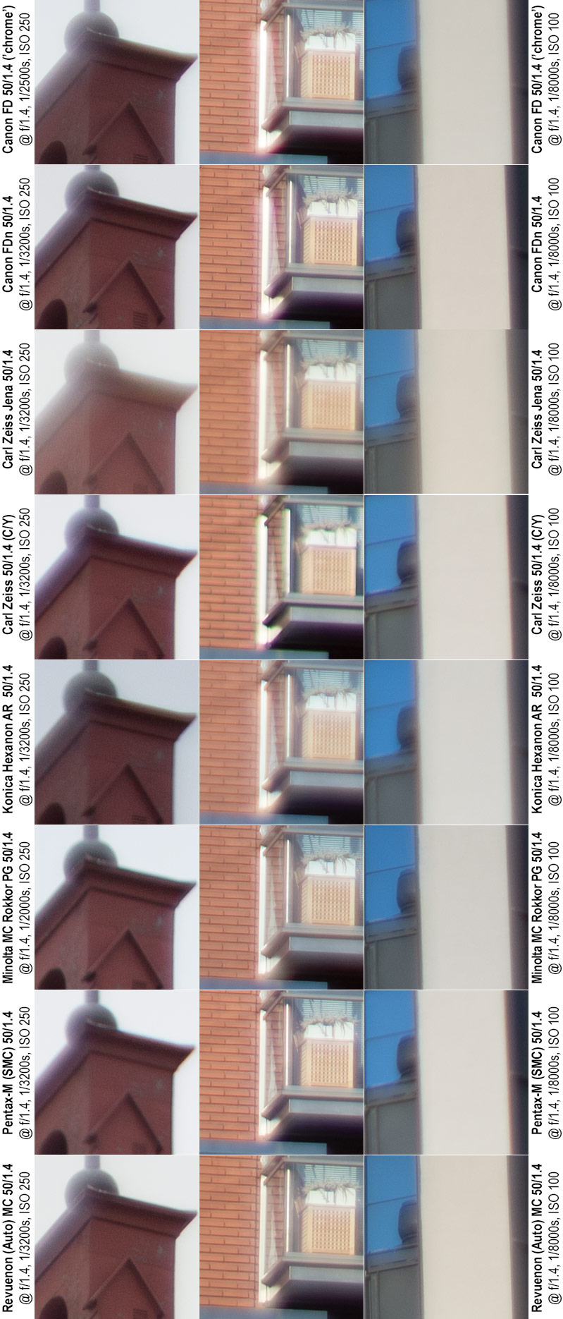
Quick comments @ f/1.4
Unsurprisingly for legacy lenses, none of the samples shows perfect results, but more importantly, the lenses’ ability to handle extreme contrasts varies quite a bit. Not unexpectedly (based on results from previous tests), the Revuenon and Minolta 50 manage decent results, as does the Canon FDn. The older chrome nose Canon is also semi-decent, but suffers more from high-contrast spherical aberrations. Carl Zeiss Planar and Pentax suffer badly from chromatic aberrations, whereas the Hexanon suffers from a lot of spherical aberration. The Prakticar/Carl Zeiss Jena tries to turn spherical aberration into an art-form (and whether it manages in doing that is in the eye of the beholder).
@f/2
Quick comments @ f/2
Going from wide open to f/2 all lenses improve, but…
The improvement is at its biggest in low-contrast situations where the lessened spherical aberrations have a great effect on contrast. In high-contrast situations the improvement is not as great. Those lenses that showed significant chromatic aberrations still show those, and the chromatic aberrations may even be more pronounced now that spherical aberrations have waned. Revuenon and FDn win this round, with the Pentax, Minolta 50 and older Canon FD in the second tier. The Pentax makes a good showing CA-wise, but suffers slightly otherwise
@ f/2.8
Some slightly longer comments @ f/2.8
Even with a lens that is half a century old (and many of these are newer than that) you should be able to expect the lens to have its demons pretty well under control from f/2.8 onward. That’s why having a more thorough look is called for:
Canon FD (‘chrome nose’) again produces very good sharpness and contrast, but shows some spherical aberration-induced haloing (alternatively, one might refer to this as localised veiling flare) and a not field-irrelevant amount of (transverse) chromatic aberrations.
Canon FDn is roughly on par with its older sibling, but – probably thanks to newer coatings – is very resistant against CA’s and haloing.
Carl Zeiss Jena shows – not surprisingly – lessened overall contrast and some edge blooming, but is very little effected by CA’s.
Carl Zeiss Planar has very decent contrast and decent sharpness, but shows a propensity towards chromatic aberrations.
Konica Hexanon is otherwise sharp and contrasty, but not when it comes to high-contrast transitions, nor in bright areas.
Minolta 50 mm is a mixed bag. On the one hand, the lens shows very pronounced CA’s in high-contrast edges, while also showing very goof detail and contrast.
Pentax-M is basically the opposite, showing very little purple/green fringes, and showing decent contrast, but having issues in the definition-department.
Revuenon continues to surprise positively. While there is a whiff of CA’s, the imagery is otherwise remarkably clean.
@ f/4
Quick comments @ f/4
All lenses improve some, but the results largely echo those given at f/2.8. Incidentally, the results from f/5.6 continue the saga (f/2.8 => f/4 => f/5.6), we’ll jump right to f/8, which – based on prior testing – is pretty much the sweet spot of these lenses.
@ f/8
Throughout this comparison/review, most of the lenses have reached their peak performance (definition & contrast) at around f/8-11. Furthermore, at f/8 it is a reasonable expectation for even a legacy lens to be rid of most if not all high-contrast artefacts. That said, due to the nature of lateral Chromatic aberrations, stopping down will not eradicate (and may even exacerbate) those. Let’s see.
Quick comments @ f/8
At f/8 none of the lenses show any significant high-contrast artefacts. There are no indications of localised veiling flare/SA blooming, and those cases of lateral chromatic aberrations that remain discernible are by no means field-relevant.
Furthermore, going past f/8 does not change the CA-profile of any lenses for the worse, so the results at f/8 are quite representative of the entire f/8–f/16-22 range.
The tests on this page (part 3) have been somewhat focused on definition and contrast, and – as they say – sharpness is not all there is to photography. Lets therefore next have a look what kind of unsharpness these lenses produce.
Next…?
• Part 1: Introduction, the lenses: pedigree and handling
• Part 2: IQ-comparison I – The Brick wall test
• Part 3: IQ comparison II – Urban vistas (you are here)
• Part 4: IQ-comparison III – Bokeh and blur
• Part 5: IQ-comparison IV – Night-time vistas
• Part 6: Summary and conclusions