Pekka Buttler, February 2021 – June 2022
Welcome to part 4 of the JAPB comparison of nine fast fifties. This is a big article, that has been subdivided into several parts for convenience and the sake of humane loading times.
This is Batch I of JAPB’s comparison of fast fifties. Have a look also at the ‘cover page’ of the entire fifties -comparisons here.
Table of contents
• Part 1: Introduction, the lenses: pedigree and handling
• Part 2: IQ-comparison I – The Brick wall test
• Part 3: IQ comparison II – Urban vitas
• Part 4: IQ-comparison III – Bokeh and blur (you are here)
• That fuzzy stuff…
• Bokeh (and blur)
• Feel (tonal range, micro-contrast, depth perception)
• Part 5: IQ-comparison IV – Night-time vistas
• Part 6: Summary and conclusions
That fuzzy stuff…
This part of the comparison covers two quite diverse aspects. The first aspect is bokeh and the other is the general feel or rendering of the lenses. While disparate, these two aspects have one central commonality – both are very much subjective and hard to quantify.
Bokeh (and blur)
Thus far, this comparison review has focused on sharpness, but one of the things you expect from a large-aperture lens is to enable selective sharpness, in other words: subject separation. Therefore, we will next have a look at what type of blurriness one can expect from these lenses. But before we go on, two paragraphs of theory and another one of meta:
What is ‘Bokeh’ and what is it not?
The sheer amount of out-of-focus-ness of a background (or foreground) is defined by only four things: The actual focal length, the used aperture, the distance the lens is focused at and the distance to the background/foreground.
• Longer focal length => more blur potential;
• Wider aperture => more blur potential;
• Shorter focusing distance =>more blur potential;
• Longer distance to background (or foreground) => more blur potential.
Hence, any two lenses used on the same camera on the same tripod produce the same amount of background blur as long as their focal length and aperture are the same. But that is not what is commonly referred to as ‘bokeh’
Instead, ‘bokeh’ is typically used to indicate the characteristics or qualities of blur. This is by no means an insignificant topic, because as the primary function of a blurred background (and, sometimes, foreground) is to direct the viewer’s eye away from that background (and onto the subject), a background which – while out of focus – is nervous or jagged, runs counter to the purpose of blurring the background in the first place. That much basically everyone agrees on.
From that point onward, ‘bokeh’ is a notoriously difficult topic to discuss, because what is considered ‘good bokeh’ seems to be subject to taste. One need only have a look at discussions about ‘swirly’ bokeh or ‘soap bubble’ bokeh to see that opinions both run the gamut and those reasonings put forward in defence of one or another type of bokeh are more personal than universal. Therefore – instead of me passing judgment on the bokeh evident in a series of perfectly boring test shots, I’ll let you judge for yourselves.
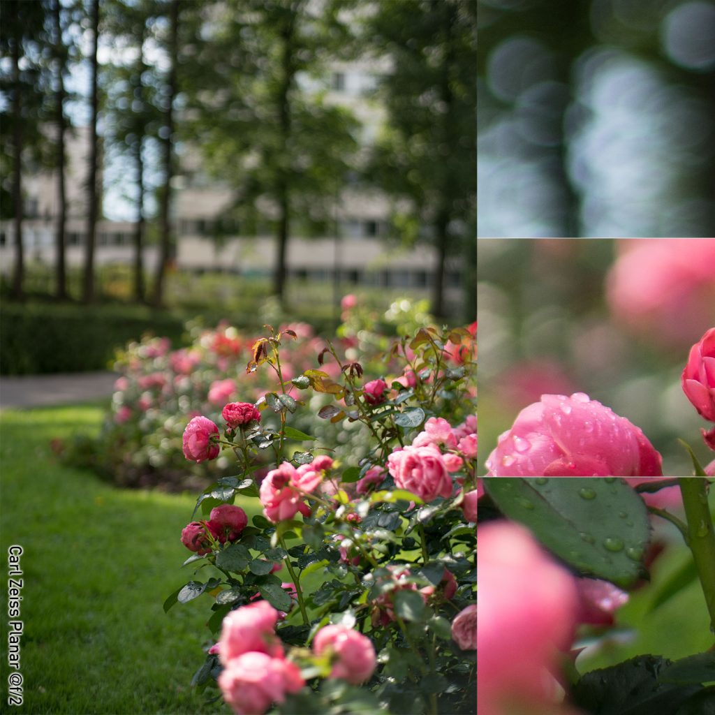
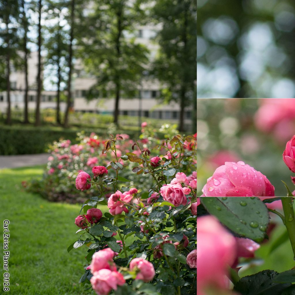
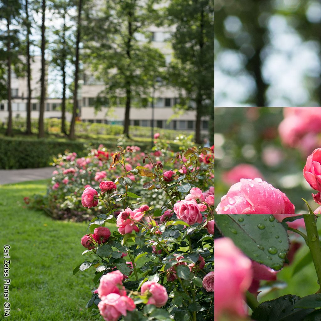
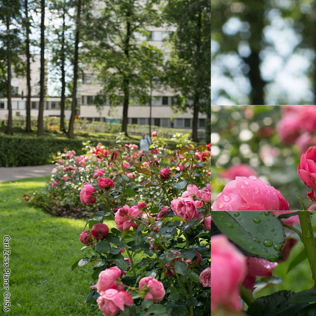
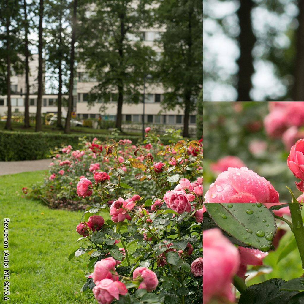
The Rose garden
The summer of 2020 was (weather-wise, in Helsinki) somewhat unstable. Otherwise warm and sunny days would often be interrupted by short squalls. While certainly annoying (in case you wanted to stay outdoors for the entire day), it did make for vibrant foliage and the potential for a lot of raindrop-reflections. In this situation, the seemingly perfect (extremely challenging) situation for a series of test shots for bokeh and blur showed itself in the ‘rose garden’ – a portion of a city park characterised by rose bushes and sculpted topiaries (the topiaries are, however, not featured in the imagery).
Note, please: In this test, the results of the Minolta 58 mm lens are again valid for comparison as the focusing distance is comfortably within the lens’ abilities.
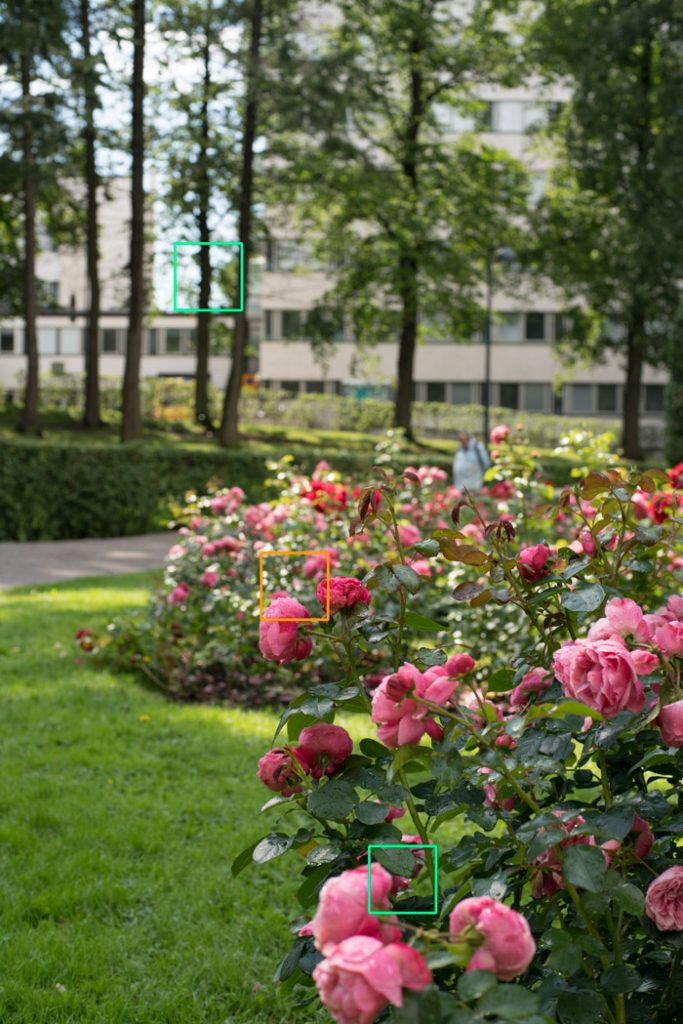
Carl Zeiss Planar 50 mm f/1.4 @ f/5.6, 1/320 s, ISO 200, Sony ⍺7R2, WB Cloudy
All shots on a tripod with a self-timer. All shots taken within 15 minutes of each other. Due to some slight windiness the rose bushes undulated a bit (not a problem for shutter speed, but excerpts do not line up perfectly) and as the clouds shifted, lighting conditions varied a bit (honestly, the shifting lighting conditions were far from optimal, but I could not wait as the raindrops were quickly vaporising). ISO 200, aperture priority, WB cloudy. All RAW files processed in ACR (default).
Composites
Be prepared for a lot of imagery – nine lenses at five aperture values (f/1.4 – f/5.6 in full-stop increments) makes close to 50 images.
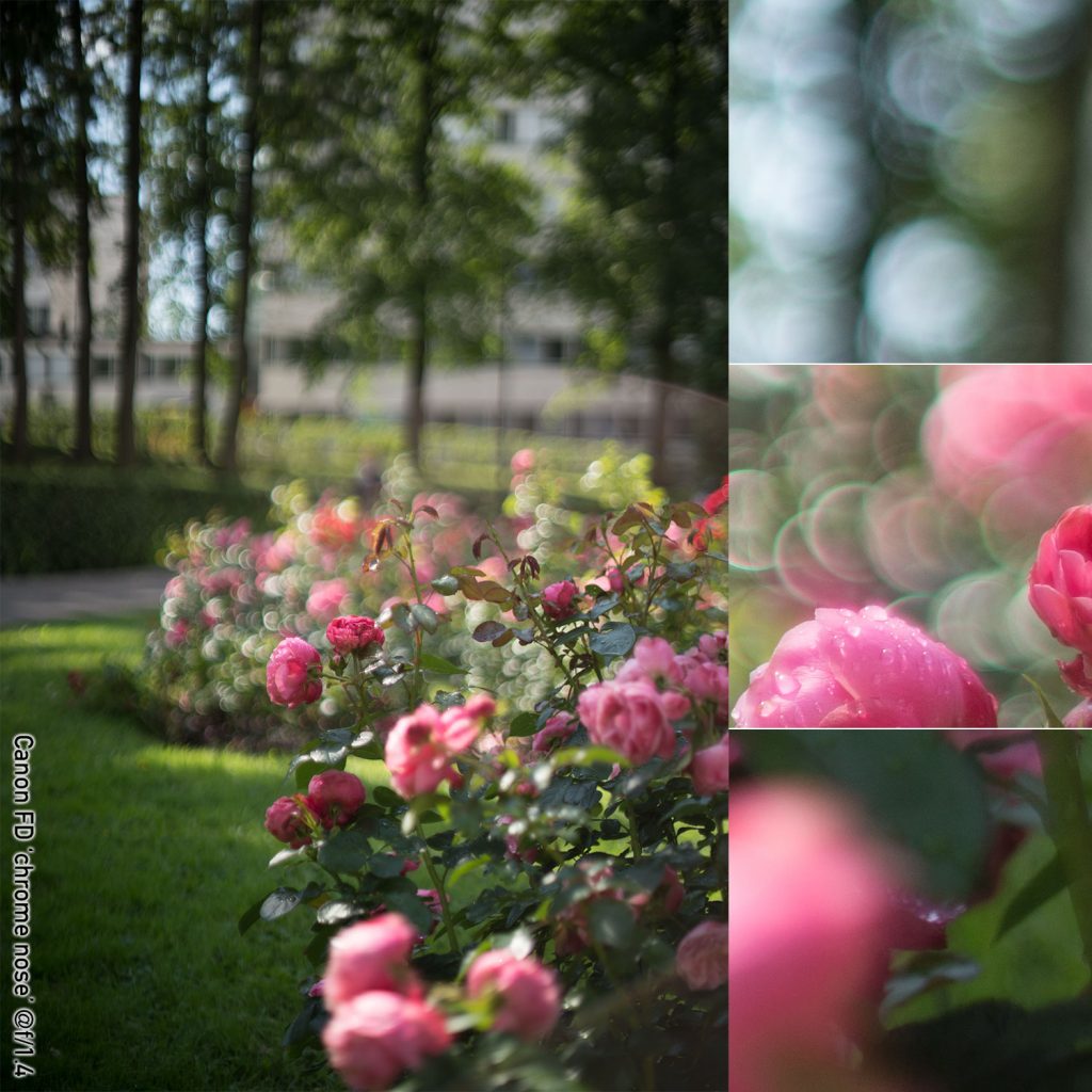
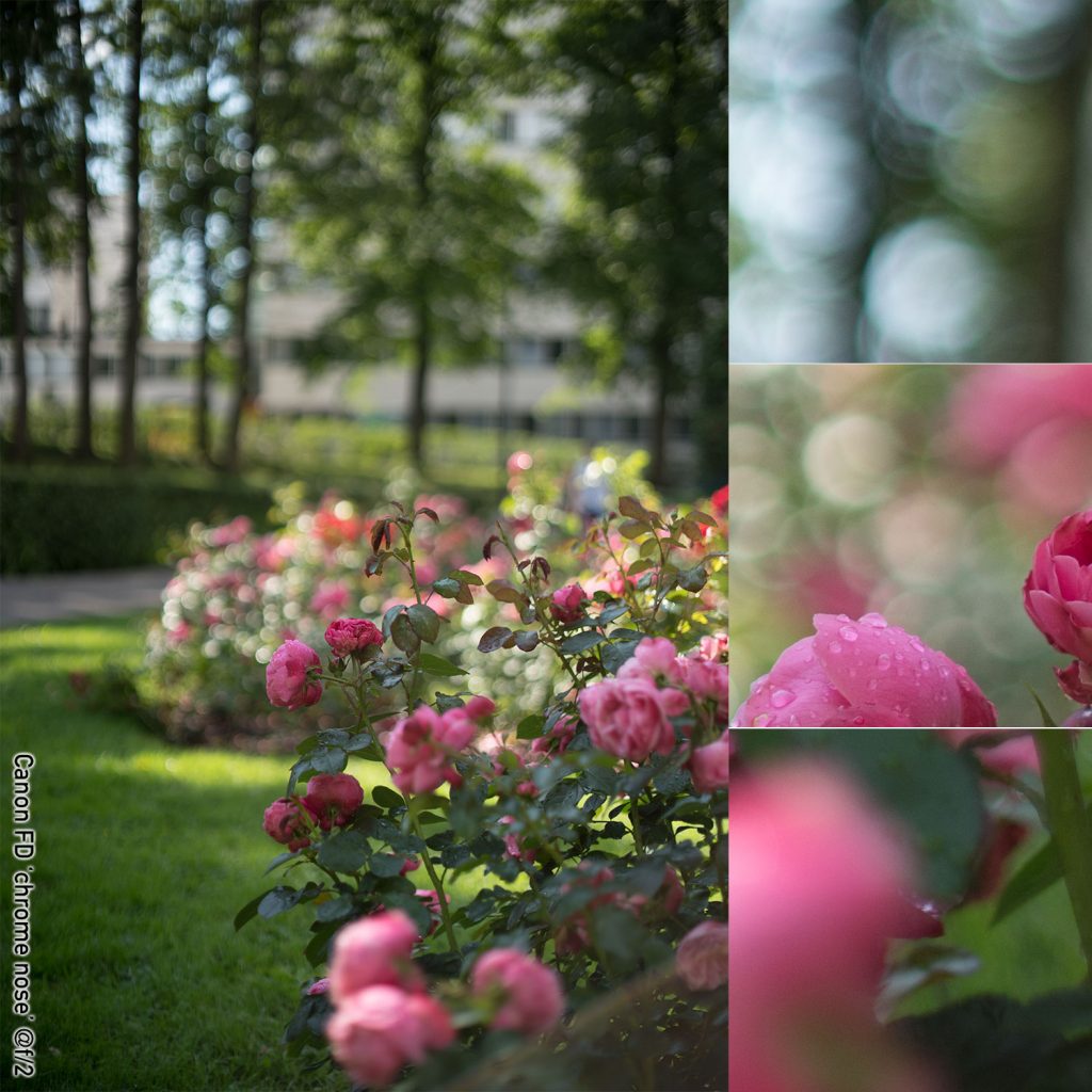
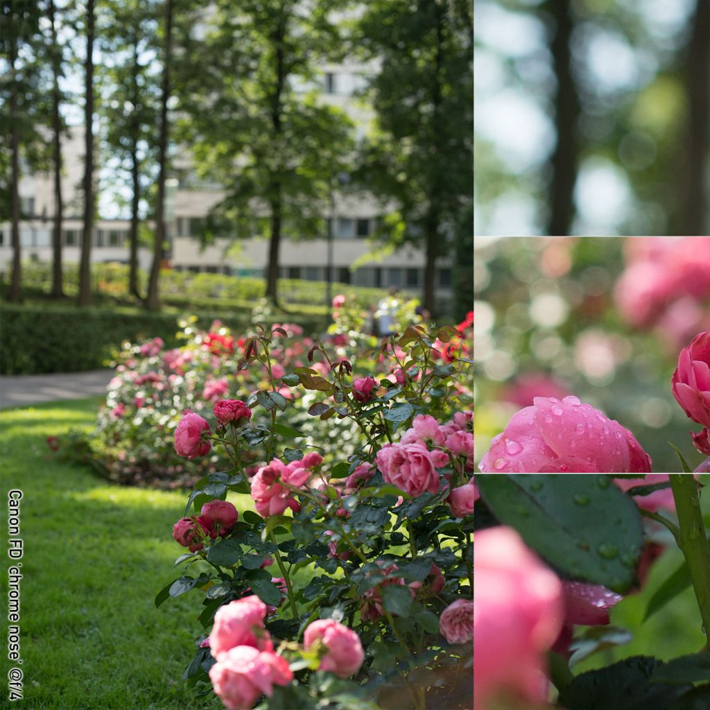
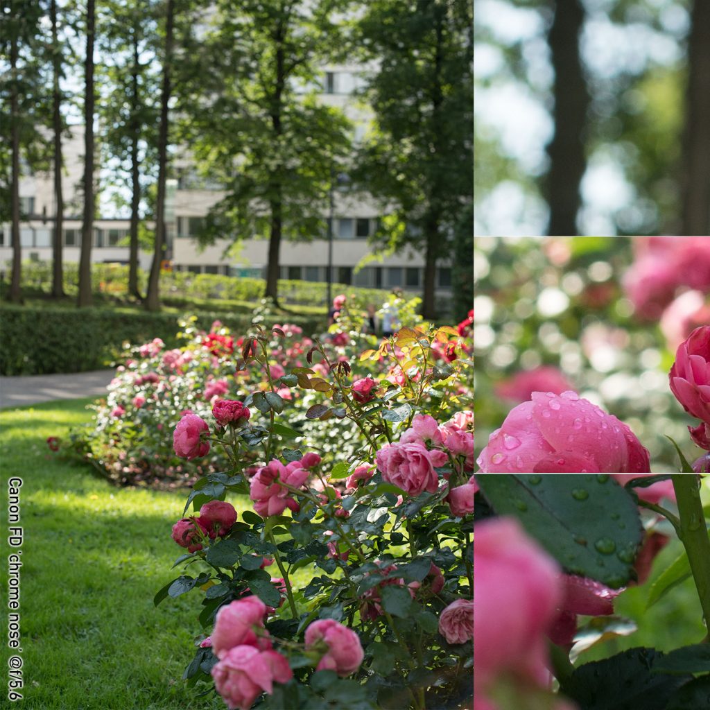
Canon FD ‘Chrome Nose’ 50 mm f/1.4
(right click and open in new tab for bigger version)
(right click and open in new tab for bigger version)

(right click and open in new tab for bigger version)
(right click and open in new tab for bigger version)
(right click and open in new tab for bigger version)
Quick comments on the Canon FD ‘Chrome Nose’
As has become evident in other tests, this lens does suffer from relatively pronounced vignetting wide open. This is not a showstopper and can be utilised creatively, but the photographer needs to be aware of it. Wide open, the lens shows some ghosting, but (in this setup) no significant veiling. The octagonal aperture is – at most aperture values – not clearly apparent. Out-of focus highlights show distinct outlining at wide open (and also a bit at f/2).
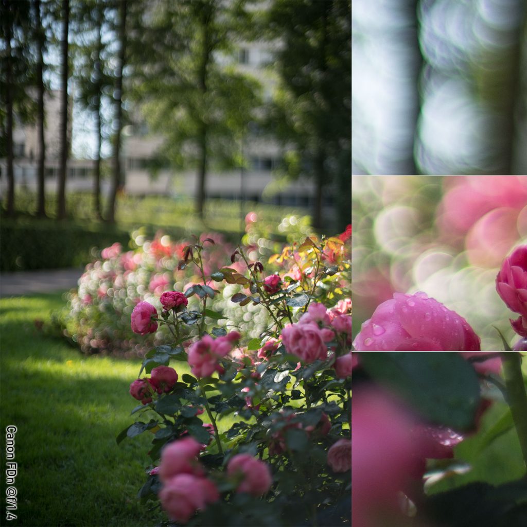
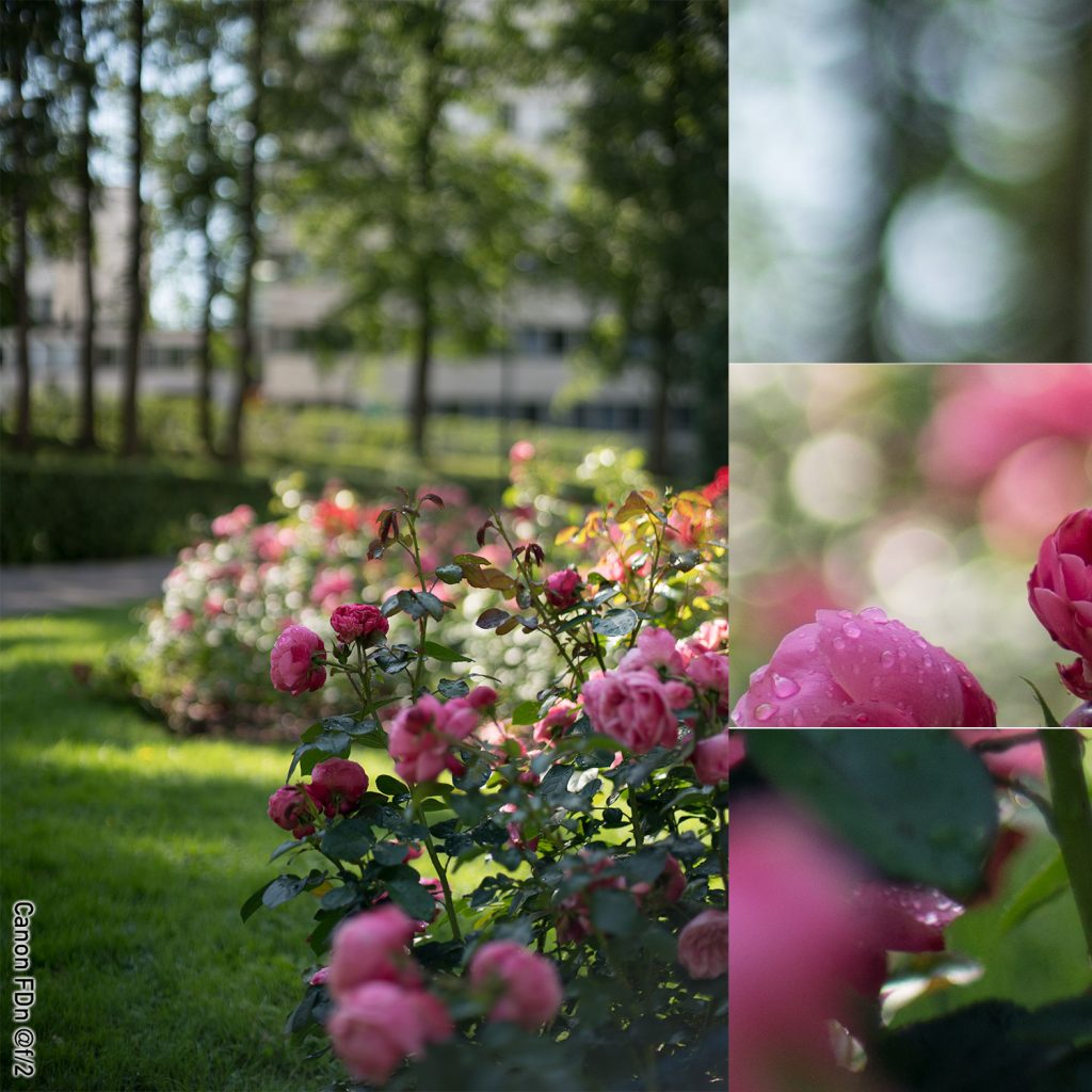
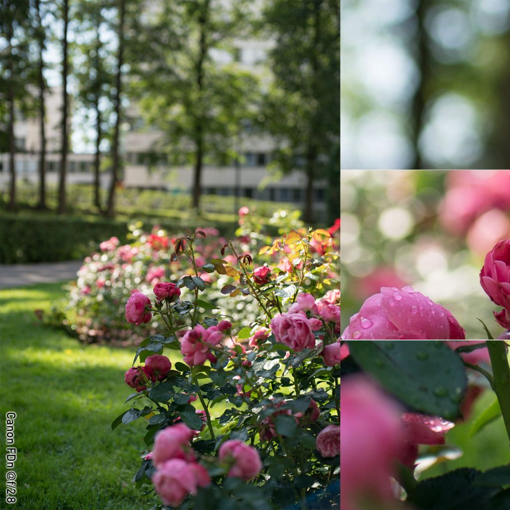
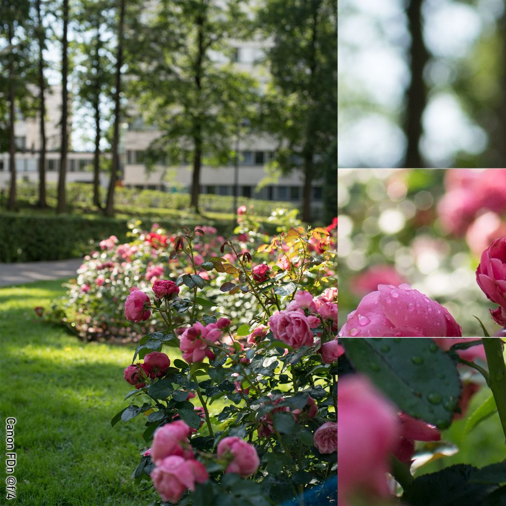
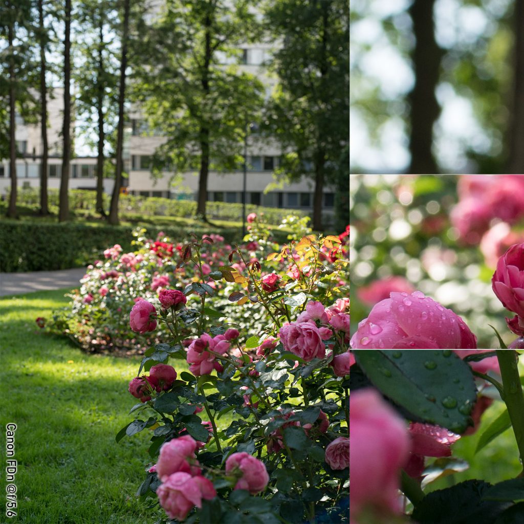
Canon FDn 50 mm f/1.4
(right click and open in new tab for bigger version)
(right click and open in new tab for bigger version)
(right click and open in new tab for bigger version)
(right click and open in new tab for bigger version)
(right click and open in new tab for bigger version)
Quick comments on the Canon FDn
Out of focus highlights show distinct outlining wide open (but not beyond that), and the octagonal aperture shape does not become apparent before f/4. Interestingly the far background (house facade) can not be said to be calm at any aperture – at wider apertures there is some double outlining (meridional lines are blurred, but sagittal are outlined) – but that might be very dependent on the distance (to subject/to background) -ratio. The out-of-focus highlights show some onion rings (a trait usually associated with aspherical lens elements)
There is an obvious temptation to compare the Canon FDn to its elder sibling, and I won’t try to resist. On the one hand the FDn shows significantly less vignetting, less glow wide open, and no signs of ghosting (the latter may be partly based on changes in the environment, but may also indicate the FD’s more modern coatings do have an effect).
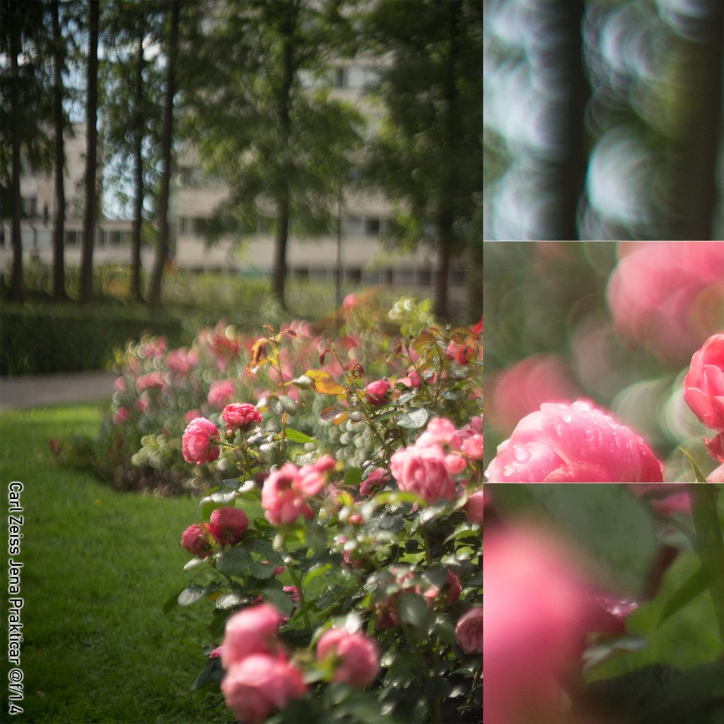
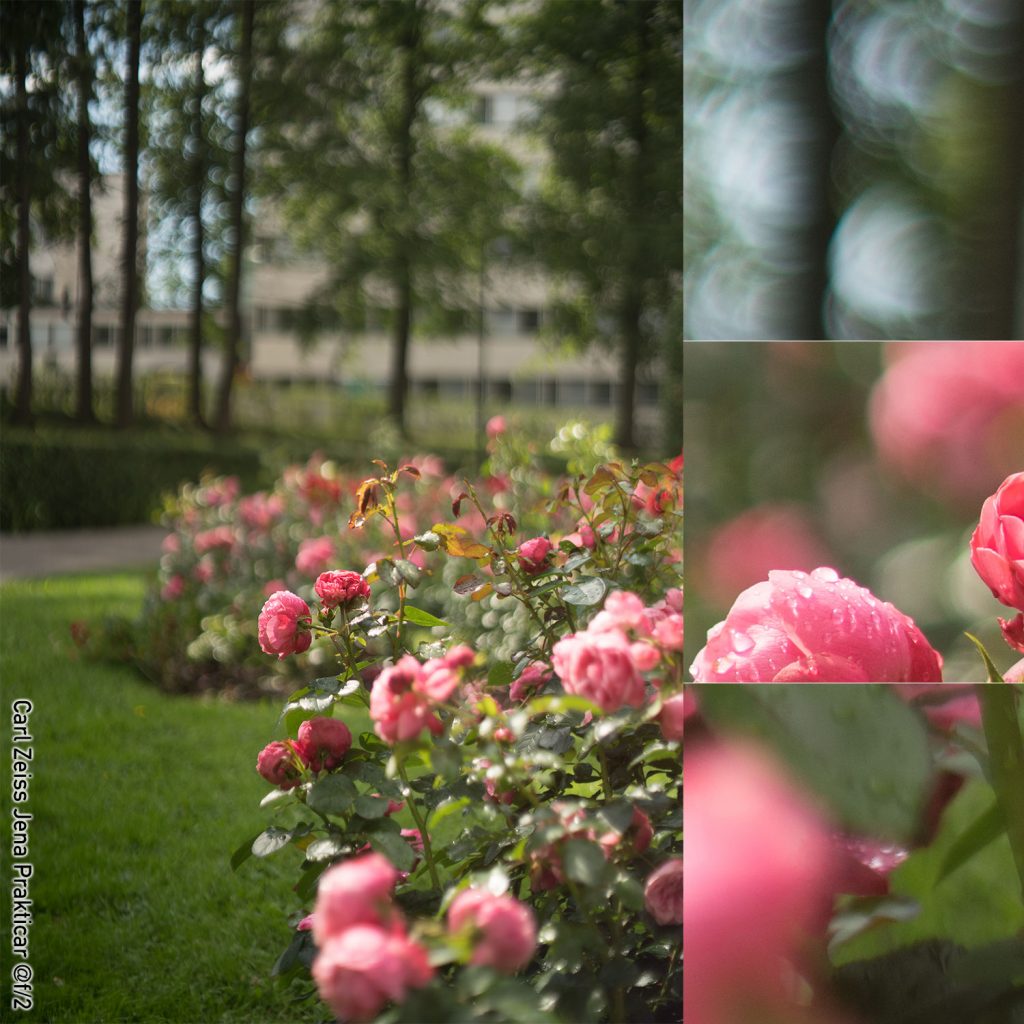
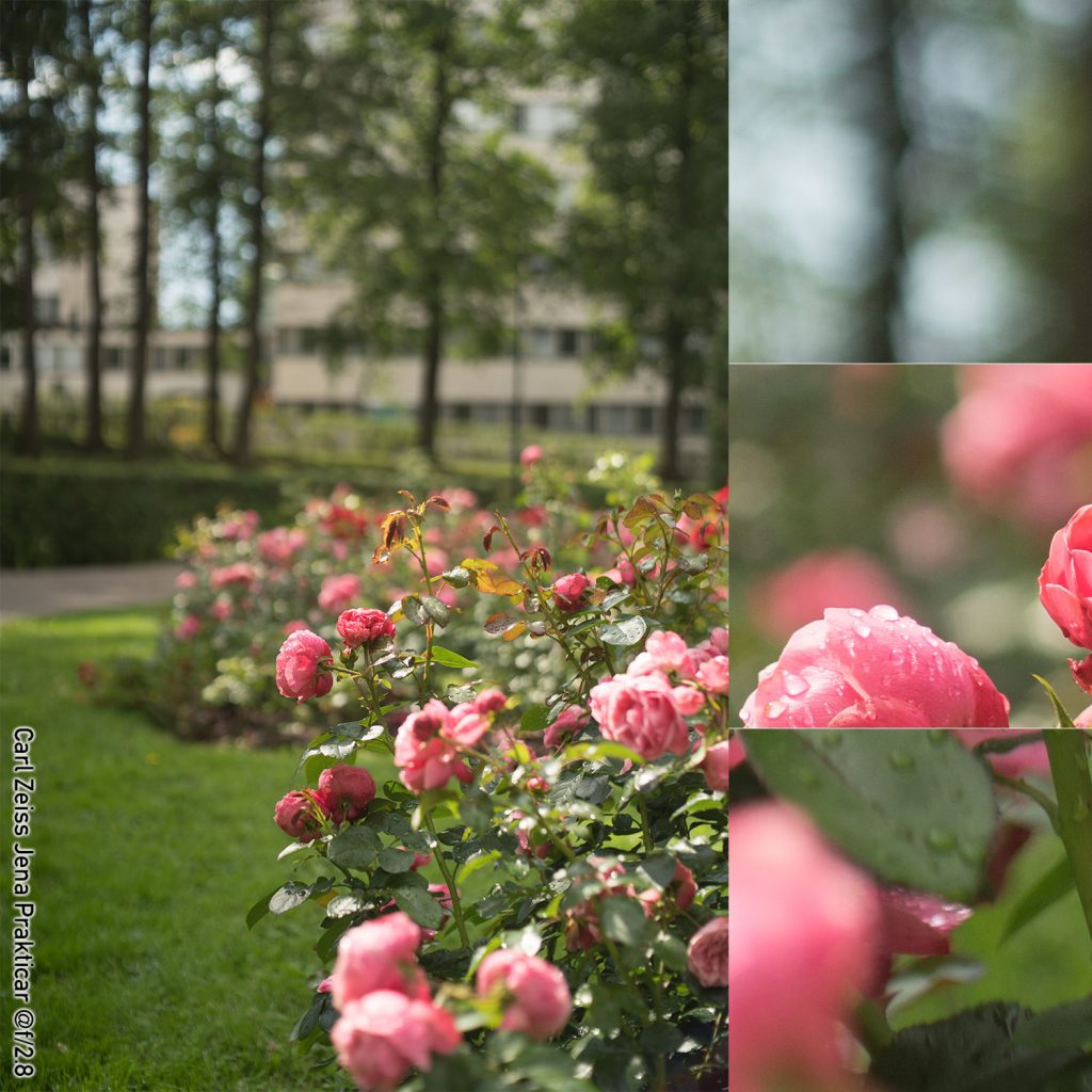
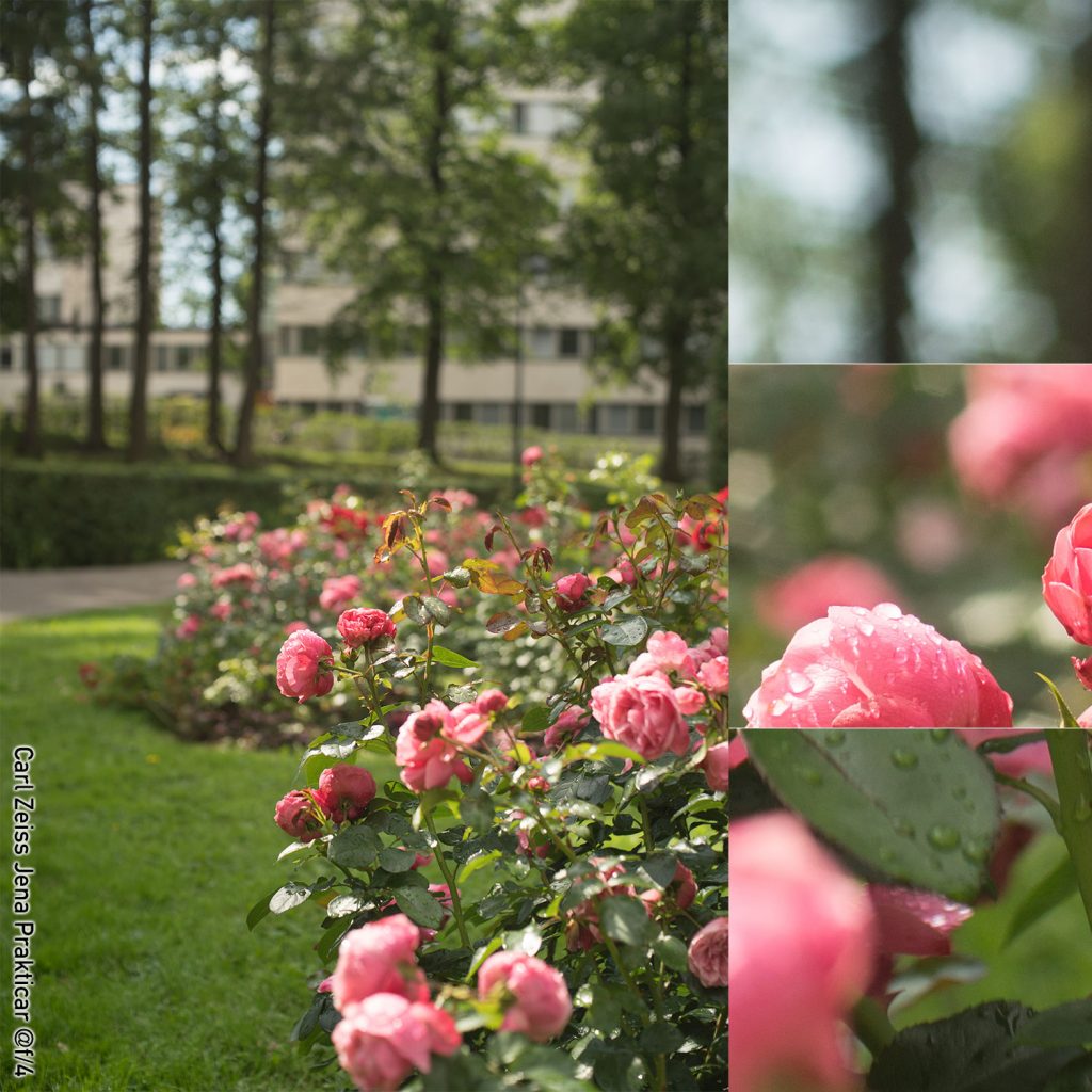
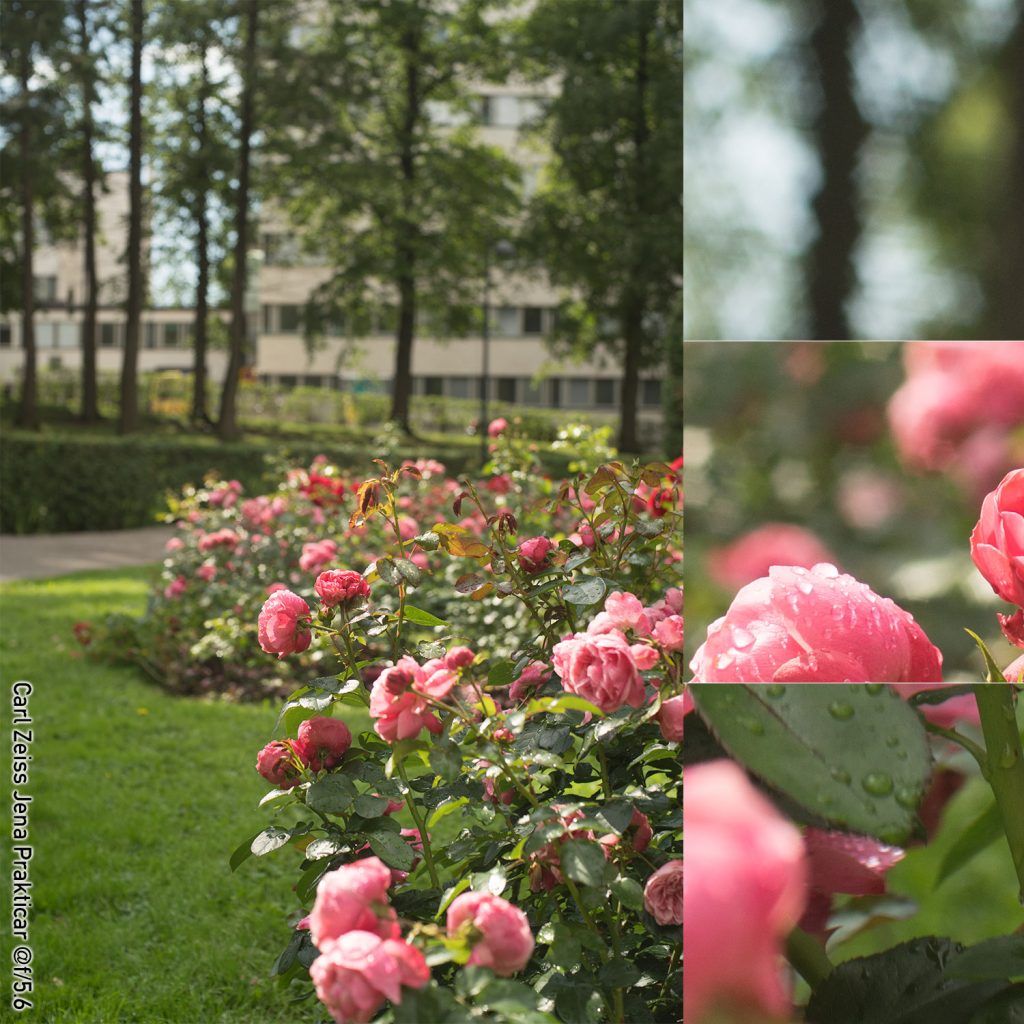
Carl Zeiss Jena Prakticar 50 mm f/1.4
(right click and open in new tab for bigger version)
(right click and open in new tab for bigger version)
(right click and open in new tab for bigger version)
(right click and open in new tab for bigger version)
(right click and open in new tab for bigger version)
Quick comments on the Prakticar
Not surprisingly, the Prakticar is softish, glowy and dreamy wide open, and while there is something a bit flamboyant about the wide open out-of-focus highlights , the Prakticar is by no means a Helios 44 or a Trioplan. This is not a lens you buy for outrageous bokeh. While there is some ninja-star-ish characteristics in the out of focus highlights, these are not very pronounced at f/2.8 (mostly as the bokeh balls do not have clear boundaries) but the pointy hexagon aperture shape does show at f/4 and f/5.6 (one could characterise the hexagons as the opposite to ’rounded’). While this contributes to obvious (in some cases annoyingly so) out-of-focus highlights, it might also contribute to an overall (subjective judgment warning:) pleasing out of focus blur.
P.S. While not strictly spoken related to bokeh, these samples clearly show the Prakticar’s different take on the colour ‘red’.
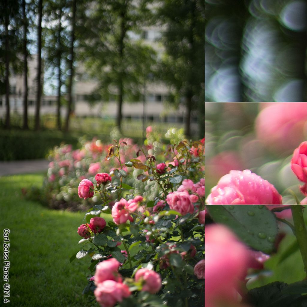
Carl Zeiss Planar 50 mm f/1.4
(right click and open in new tab for bigger version)
(right click and open in new tab for bigger version)
(right click and open in new tab for bigger version)
(right click and open in new tab for bigger version)
(right click and open in new tab for bigger version)
Quick Comments on the Carl Zeiss Planar
At first sight, the Planar performs as one would expect a premium lens to do – no visible flaring or ghosting, and the image is crisp and contrasty. But once you look closer at the out-of-focus areas, the picture is not so rosy any more (pun intended). Not only do the out-of-focus highlights show significant outlining (at f/1.4 and also at f/2), but (especially as one moves away from the optical axis), those outlines tend to become flattened, leading to a relatively pronounced chevron. While the Planar is by no means the only lens to show partial outlines, these flattened outlines are something different. Also, at f/1.4–2, there is some outlining on vertical lines, which IMO somewhat defeats the purpose of a blurred background.
Finally, I must say a word about the ninja stars. I’ve always felt the whole ninja star-gate to be blown entirely out of proportion, and while I concede that there are situations in which they might be more annoying than in this example, in a case like this, one hardly notices.
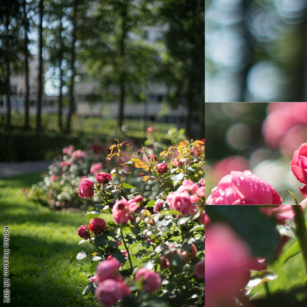
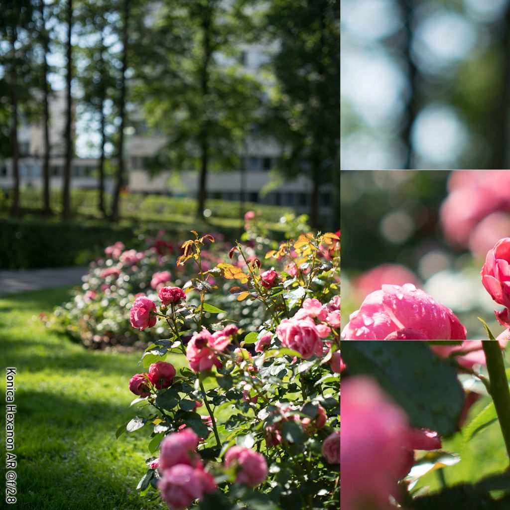
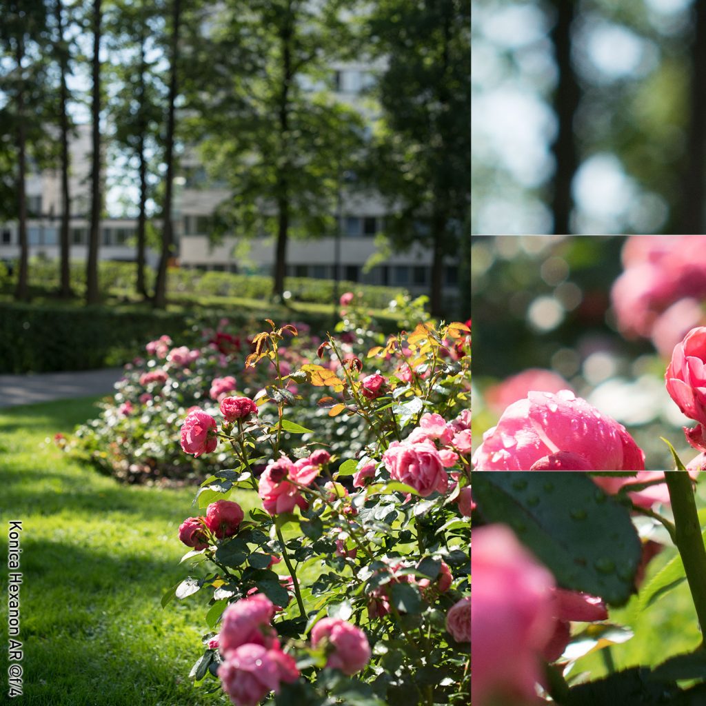
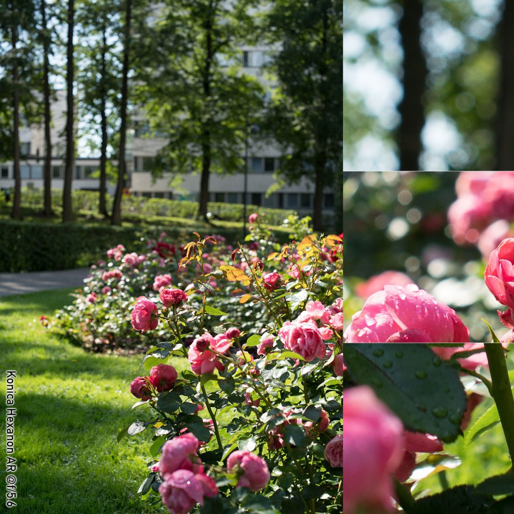
Konica Hexanon AR 50 mm f/1.4
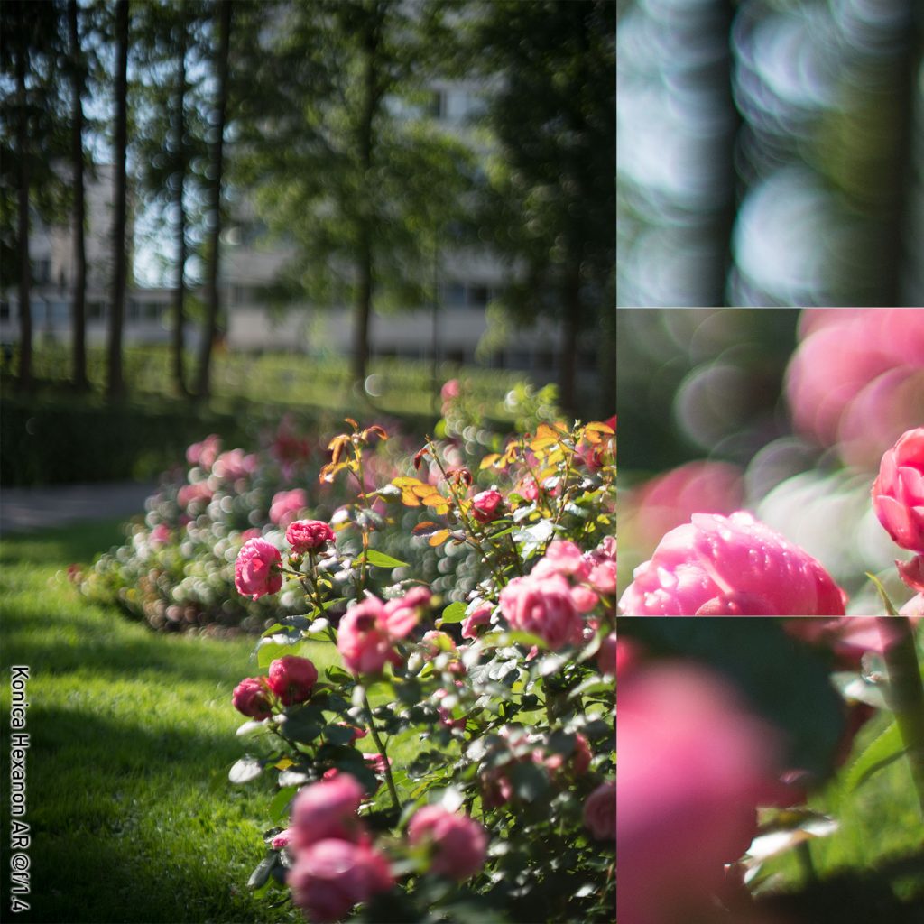
(right click and open in new tab for bigger version)
(right click and open in new tab for bigger version)
(right click and open in new tab for bigger version)
(right click and open in new tab for bigger version)
(right click and open in new tab for bigger version)
Quick Comments on the Hexanon
The Hexanon shows significant vignetting at f/1.4, but that stops being field relevant before f/2.8. Alike most lenses here, the Hexanon shows some outlining of the bokeh balls at wide open, but by f/2 this is no longer the case. The out-of-focus highlights remain perfectly circular until f/2.8, at which stage the eight blades start becoming visible to the discerning eye. That said, the out-of-focus highlights always retain a predominantly circular appearance. Compared, for instance, with the Zeiss Planar, the out-of-focus highlights never have a prominently x-agonal form.
Not unlike some other lenses, the background blur at wide open tends towards the distracting, but this improves going to f/2 and f/2.8. While some diffraction artefacts start creeping into the out-of-focus highlights at f/5.6, the Hexanon’s bokeh characteristics are not at all bad.
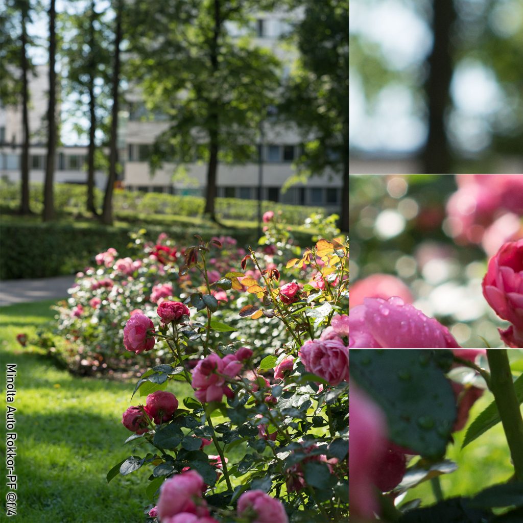
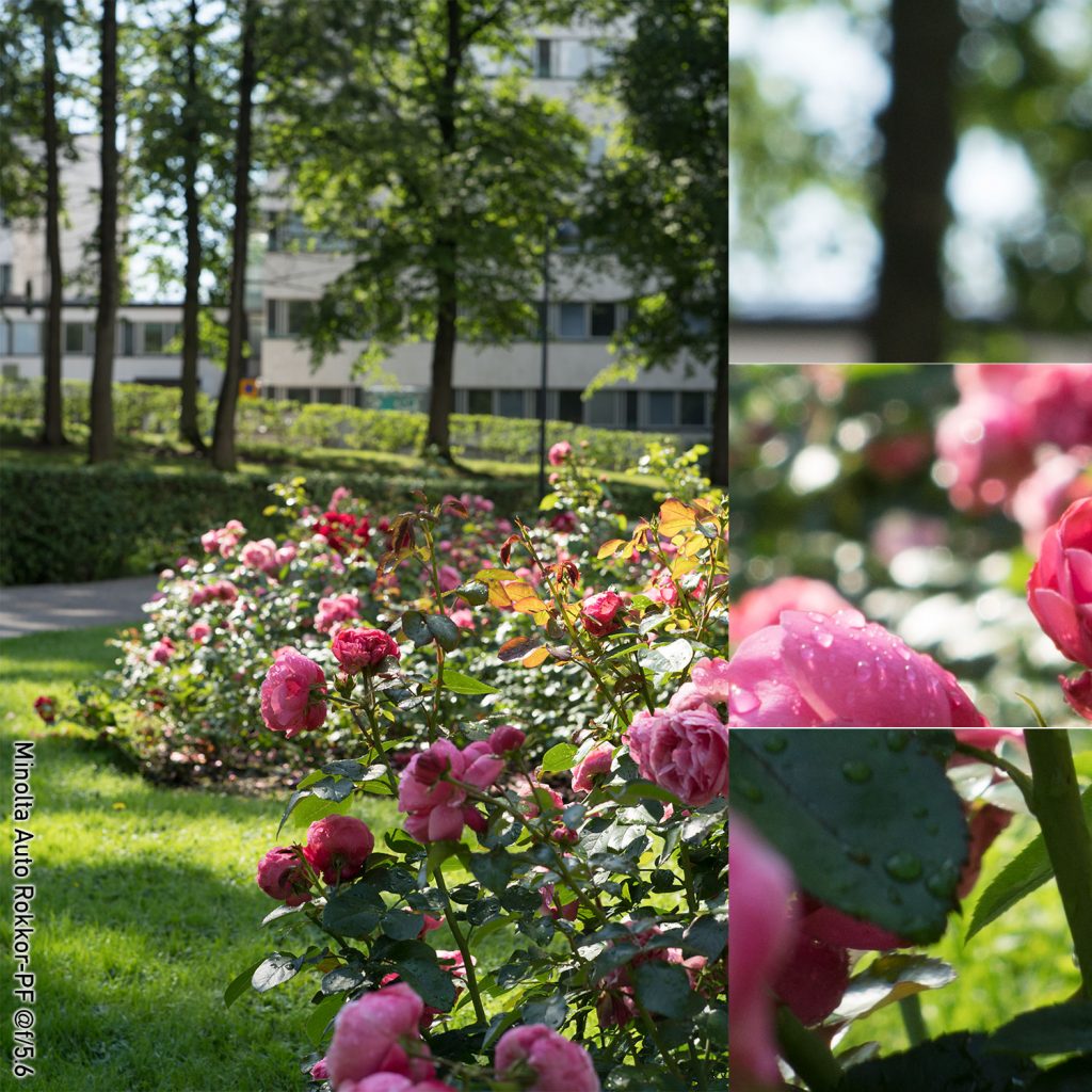
Minolta Auto-Rokkor PF 58 mm f/1.4
(right click and open in new tab for bigger version)
(right click and open in new tab for bigger version)
(right click and open in new tab for bigger version)
(right click and open in new tab for bigger version)
(right click and open in new tab for bigger version)
Quick comments on the 58 mm Minolta
The Minolta 58 mm – being the oldest lens in this batch – not unexpectedly, shows some ghosting at wide open, but as that ghosting does not come at the cost of a significant drop in contrast, could be judged a positive attribute.
Out-of-focus highlights are clearly outlined at f/1.4, and while that is not to everyone’s liking, it does lend the imagery a grandness of its own. Looking purely at the bokeh balls, f/2 probably offers the sweet-spot (unless you like outlines), because starting at f/2.8 the eight-bladed aperture starts showing clearly.
Looking at the far background, the Minolta 58 has to be seen as one of the best performers, as there is no trace of double outlines, or any other bokeh artefact that would make the wide open image’s far background loog jagged or distracting.
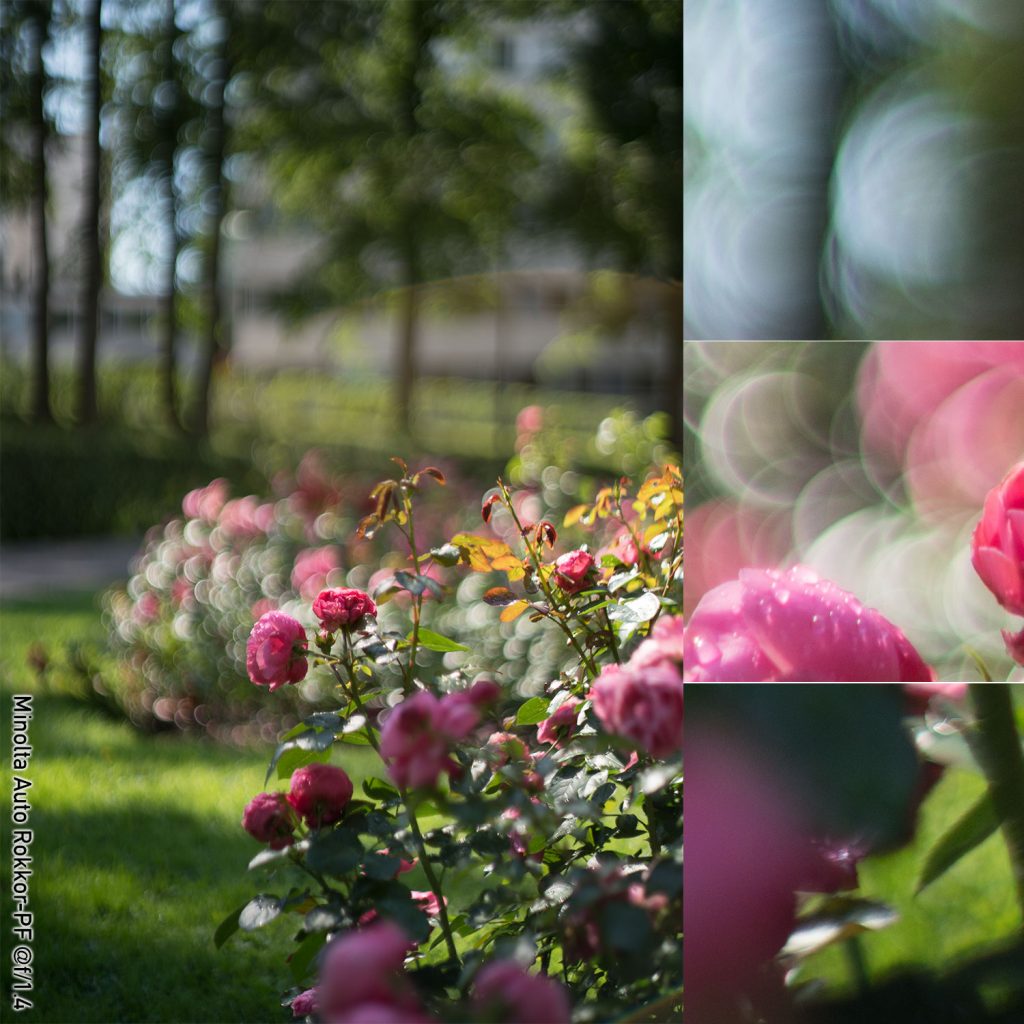
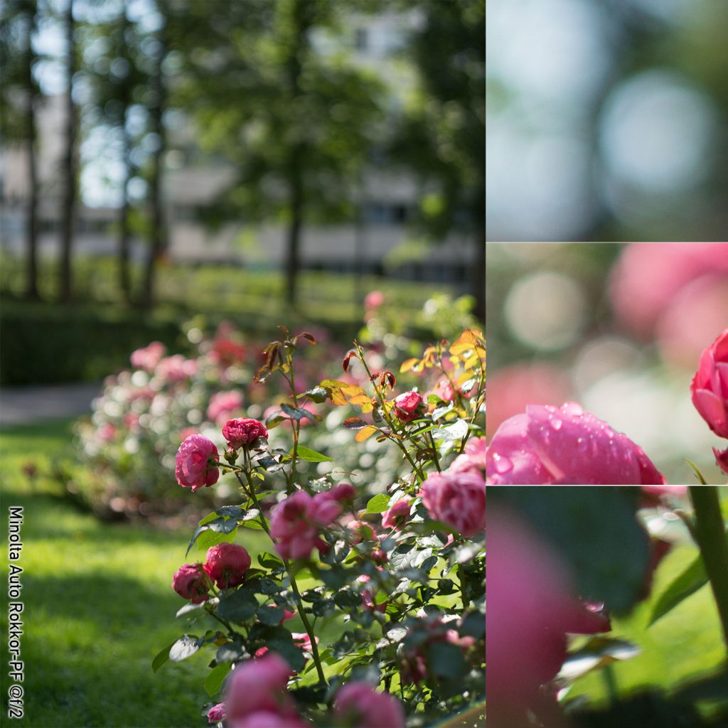
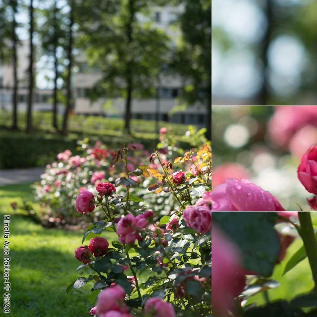
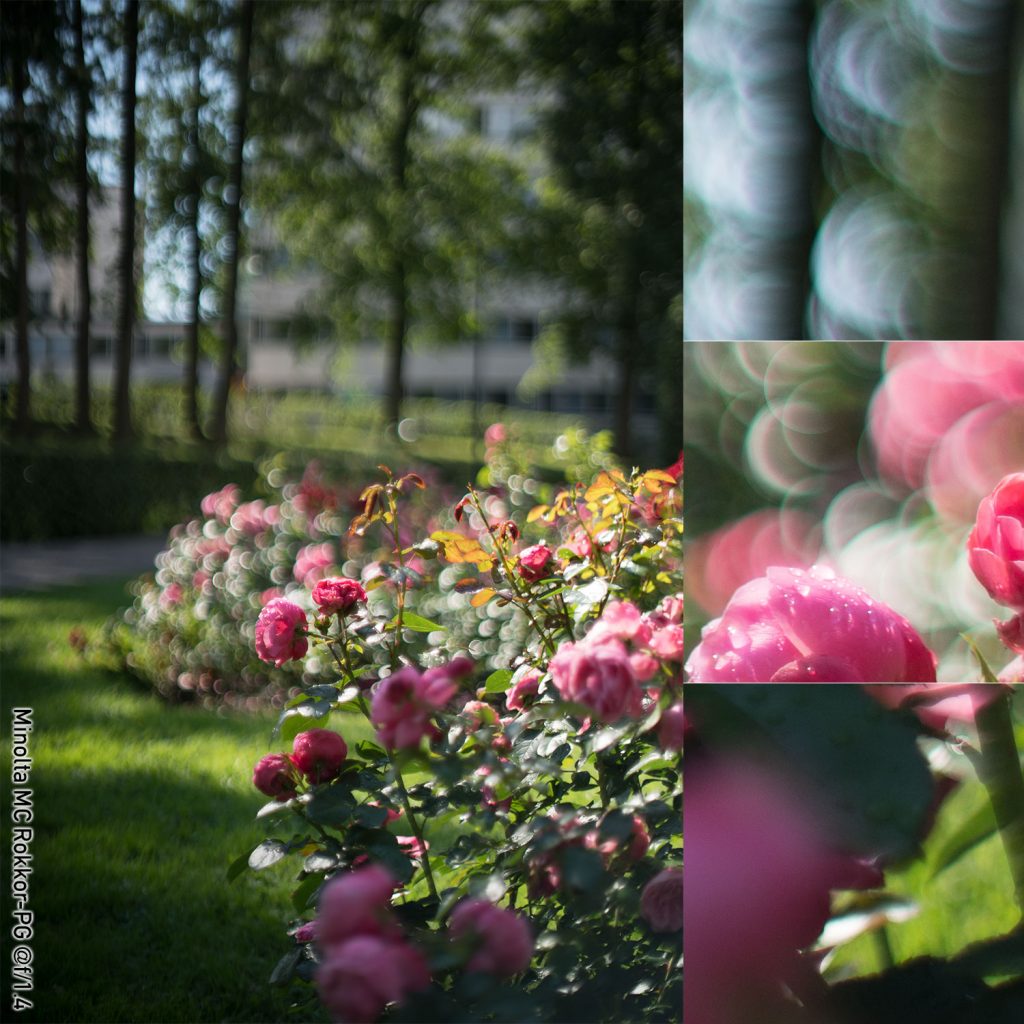
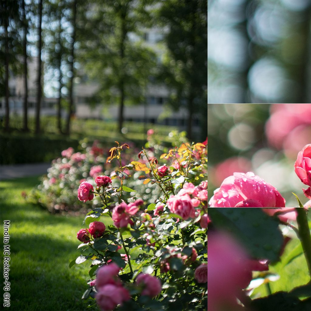
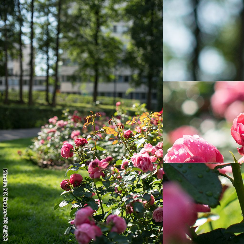
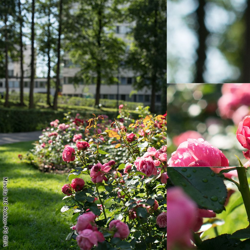
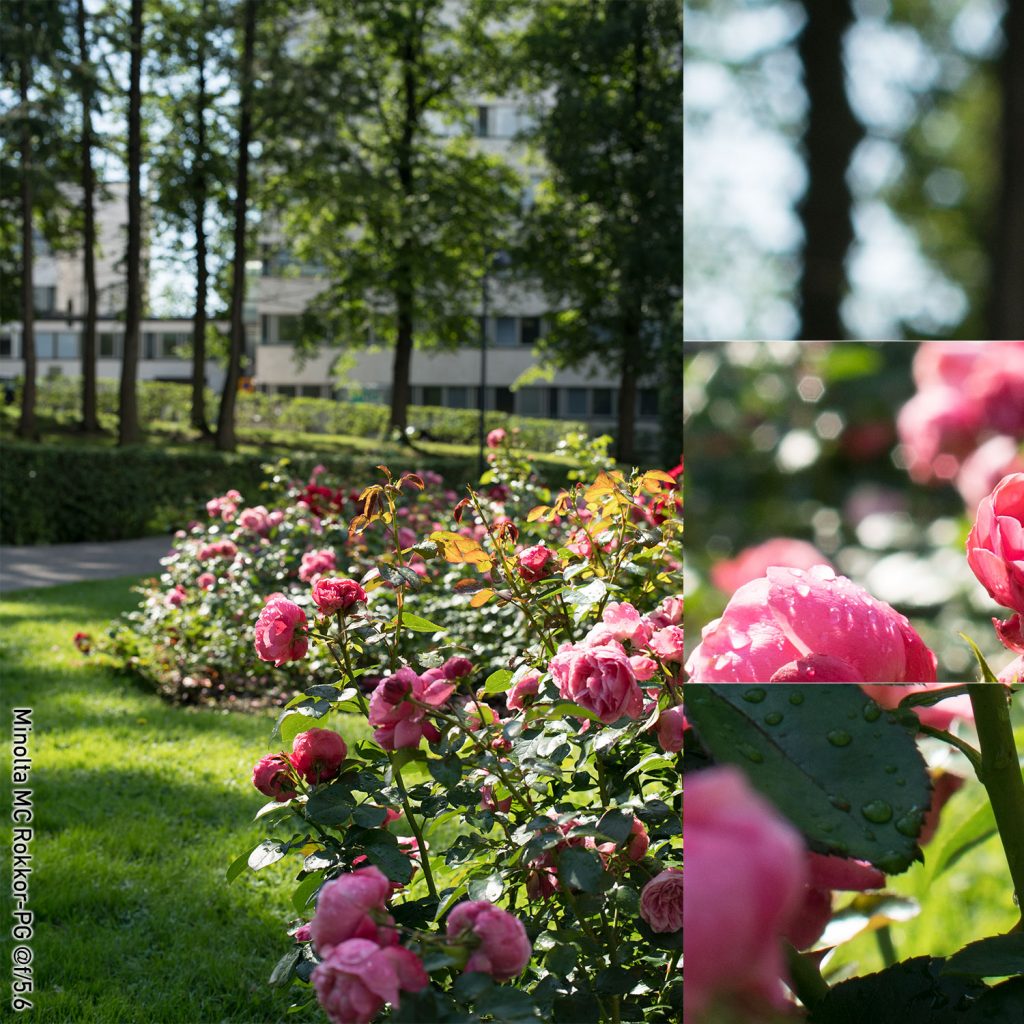
Minolta MC Rokkor-PG 50 mm f/1.4
(right click and open in new tab for bigger version)
(right click and open in new tab for bigger version)
(right click and open in new tab for bigger version)
(right click and open in new tab for bigger version)
(right click and open in new tab for bigger version)
Quick comments on the 50 mm Minolta
While the Minolta 50 mm is by no means a Trioplan, the outlining of out-of-focus highlights at f/1.4 does come closer to being describable as ‘soap bubble bokeh’ than any other of the tested lenses. By f/2 that outlining goes away but from f/2.8 onward, the hexagonal aperture starts becoming apparent, leading to a feeling of pixelation/pointillism in the canopy. At f/5.6 there are clear onion rings in the hexagonal bokeh balls, and I have to assume that this is indicative of a diffraction pattern. Wide open there is some double outlining in the far background, but at f/2 that is no longer an issue.
n.B!
And as much as I hated the fact, the weather played tricks on me. Gone was the sunshine and with it the sunlight rays reflected off the raindrops. I hung around for a couple of minutes, waiting for the sky to clear, anxiously looking at the weather/rain radar, only to notice that I had only a few minutes before the sky would turn darker still. Knowing the Pentax and Revuenon shots would not be comparable, I finished the shoot, packed by gear, and cursed the fickle weather all to HEL and back.
(Inside joke: The three-letter-acronym for Helsinki international airport is HEL, and is – unsurprisingly – pronounced with a weight on the ‘L’. This has lead to a spate of puns and jokes wherein HEL/Helsinki takes the place of ‘hell’ in various anglo-american inspired idioms.)
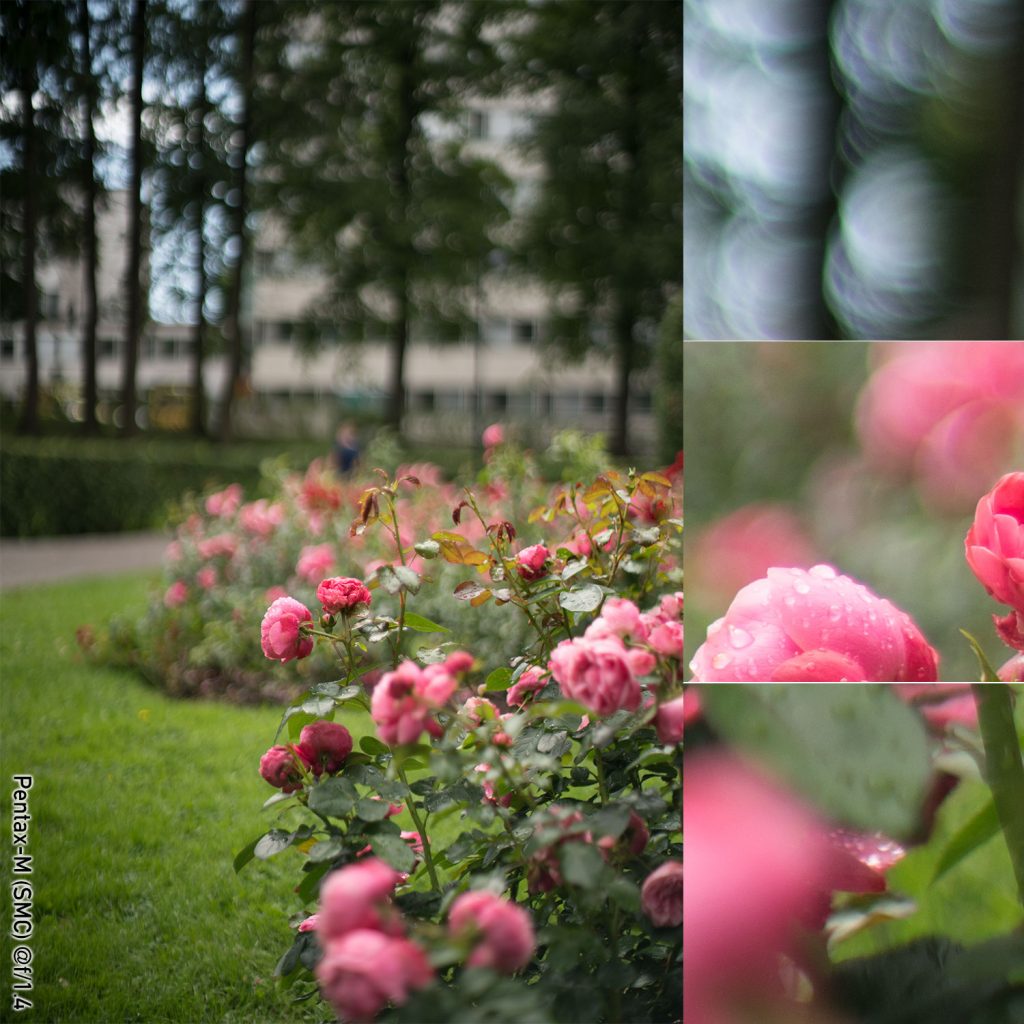
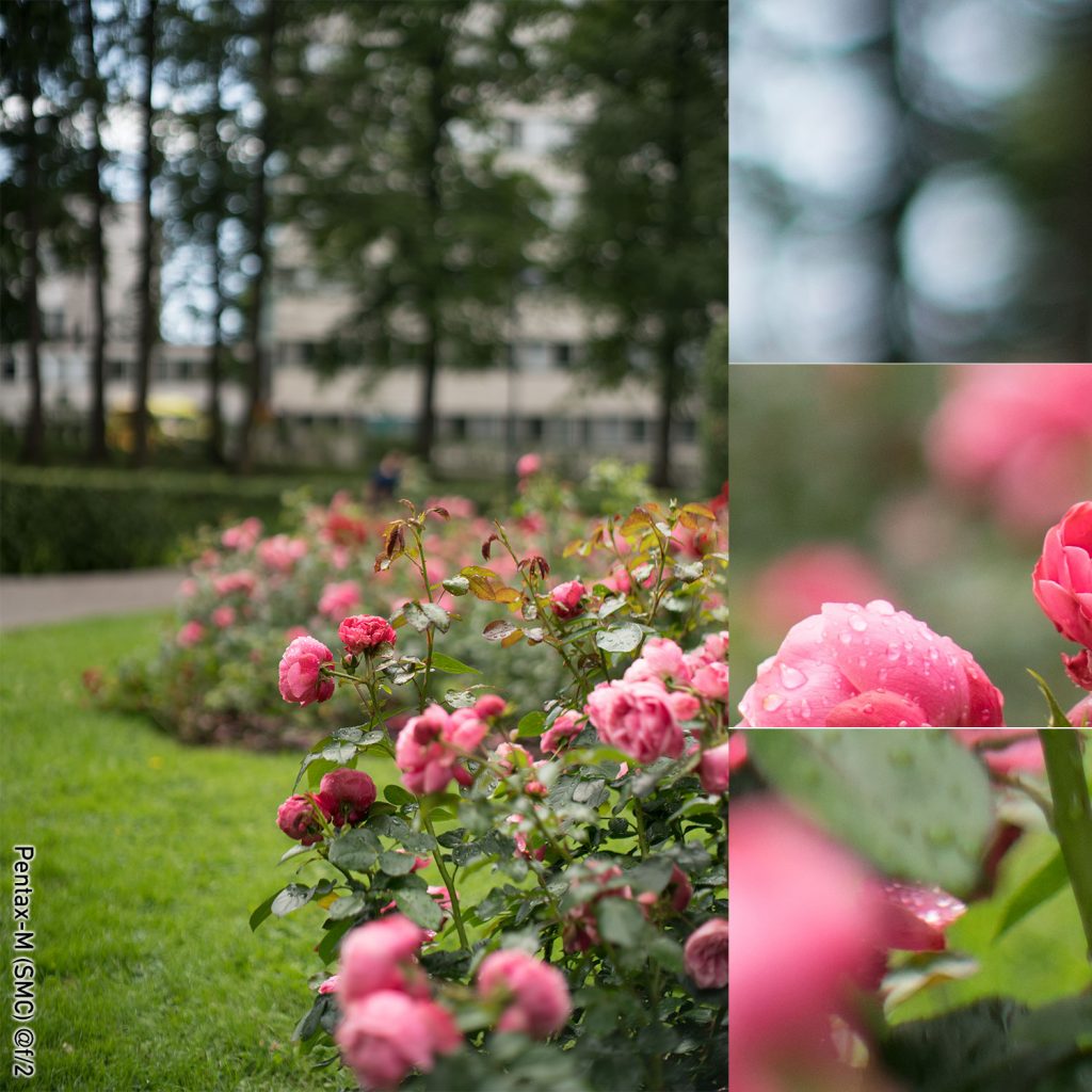
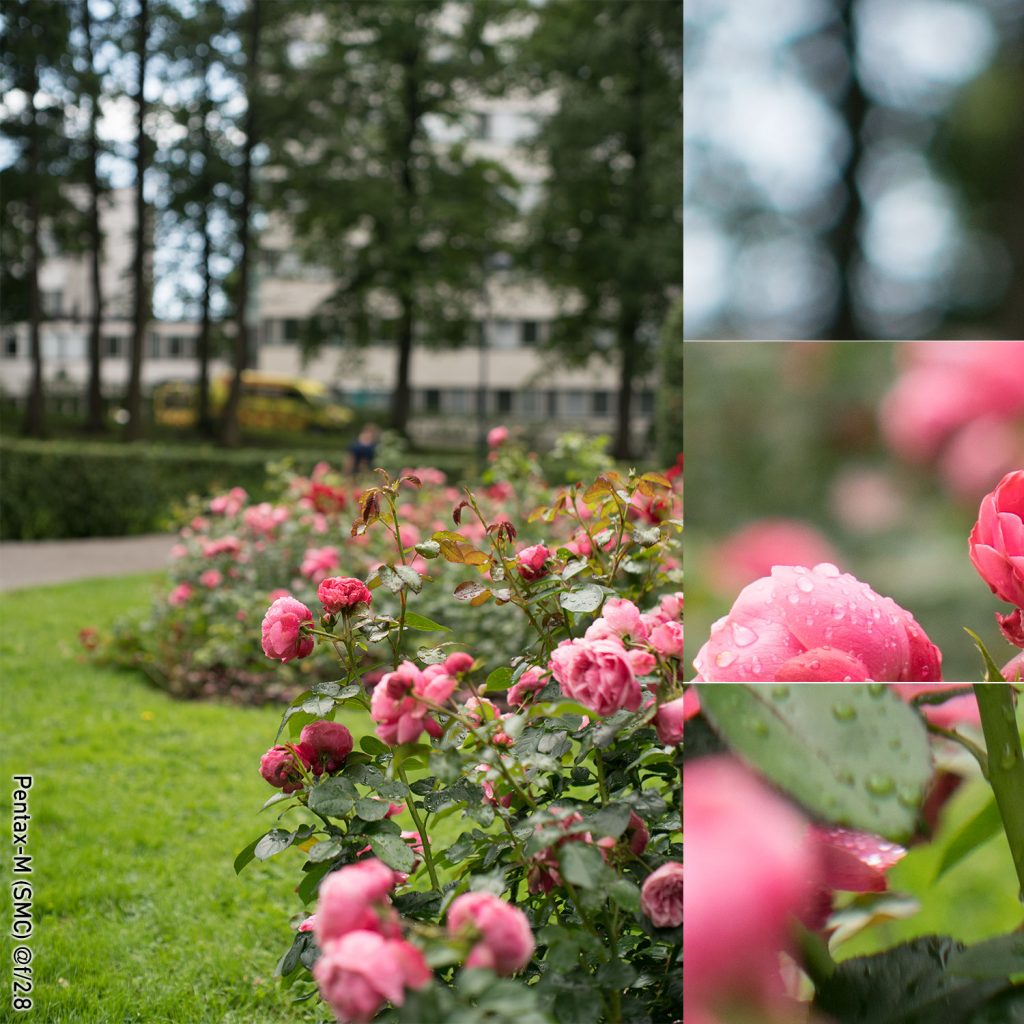
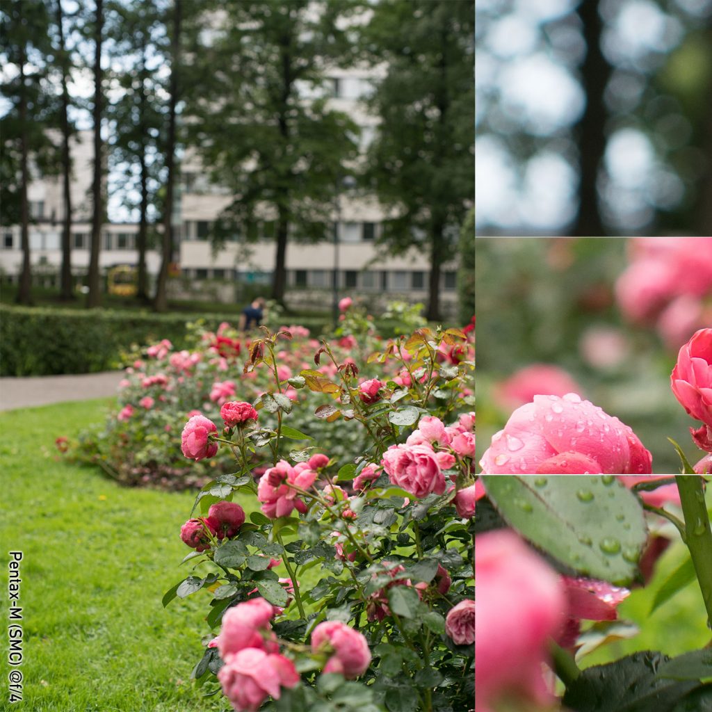
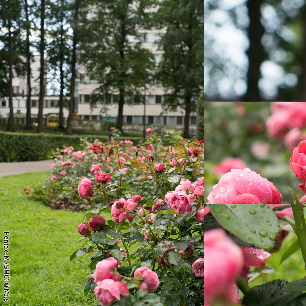
(SMC) Pentax-M 50 mm f/1.4
(right click and open in new tab for bigger version)
(right click and open in new tab for bigger version)
(right click and open in new tab for bigger version)
(right click and open in new tab for bigger version)
(right click and open in new tab for bigger version)
Some quick comments on the Pentax-M
Given the relatively much lower contrasts in these shots, comparison with the earlier shots is somewhat futile. That said, the Pentax puts in a rather balanced performance. There is outlining of the bokeh balls in the in the wide-open shots, but nothing major. Veiling or flaring cannot be judged (as there was no bright sunlight). Vignetting wide open is existent, but hard to judge in comparison. One undeniably positive aspect is that the out-of-focus highlights keep a very round appearance all the way to between f/4 and f/5.6, and even at f/5.6 – where the bokeh balls start showing some octagonal form – the general impression (in the final image) is by no means jagged. This is all the more astonishing as the lens itself has (when looking through the lens) a clearly octagonal aperture all the way from f/2 to f/16 (with some ninja star/circular saw blade pattern thrown in at f/2). Another positive aspect is that there is only moderate outlining of vertical structures in the far background.
Revuenon MC 50 mm f/1.4
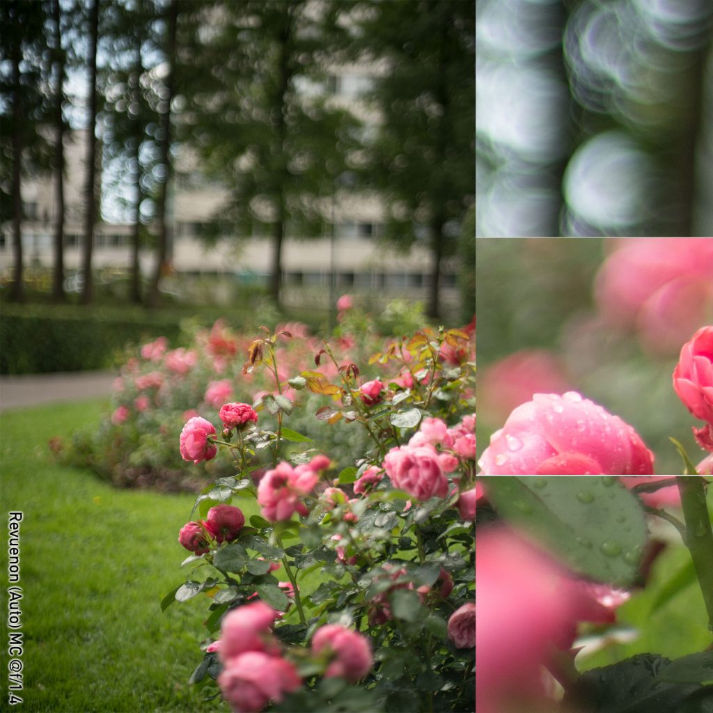
(right click and open in new tab for bigger version)
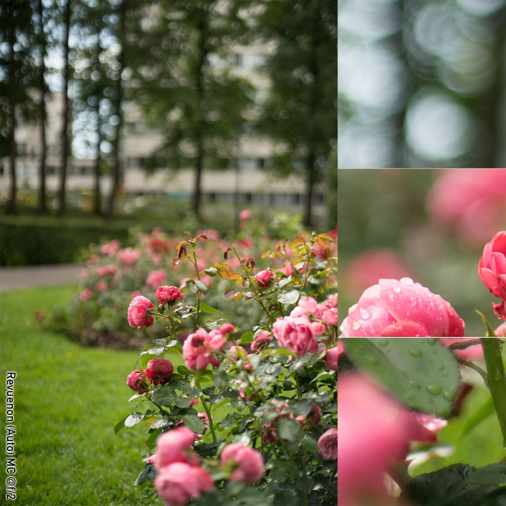
(right click and open in new tab for bigger version)
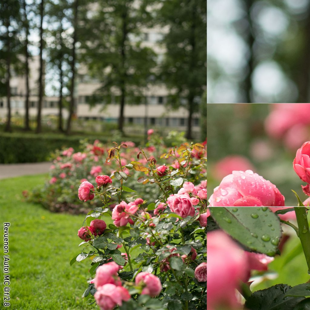
(right click and open in new tab for bigger version)
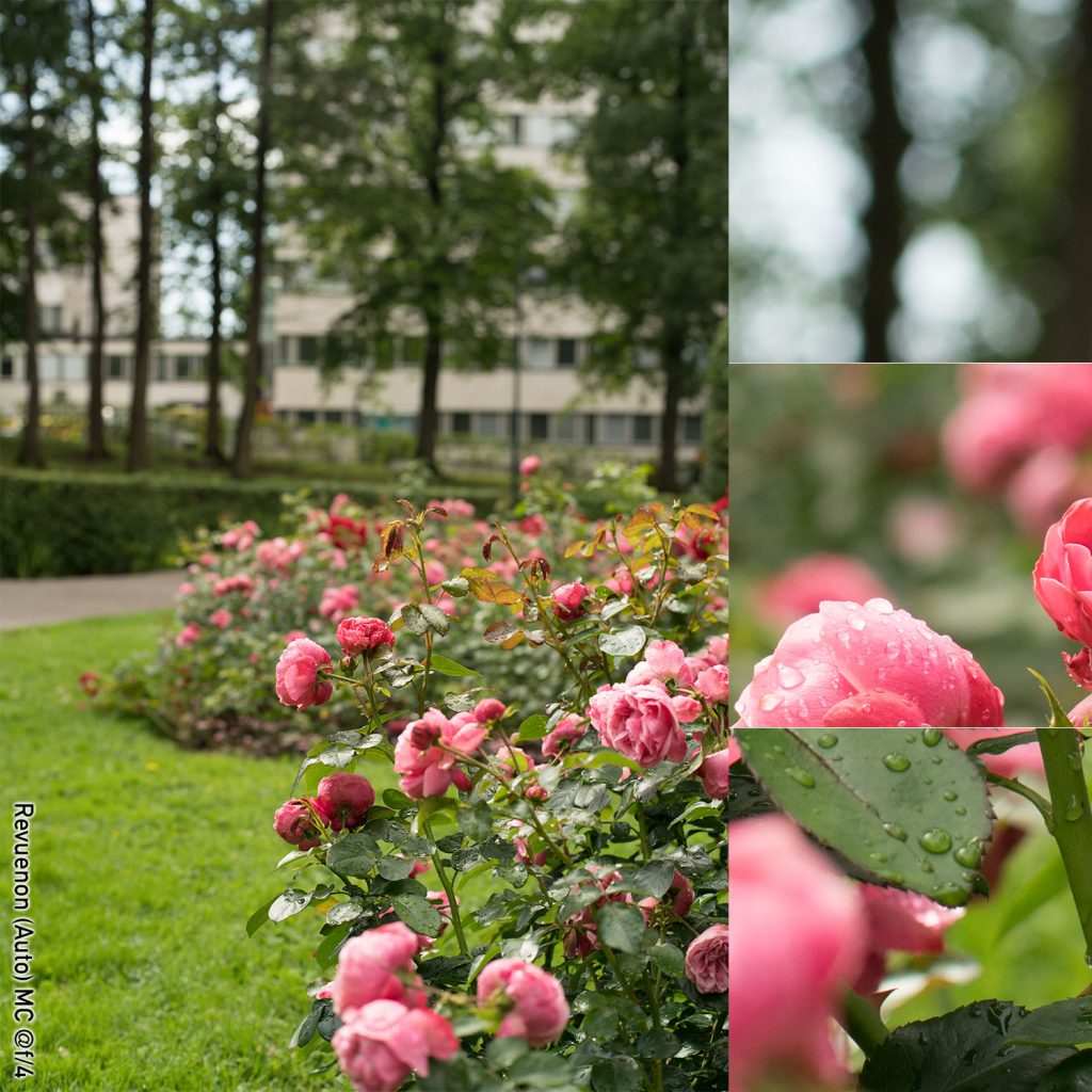
(right click and open in new tab for bigger version)
(right click and open in new tab for bigger version)
Quick Comments on the Revuenon
As with the Pentax, the Revuenon puts in a balanced performance, but there are differences. To my eyes the Revuenon vignettes slightly less, and has a tad more outlining wide open. Interestingly, while the Revuenon’s aperture blades are (physically) more rounded, this does not show in the final image, as the out-of-focus highlights have a distinctly angular feel to them from f/4 onwards.
Summary
As I’ve said many times, bokeh is subjective. Therefore, while I might think one type of bokeh to be preferable, you might think different. Therefore, I cannot generalize the characteristics of bokeh, nor unequivocally ascertain that one lens would have good bokeh and another … you get the point. Moreover, as bokeh is dependent on relative distances, these shots might have turned out different if I had decided to focus on a different rose.
Even so, as I’ve stared at these images for far longer that you likely will, let me tell you how I subjectively see this. In my opinion, there are two kinds of uses for bokeh. One is to try to make the background as smooth as possible. This is the kind of bokeh you want when you photograph an object at relatively close range (e.g. a face or a flower) without being able to manipulate the background, and want as much of the viewer’s attention on your object of choice.
Another is to make the shot look as spectacular as possible, to give it an otherworldly feeling to make the viewer think that your photograph has passed from the realm of reality alltoghether (all those swirly bokeh’s and soap bubble bokeh’s fall into this purpose.
Even so, there are no Trioplans or Helioses in this batch. No swirl, no real soap bubbles. The only lens here that shows some ‘spectacular bokeh’ quality is the Carl Zeiss Jena, and that only happens due to a combination of low contrast and dreaminess/glow. In the hands of an artisan, this lens can be made to work wonders, but it is demanding.
But if you see the point of out-of-focus blur to be the un-doing of the background, there are some quite distinct differences in this batch. Personally, I think the older Minolta does a splendid job, that cannot be entirely explained away by the inherent advantage given by its longer focal length. Both Canon lenses also do a good job, as does the Carl Zeiss Jena. At the other end of the spectrum, the Carl Zeiss Planar – although undoubtedly a fine lens – leaves me with a ragged, almost abrasive impression. Wide open the flattened bokeh ball outlines make the far background look nervous, while from f/2.8 onward the bokeh balls are very distinct hexagons. Opened up, the Planar also shows more outlining in background structures than the other lenses. But – and I think this can be stated to apply to all these lenses – while out-of-focus blur is naturally at its strongest wide open, f/2 typically offers a significantly calmer background.
Feel (tonal range, micro-contrast, depth perception):
Some readers might cringe at the mere mention of micro-contrast. They might feel the whole concept is hogwash, unscientific pseudo-babble that is used primarily by lens snobs (especially adherents of lenses with the red circlular or blue square logos) to prop up the reputation of their lenses (and help justify the price they’ve paid). Others might be of the opinion that this is the part of the review they’ve patiently been waiting for.
“Micro-contrast”, “3D rendering” and “pop” (which are typically used as synonyms) are divisive terms, and it is not my place to be taking sides – neither regarding whether “pop” is more important than definition and contrast, nor whether it’s actually a real phenomenon.
Feel, ‘3D-pop’ and ‘micro-contrast’ are notoriously hard to quantify – especially as the concept is fragile: even when a lens is known to be able to produce micro-contrast, there are no guarantees that every shot will show it. On the other hand, while a shot might seem like it does not have much micro-contrast, a skilful post-productionist may be able to dig up a lot of detail which initially did not seem to be there.
Moreover, while sharpness is easy to quantify, and even coarser contrast structures are relatively easy to discern, micro-contrast seems to be really hard to quantify in a meaningful sense (i.e. in a way various people would agree on).
Playing the devil’s advocate, there are five potential variables which together define whether a shot (of the same object in identical lighting) is deemed to have good micro-contrast, and we’ll take these elements in the order in which they affect the perception of a shot: lens, sensor (including in-camera software), post-production, reproduction medium, and viewer.
Thom Hogan does a good job of covering the effects of the first three, while I want to add one more obvious (in hindsight) element to the equation: the quality and calibration of your reproduction medium (your monitor or your prints). Finally, let’s not kid ourselves and pretend we all have perfect eyesight or that we all agree on what makes a picture ‘pop’.
In these pictures I have tried to eliminate as much of that variance as possible. You are you (and not someone else) and your monitor is unlikely to change between the first and last picture. Also, I have kept the editing of these pictures at a minimum(ACR monochrome, exposure adjustment to match the pictures + resize in Photoshop, but nothing else). The lenses I have obviously changed, and while the sensor has stayed the same, it is not inconceivable that the circuitry’s logic would do things (de-mosaicing etc.) differently depending on changes in the light inundating the sensor, but one must assume those changes are minor.
Thus, whatever differences you see in the following pictures is most likely caused by the various lenses. The approach I take here is largely the same as above, meaning that I show you some shots and let you make up your mind. I am sorry that my bandwidth does not (for the moment) allow me to offer you the RAW-files for download, but if you really want them, be in touch.
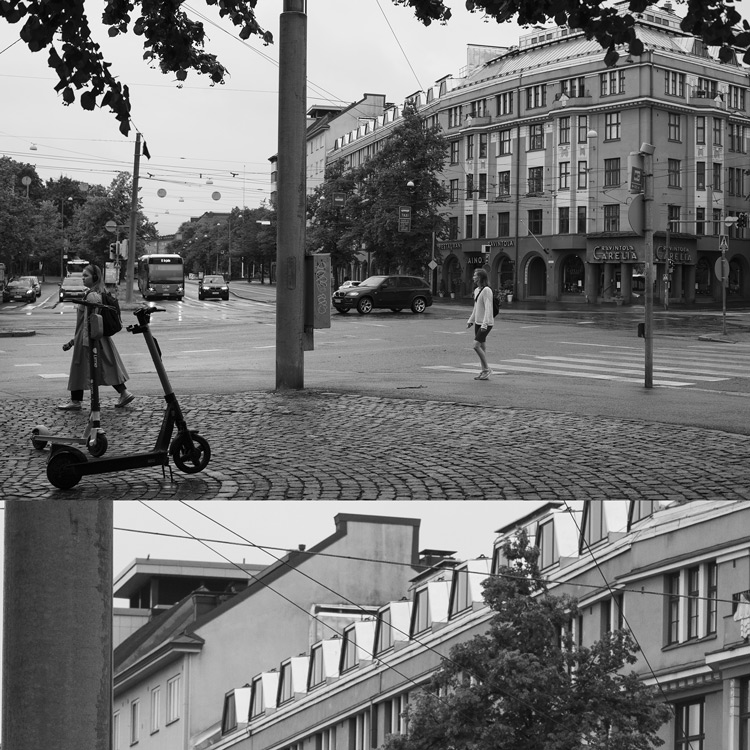
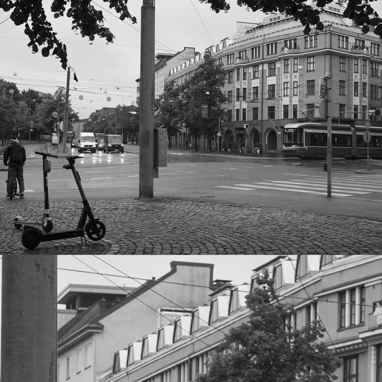
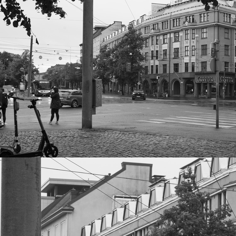
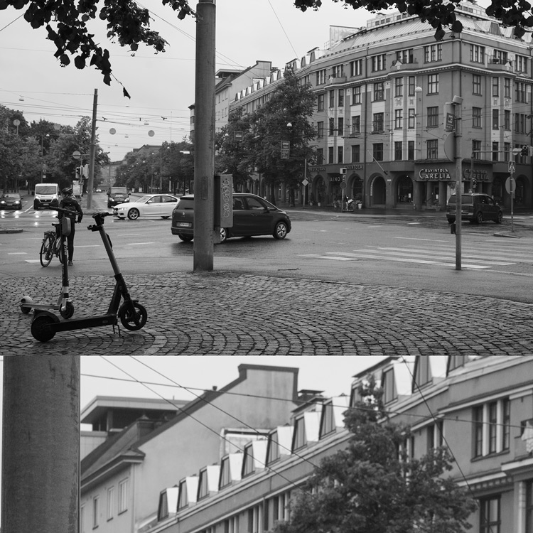
The setup
Inspired by Lloyd Chambers’ article on micro-contrast, I went on the lookout for a the perfect scenery, and – more importantly – the perfect lighting, which (to highlight micro-contrast) actually meant that a overcast and drizzly day was perfect.
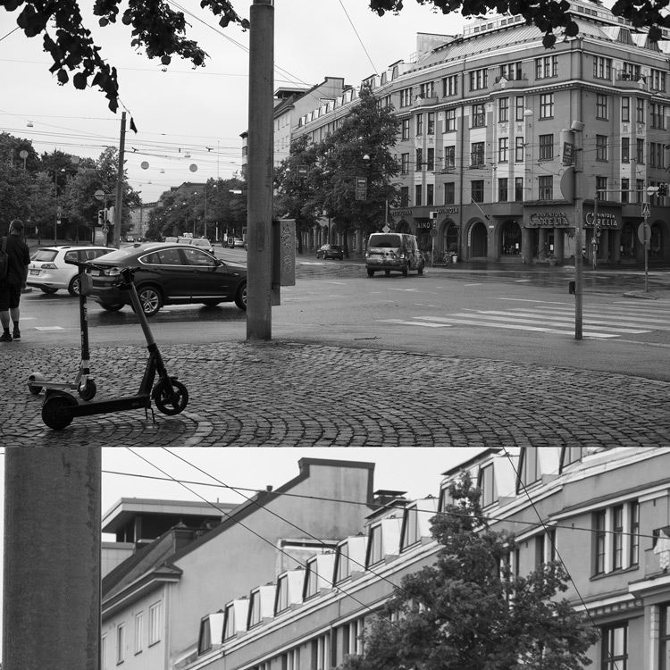
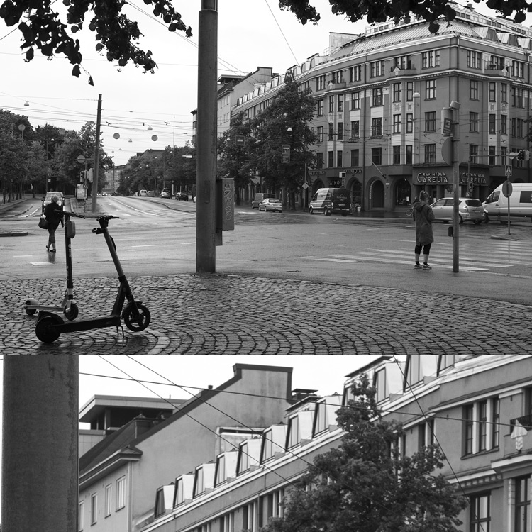
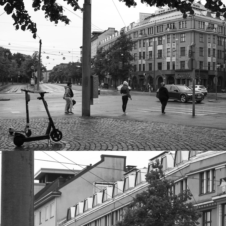
All shots on a tripod with a self-timer. All shots in unchanging (read: as stable as possible) lighting conditions, all taken within 15 minutes of each other. ISO 400, aperture priority, fixed WB (5300K, tint +8). Each shot shows the lens at f/5.6 (this aperture was chosen to minimize aberrations’ effects, while still keeping away from diffraction’s effect on micro-contrast). Distance to point of focus (lower bolt of the access hatch on pole in foreground) was 8 meters. Focus was manual, achieved using max. focus magnification with aperture wide open. Shots were not refocused after stopping dow
All RAW files processed in ACR (monochrome), and exposures tweaked to match perfectly. Composite made by combining a 1:1 crop (lower third) with the entire image resized to 2048×1366 (upper two thirds). 2048×2048 composite saved as JPG (quality 75).
Trivia:
The motif of the pictures is the crossing between Mannerheimintie (Mannerheim road), Runeberginkatu (Runeberg street) and Helsinginkatu (Helsinki street), located in central Helsinki. Mannerheimintie is one of Helsinki’s main South-North traffic arteries, and – with one exception – all streets that cross Mannerheimintie have different names on either side of Mannerheimintie (so Helsinginkatu and Runeberginkatu are actually the same street/road).
Images
Tip: If you want to watch & compare these in detail, click the links below these images to open each of the images in their larger versions in an own tab.
(click here for bigger version)
(click here for bigger version)
(click here for bigger version)
(click here for bigger version)
(click here for bigger version)
(click here for bigger version)
(click here for bigger version)
(click here for bigger version)
(click here for bigger version)
Analysis
This part is actually up to you, because – as I’ve said – judging ‘feel’ tends to be very subjective.
But in case you’ve already made up your mind regarding which of the pictures you liked best, let me ask you to go and have another look, and while doing so, answer this question: Did you like those the best that seemed sharpest?
If you did, then please note that you’ve probably judged the pictures not based on micro-contrast, but based on macro-contrast. And in that case, allow me to offer a few viewpoints on how to train your visual perception towards seeing micro-contrast.
Micro-contrast: Remember that you’re not looking for sharpness (definition and (macro-)contrast) but micro-contrast. In case you’re still unclear about what the difference is (and why it would matter), look at the example crops below:
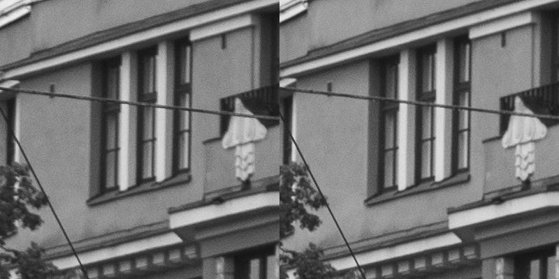
The excerpts above both come from lenses which show good sharpness – which is most typically interpreted as showing clearly defined outlines (in other words, good definition and high macro-contrast). And there’s nothing wrong with definition and macro-contrast, because whites should be white and blacks should be blacks. But having a good range of grays is most important to fostering depth-perception, and in this aspect these two lenses show some notable differences.
So when looking for micro-contrast, one would do well to focus on discerning low-contrast detail (which is made possible by the range of tones) in the highlight and shadow areas (in shots that are otherwise calibrated to be as equally exposed as possible).
In case you still cannot see it, I’ll point out a couple of spots:
• Look at the leaves. In both clips the leaves are similarly sharply outlined (against the facade), but in the LHS shot, the leaves are a dark mush, whereas in the RHS shot there are more tonal differences.
• Look at the relief of the balcony. In both images you can gain an inkling of the plasticity, but in the RHS image the ovals making up the upper portion are significantly more distinct.
Depth perception: On detailed inspection any picture is flat, because that’s what it is: a two-dimensional projection onto a flat plane. To be able to gain an impression of depth by looking at a flat picture, you have to help fool your brain, which basically means working by looking at pictures at-a-glance (not through studying it in detail).
In general, with wide-open pictures (that offer distinct out-of-focus areas both ‘behind’ and ‘in front of’ the point of focus), your perception of depth is often generated by the selective focus, so the real test is whether you can fool you brain even with a more closed-down shot (which is another reason why I’m only offering you f/5.6 shots).
If you’re having trouble spotting any differences, try this: Set up the images so that you can quickly cycle through them and so that focus on the post (LHS of 1:1 crop). Now quickly cycle through the images and just try to make a snap judgment on whether you feel that the post looks ’round’ or whether it feels ‘flat’.
Next…?
• Part 1: Introduction, the lenses: pedigree and handling
• Part 2: IQ-comparison I – The Brick wall test
• Part 3: IQ comparison II – Urban vistas
• Part 4: IQ-comparison III – Bokeh and blur (you are here)
• Part 5: IQ-comparison IV – Night-time vistas
• Part 6: Summary and conclusions