Pekka Buttler, February 2021 – June 2022
Welcome to part 2 of the JAPB comparison of nine fast fifties. This is a big article, which has been subdivided into several parts for convenience and the sake of humane loading times.
This is Batch I of JAPB’s comparison of fast fifties. Have a look also at the ‘cover page’ of the entire fifties -comparisons here.
Table of contents
• Part 1: Introduction, the lenses: pedigree and handling
• Part 2: IQ-comparison I – The Brick wall test (you are here)
• Image quality tests – some introductory remarks
• Close-range definition and contrast, distortions, vignetting – the ubiquitous brick wall test.
• Distortions
• Field-of-view
• Close-range corner performance – the interplay of field curvature and aberrations
• Vignetting
• Part 3: IQ comparison II – Urban vistas
• Part 4: IQ-comparison III – Bokeh and blur
• Part 5: IQ-comparison IV – Night-time vistas
• Part 6: Summary and conclusions
Image quality tests – some introductory remarks
And now for the part you all have been secretly waiting for <grin>.
The central ‘value proposition’ of a fast fifty is (and, more importantly: was) that it’s supposed to be the quintessential jack-of-all trades. While the fast fifty is obviously limited by its focal length (and ensuing field of view), a good fifty in the hands of a mobile photographer is a very versatile instrument. The point of a fast fifty (as opposed to a nifty fifty) is to be able to do everything a nifty fifty can, and do so in less light, with greater subject separation and – preferably – sharper.
Therefore the scenes used (shot) in this comparison will attempt to encompass many of the types of real-life scenarios that you would typically use a fast fifty lens for, with one significant exception: people-shots.
This comparison was conducted in the middle of the Corona/COVID pandemic. While my local conditions did not involve a lock-down or mandatory social distancing, the timing of the comparison made the inclusion of people shots more complicated than just having someone sit motionless for 15 minutes (the time it would usually take to take a series of shots with all lenses at all apertures).
Having used hundreds of lenses and shot thousands of test frames, I can quite unequivocally state that basing an opinion of a lens on just one series of studio-grade test shots – however elaborate the target test chart – results in – at best – a partial result. Instead, I’ve found that a lens that aces one type of test may struggle in another test, and (what’s more important) be utterly useless in real life. And no, this is not about flaring or bokeh. A lens’ ability to resolve detail is – in practice – extremely dependent on subject distance and contrast.
Given that (in discussing legacy lenses) we’re mostly concerned with lenses that focus near/far by moving the entire objective (assembly of lenses and elements), these lenses typically have different resolution characteristics for near/medium distance/far-away subjects. A considerate lens designer will have made an informed choice on the distance most important to their users, but the user might not know it.
Another important aspect of lens design is related to how well the lens is to deal with extreme contrast situations (and how it is to achieve that). Light is a tricky medium (a wavelength of ≈380–750 nanometers), especially when considering the machining precision available and the resulting tolerances. In short, even the best lens ever built will scatter light to where it’s not supposed to go. The question is: how much and why.
Therefore, you will find this comparison to contain shots both of near subjects and of far subjects; shots in a balanced (relatively low-contrast) light and in high-contrast settings. Therefore also, we will also discuss issues – such as vignetting – not as global characteristics, but as a condition-specific.
This comparison aims at being thorough, but even so, there are issues that are beyond us. For instance the bokeh of many lenses vary greatly depending on the relationship of focusing (subject) distance and background distance, resulting in fundamentally endless numbers of potential permutations. Another aspect we do not have the resources to sufficiently address is field curvature – as there are not only a wide range of different types and strengths of field curvature, but the effects of mild field curvature can be hard to distinguish from ordinary off-centre softness (and also field curvature is dependent on factors such as aperture and focusing distance). Even so, we’re hoping you’ll appreciate the effort.
Oh, and one more thing: The comparisons you see below are excerpts. The entire material (40 GB in RAW files) may be made public that day when hosting & bandwidth become affordable. Until then, if you want to scrutinise a RAW-file, drop me a line.
Close-range definition and contrast, distortions, vignetting – the ubiquitous brick wall test.
Let’s get this out of the way, before we get to the ‘real’ pictures.
As pathetic as it is to set up your tripod in front of a blank brick wall, the brick wall test has its uses: not only is it a decent gauge of distortions (only decent, when your brick wall is the result of human masonry), but it offers a good test for close-focus centre sharpness-potential as well as some inkling of the lens’ corner sharpness and field curvature.
n.B! You’ll notice that this review uses three seemingly related terms: sharpness, definition, and contrast. While some sites and bloggers use these terms as synonyms, JAPB has a different approach. You can read more here, or simply accept the short version:
• definition indicates how fine details a lens is able to resolve;
• contrast comments on how strongly these details show up; and
• sharpness is a subjective combination of these two.
Therefore JAPB reviews use ‘sharpness’ only as shorthand for ‘definition and contrast’.
Furthermore, compared to your typical real-world shot, the brick wall test does away with some pesky nuisances, such as high-contrast transitions and varying distances to the objects (that we will get to in the next part)
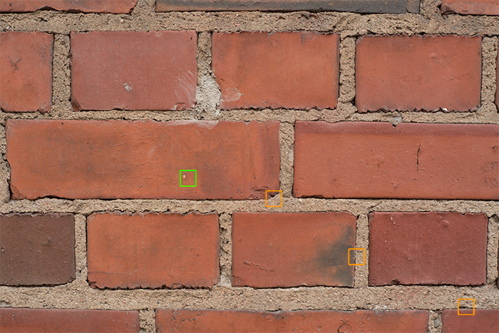
Before you look at the 100% samples, please remember that these pictures are both an ideal case (tripod=>longer exposures & low ISO, no shake), and deliberately brutal: at 100% zoom, the real-life size of these (huge) Sony a7R2 files at screen resolution is roughly 2 meters by 1,3 meters.
Test statistics: All shots were taken in one go, in stable outdoors lighting conditions (overcast, wall is on shade-side). All shots taken in RAW on a Sony a7R2, with ISO 200, IBIS off and WB cloudy. All excerpts below are unprocessed (ACR default) crops. Distance to subject ≈ 0,7 meters.
@ f/1.4
At f/1.4 all these lenses are at the outer limits of their abilities. Therefore, what you really want to look for are:
• centre (left column) definition and contrast
• glow and other signs of excessive spherical aberration
• off-centre definition would be a bonus
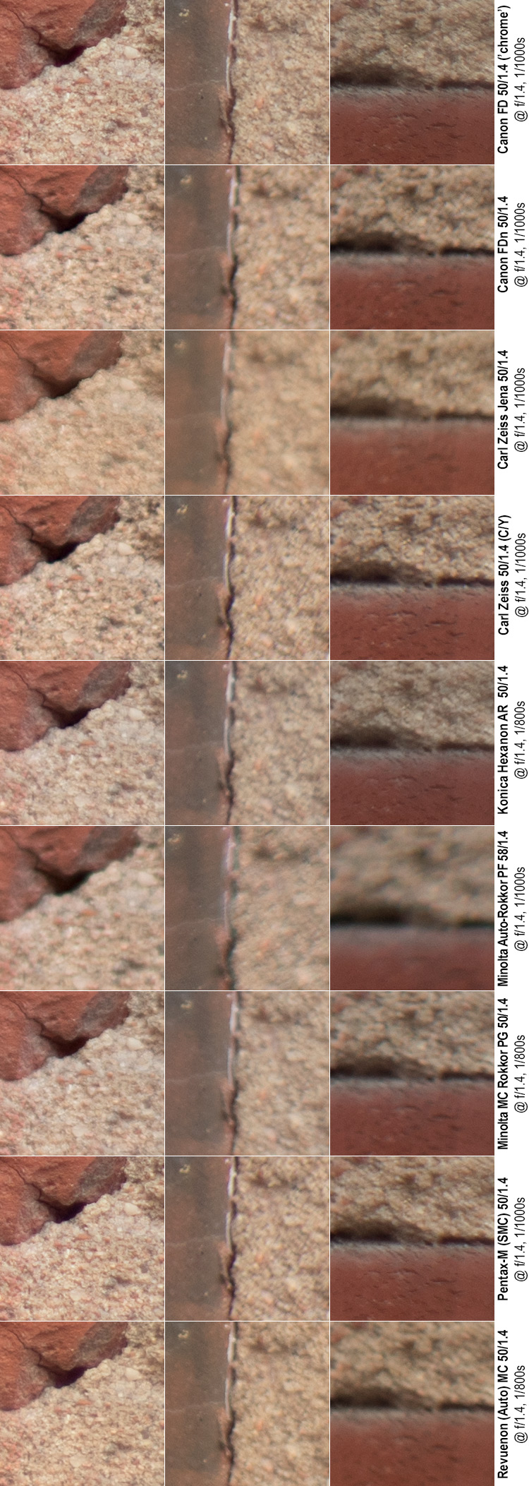
Quick comments:
Centre definition: The chrome nose Canon FD puts on a good show, as do the Carl Zeiss Planar, as well as the Pentax and the Revuenon. The older Minolta occupies the cellar, but the Carl Zeiss Jena is not much better. None of these lenses exhibit stellar wide-open definition.
Centre contrast: In a low-contrast situation such as this, centre contrast is surprisingly good. The chrome nose Canon comes away on top, followed by the Zeiss Planar, Revuenon, Pentax and Konica. But the others aren’t far behind.
Glow: Both the Carl Zeiss Jena and the older (58 mm) Minolta show clear signs of glow / spherical aberrations, even in the centre.
Off-centre definition: The chrome nose Canon FD and the Carl Zeiss Planar manage a decent performance.
Other noteworthies:
• Interestingly, there are a number of lenses that show better corner than off-centre performance (Hexanon and Pentax). As this could indicate wavy field curvature, we’ll will keep an eye on the results as we stop down.
• The 58 mm Minolta shows some signs of corner smearing, which could indicate a combination of astigmatism and field curvature.
• At close range, all lenses seem to show very uniform vignetting characteristics, with only very minor variation. For more details on vignetting, see later.
@ f/2
What to expect at f/2?
At f/2, all lenses should be rid of the worst aberrations, but for a lens to hit peak definition and contrast this early (even in the center) cannot be expected.
Depth of field is still on the order of 2 centimetres, so unless the lens displays an amazingly flat focus plane (in other words: no field curvature to speak of), expecting sharp–across–the–frame is a waste of time.
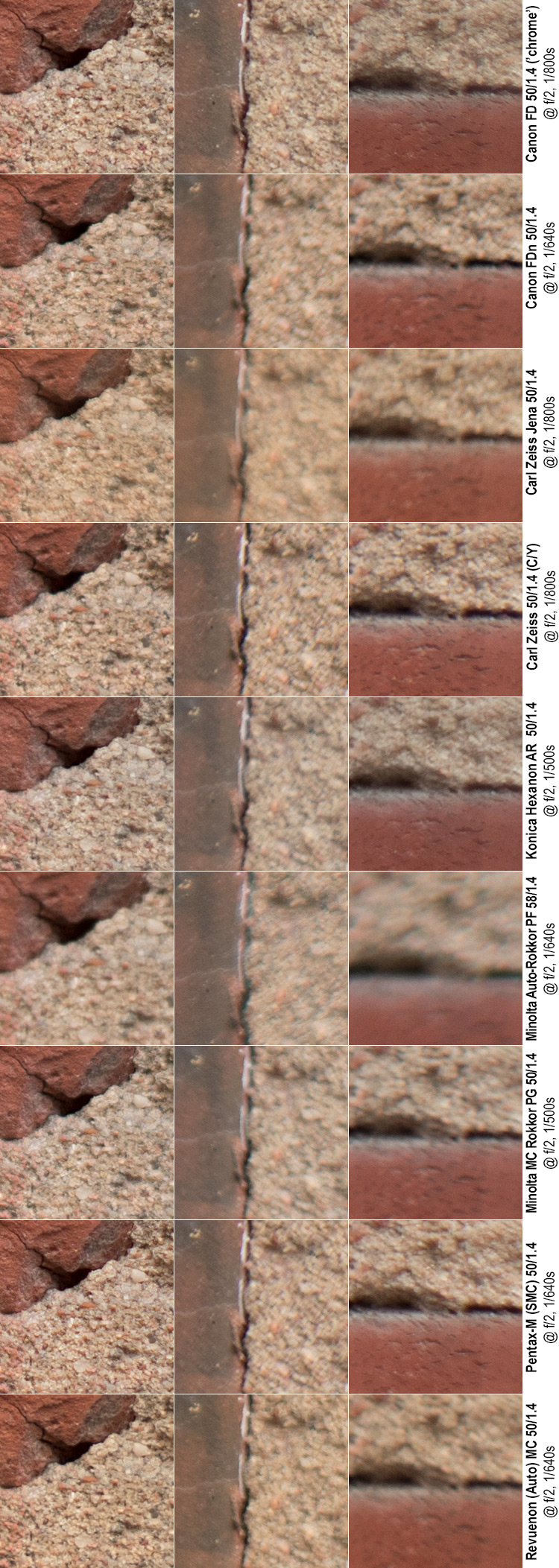
Quick comments
Centre definition and contrast: Improves across the board, but improves the most for those lenses that did well already at f/1.4. Therefore, the results are actually a bit more varied than before. The 58 mm Minolta, the Carl Zeiss Jena and the Canon FDn still leave something to be desired, whereas the rest are basically entirely satisfactory.
Glow and spherical aberrations: have basically disappeared. The remnants that still exist are not really field-relevant.
Off-centre and corner definition: Well now…
Firstly, these results show a number of lenses where corner performance is on par (if not better than) off-centre performance. While the FD and Zeiss Planar basically offer corners as good as the off-centres, the corner performance is actually (albeit slightly) better than off-center with the Pentax, Canon FDn and Konica, indicating some wavy field curvature.
The corner performance of the Carl Zeiss Jena, the Revuenon and both Minoltas is not worth a eulogy. But, considering that we’re still only at f/2, neither are they dismally bad.
@ f/2.8
At f/2.8, one would expect a good legacy lens to be sharp and contrasty in the centre. That is not to say that centre definition and contrast will not continue to rise for another few stops, but that whatever aberrations/quirks the optical design has led to should – in the centre – be well under control by now.
Likewise, at f/2.8 one should be able to expect the area of acceptable definition to reach beyond the centre of the frame. Sharp corners are still not in the cards.
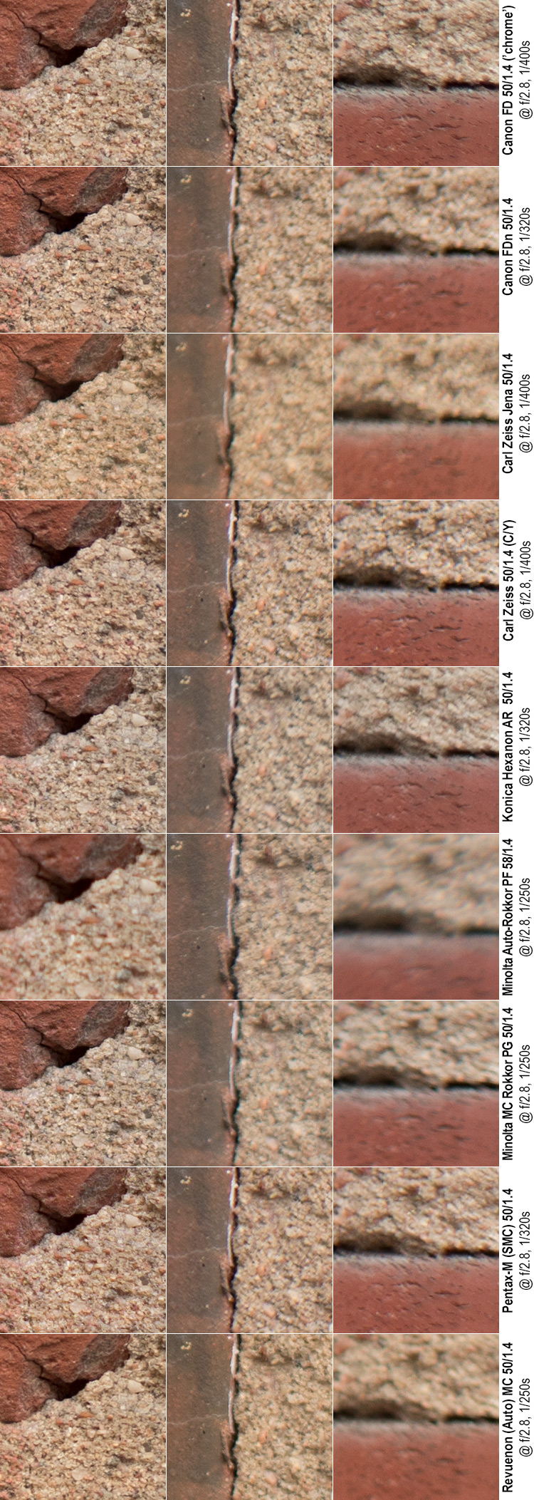
Quick comments.
Centre samples: Let’s start with the bad news. While the 58 mm Minolta shows a marked improvement, it still is not really sharp. Otherwise, the centre samples start to look really good. The Carl Zeiss Jena and Revuenon show a tad less contrast than the other samples, but all of these are really good by now.
Off-centre: The situation is not quite as rosy. The chrome nose Canon, Zeiss Planar and Pentax are more than satisfactory, and the Konica and Revuenon are not half-bad, and interestingly, the older Minolta (which still struggles in the center) shows good off-center contrast. But the rest show various levels of affliction. The predominant form of affliction in these cases is not loss of resolution (the detail is there), but a lack of contrast – in some cases (Minolta 50 & Carl Zeiss Jena) accompanied with slight sagittal blurring, indicating some degree of astigmatism.
Corners: The chrome nose Canon and Zeiss Planar show basically flawless (considering we’re only at f/2.8) corner performance, with the Pentax not far behind, and the Konica looking good as well. The rest of the pack does not look as good. The Canon FDn has resolution, but lacks contrast. The Carl Zeiss Jena, Minolta 50 and Revuenon lack both definition and contrast and the Minolta 58 shows sagittal blurring to such a degree that ‘smearing’ is the word to use.
@ f/4
What to expect at f/4? In short: Improvements across the board.
In slightly more detail: if centre definition was already good at f/2.8, then a large improvement there should not be expected, but the smaller aperture should help combat the range of aberrations typical for off-centre areas, while the added depth of field should help negate anything but the strongest field curvatures.
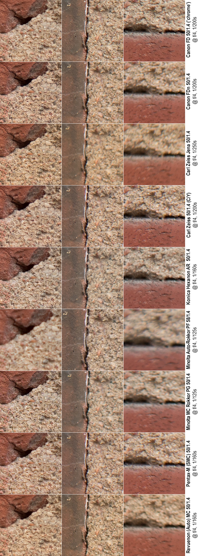
Quick comments
Centre samples: The centre samples continue to look really good, and definition/contrastwise eight out of nine look really good (the 58 mm Minolta continues to lag, but is finally starting to reach the realm of the acceptable). That said, something interesting is happening, because no longer are the chrome nose Canon, Zeiss Planar and Pentax at the top of the heap – instead they have been surpassed by the Canon FDn, the Carl Zeiss Jena, and Minolta 50. Even the Konica is neck-to-neck with the Zeiss Planar.
Off-centre: While tables turned in the centre samples, in the off-center samples the same has not happened. While two thirds of the pack show satisfactory performance, the Canon FDn, Carl Zeiss Jena and Minolta 50 are lagging behind.
Corners: The chrome nose Canon, Zeiss Planar and Pentax show basically flawless f/4 corner performance, and the Konica is not far behind. The rest of the pack does not look as good. Mind you, they’re not all equally bad. The Canon FDn has contrast but the definition is not quite there. The Carl Zeiss Jena, Minolta 50 and Revuenon lack both definition and contrast and the Minolta 58 continues to show some smearing.
@ f/5.6
At f/5.6 we’re pretty close to the centre sharpness sweet spot, so if a lens continues to struggle in the centre, there must either be something amiss with the design or the sample.
Also, at f/5.6 depth of field is already on the order of 15 centimetres so unless a field is so curved that one’d rather refer to it as ‘warped’ or ‘twisted’, the added DOF should be able to compensate. Mind you, this does not remove the fact that corners tend to suffer also other maladies than field curvature, especially coma, astigmatisms and lateral chromatic aberrations.
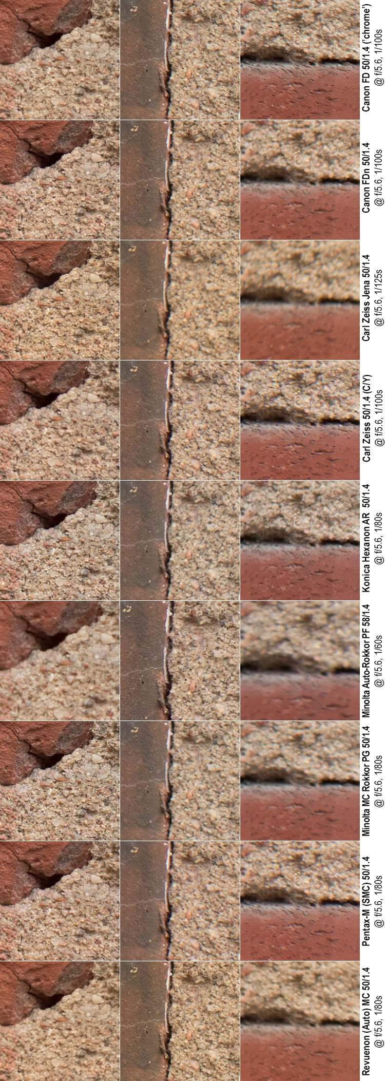
Quick comments
Not unexpectedly, those lenses that already showed basically perfect centre performance at f/4 improved only very marginally. The Minolta 58 is still not really sharp in the center.
The biggest improvement obviously occurred in the off-centre samples, and now every lens (with the exceptions of the Carl Zeiss Jena and Minolta 50) shows basically very good performance. Still, some lenses continue to struggle in the corners, and the list of suspects (Carl Zeiss Jena, the Minoltas and the Revuenon) is the usual.
@ f/8
Largely the same as before. At f/8 we’re not yet expecting the lenses to hit the diffraction barrier (the point at which the added sharpness accrued by closing down a lens is fully mitigated by diffraction), but we’re already very close. Corner performance should continue to improve, and while it would be laudable for a lens to be corner-to-corner sharp at f/8, few really are.
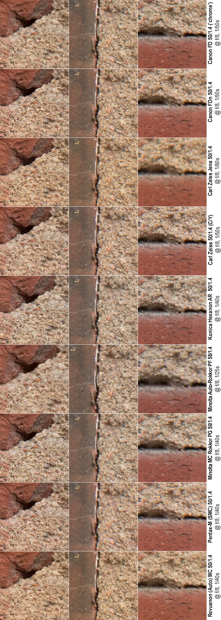
Quick comments
And no-one should be surprised to see the trend (that we’ve observed since f/2.8) to continue. What we have here at f/8 are a number of lenses – both Canon lenses, the Zeiss Planar, the Konica and Pentax – that are basically flawless in all sample areas, with the Revuenon breathing down their neck.
The rest suffer variously: The Carl Zeiss Jena is soft in the corner (but off-centre shows decent definition), The Minolta 58 is clearly soft in the corner and a bit less sharp in the centre), and the Minolta 50 (while bitingly sharp in the centre) is ever so slightly soft off-centre and worse so in the corner.
@ f/11
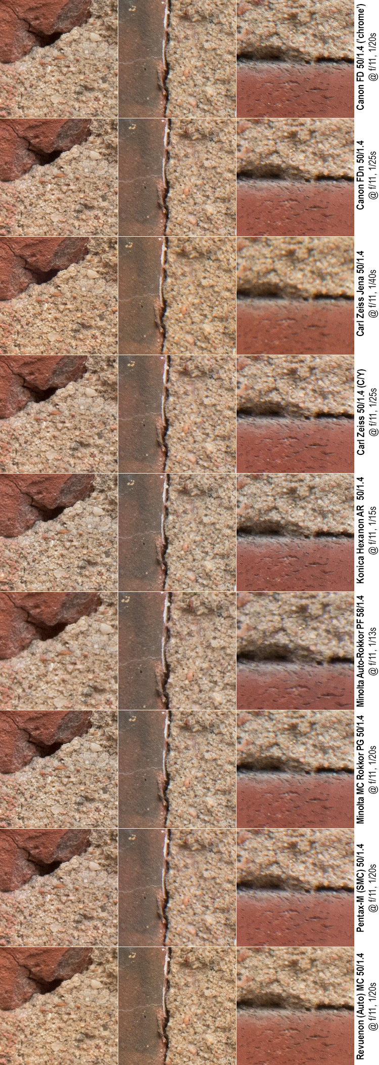
Quick comments
Well, I cannot say that I’m surprised. Going from f/8 to f/11, almost all centre samples (the Minolta 58 is the one exception) show a mild drop in detail, whereas off-centre and corner samples show a similarly marginal raising of resolving power. It is noteworthy, that even at f/11 not all samples are sharp across the board. The Minolta 58 continues to (slightly) disappoint in the centre and corners, while the Carl Zeiss Jena remains soft in the corner.
@ f/16
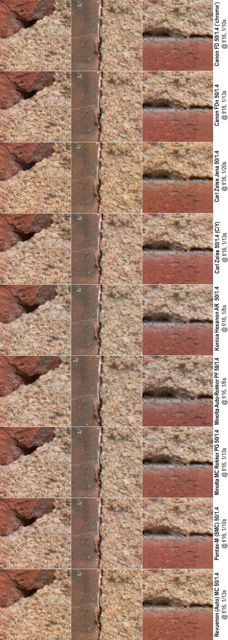
Quick comments
Going from f/11 to f/16, diffraction kicks in big time, and the only sample that did not evidence a marked change for the worse is the corner sample of the Carl Zeiss Jena (that too changes, but not for the worse, just for the different).
Simply put, judging by definition and contrast, going beyond f/11 is not justifiable. That does not mean that f/16 (and beyond) would not have a potential role to play (either through the increase in depth-of-field or through slower shutter speeds), but it is a tradeoff with a significant cost.
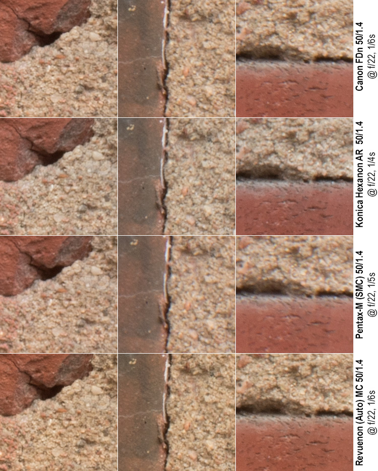
@ f/22
Four of the compared lenses offer to close down beyond f/16. While the results (with an eye to sharpness) are not especially laudable – at this stage diffraction limits resolution big time – I’ll post them below (mainly for the sake of completeness), without any analysis.
Distortions:
All lenses showed a moderate degree of simple barrel distortion that
• is mild enough not to necessitate correction except in absolutely critical situations (e.g. architecture)
• could easily be corrected in post-production (no complex distortion patterns).
• differences between lenses were so small, that they’re not worth making an issue of.
Field of view?
If you look closely at the specifications of lenses, you will notice that many lenses that are reported as 50 mm lenses are actually not precisely 50 mm. For instance, the Zeiss Planar’s data sheet reports the lens’ actual focal length as 51,8 mm. Considering that Konica used to offer 52 mm (stated) focal length standard lenses, one has to ask, whether lens manufacturers have not become somewhat lax in posting their lenses’ actual field-of-view/focal length.
Assuming the Zeiss’ stated focal length is correct, and using diagonal measurements in the brick wall shots, one can compute approximate measures for the compared lens’ focal lengths.
| Lens | Reported focal length | Computed focal length |
| Pentax-M | 51 mm | |
| Canon FD | 51,2 mm | |
| Canon FDn | 51,3 mm | |
| Minolta 50 | 51,4 mm | |
| Revuenon | 51,5 mm | |
| Hexanon | 51,6 mm | |
| Zeiss Planar | 51,8 mm | |
| Carl Zeiss Jena | 51,9 mm | |
| Minolta 58 | 60,8 mm |
Some caveats:
• Firstly, this entire calculation is premised on the Zeiss data sheet’s figure of the actual angle-of-view of the Planar.
• Secondly, in the normal order of things a lens’ focal length/angle-of-view is stated as focused to infinity. Considering that all these lenses are unit focusing (all lens elements move together), focus breathing is a factor. Then again, as the lenses are unit focusing, any difference in fields of view at close range are highly likely to also persist when focused to infinity.
• Thirdly, that whereas the calculated focal lengths by necessity involve some approximations, the stated order (one lens being wider than another) is beyond dispute. That said, the differences among the lenses (except the 58 mm Minolta) are small.
While it seems that the average fast fifty is actually closer to a 52 mm lens, this comparison does not show any significant hidden variance (unlike the lenses in JAPB’s earlier comparison of lenses purporting to be 35 mm lenses).
Close-range corner performance – the interplay of field curvature and aberrations
Personally, I find the obsession many test/review sites have with wide-open corner definition to be quixotic at best. In general purpose photography, wide-open corner sharpness (definition&contrast) has little to no real-life relevance.
I challenge you to browse your catalogue of pictures, and find all those shots you’ve taken of reasonably close subjects (your lens’ focal length times less than 50), where the entire subject of your picture has been one level plane. Fine, now deselect all those pictures that were test shots. For most photographers the result is zero.
But a study of corner definition is not pointless, if done right. If you study how corner definition changes as you close down the aperture you may gain some valuable knowledge. The reason for this is, that corner softness is typically the combination of two factors: field curvature and various sharpness-limiting aberrations (Spherical aberration, Comatic aberration (‘Coma’), Astigmatisms, and Chromatic aberrations) and by careful study of photographic evidence, you can deduce which is the culprit.
(If you’re not familiar with these concepts, I recommend you start by perusing the JAPB articles the topics involved)
Field curvature (very briefly):
In theory a perfect lens’ field of sharpness is a perfect plane running perpendicularly to the optical axis, and this is also the assumption behind all those wide-open test chart shots. But as anyone who knows a bit about lens design can tell you, that:
• very few lenses have a perfectly flat field (especially not SLR lenses with the largish back focus distance demanded by the mirror box)…
• lens design is always a business of trade-offs and compromises. Therefore, many lenses are designed to sacrifice a flat field of focus (or, they used to be until this ‘wide open corner sharpness’ craze hit) in order to chase a higher goal, such as decent size and not costing a kidney.
• there are cases where you’d want to have field curvature. For instance, a strongly concave field curvature helps increase subject separation between a central foreground subject and a background. Some lenses have even implemented systems to allow the photographer to tweak field curvature (e.g. the Minolta 24 mm VFC).
But – in general – when dealing with ordinary legacy lenses, assuming that an average lens’ field (of sharpness) curves a bit, is a safe bet. But if the field curves only a bit, then one can compensate for a slightly curved field (when shooting brick walls or test charts) by stopping down, as stopping down deepens the depth-of-field, and thus makes minor field curvature a practical irrelevance.
Aberrations (equally briefly):
Aberrations come in many forms:
• Some do not affect the frame centre (but do affect the off-centre and corners), others affect the entire frame.
• Some affect especially colours, while others are colour-agnostic.
• Most aberrations plague lenses the most when being shot wide open and go away once the lens is stopped down. On the other hand, some aberrations are not significantly addressed through stopping down.
Luckily, most of those aberrations that affect sharpness are of the type that can be successfully addressed through stopping down. These are especially spherical aberration, longitudinal chromatic aberration, astigmatism and comatic aberration. Regarding these, it’s important to understand that:
• spherical aberration and longitudinal chromatic aberration affect the entire frame, while
• astigmatism and coma are characteristically off-centre aberrations (unless the lens is badly de-centered)
Moreover, there is a significant difference in the detectability (in an average wide-open shot) between the four wide-open aberrations:
• spherical aberration clearly shows up in all kinds of situations (softness, lack of contrast, even glow),
• chromatic aberrations are most visible in high-contrast transitions (colour fringes)
• astigmatism and comatic aberration are most visible with point light-sources (streetlights at night, stars), that become comets or UFO-like discs.
Importantly, one should differentiate between detectability and overall effect: While one may need a specific shot (e.g. starscape) to enable the identification of a specific aberration (e.g. coma) possible, this does not mean that every shot taken by that lens (at that aperture) would not be plagued by coma – simply that detecting that corner softness is due (in part) to coma is not possible in a brick wall shot. In other words, simply that you can’t see it, does not mean it ain’t there.
But, and this is equally important, most of those aberrations that plague wide-open shots are easily addressed by stopping down. Centre-area aberrations (spherical aberrations, longitudinal chromatic aberration) are usually addressed effectively by stopping down two stops (for an f/1.4 lens that would mean f/2.8), whereas eradicating aberrations (spherical aberrations, longitudinal chromatic aberration, coma, astigmatism) from the off-centre may necessitate one or two stops further (f/4 and f/5.6 respectively. So how does that help?
The interplay
So what happens when you stop down the lens is that you both curtail wide-open aberrations AND deepen the depth-of-field, thus alleviating field curvature. Right?
Right, but…
When you stop down an f/1.4 lens by four stops (landing you at f/5.6), you’ve not only done away with almost all the wide-open aberrations, you’ve also quadrupled the depth of field. That’s good, but it does not yet guarantee sharp corners if the field’s curvature is significantly beyond the depth of field.
So how does this help analysing pictures made with a 50-58mm f/1.4 lens? It’s actually quite simple:
• The change you can see in the centre going from f/1.4 to f/2.8 is what you attain by eradicating spherical aberration and longitudinal chromatic aberrations.
• If at f/2.8 the entire frame is decently sharp (it need not be overall contrasty), your lens is admirably free from field curvature (some lack of contrast at f/2.8 is to be accepted, especially in the corners, because even two stops down, some aberrations remain)
• At f/5.6 one should expect aberrations to have stopped reaching field-relevant levels. If at f/5.6 (especially f/8) the entire frame is not yet sharp, you’re clearly dealing with field curvature.
• If even at f/8–f/11 your frame has sections that just won’t sharpen up, then your lens has significant field curvature. If the unsharp area is in the corners, the cause is a classic curved field, whereas if the unsharp area is in the mid-zones, you’re dealing with a wavy field curvature profile.
• Finally, as a bonus, if your centre area (assuming that’s where you’ve focused) first deteriorates as you stop down, then improves, you’re dealing with focus shift.
To apply this in practice to study the corners (even JAPB has space limitations, so we’ll skip the mid-zones), look at the following collage:
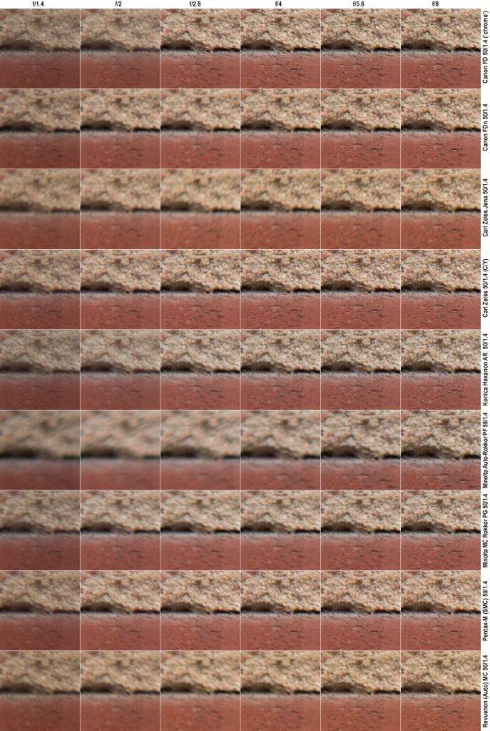
You are free to draw your own conclusions, but let me tell you what I see: There are basically two lenses that reach good corner definition at f/2.8 (The Canon Chrome nose and the Zeiss Planar), with the Pentax-M in third place (sharp at f/4). The Konica reaches the goal around f/5.6, with the Canon FDn and Revuenon getting there at f/8.
At f/8 the Minoltas are getting decent (but not yet good) and the Carl Zeiss Jena shows no indication of ever intending to get there. These performance of these three lenses (when photographing a flat subject) is not impressive and speaks of a higher-than-normal level of field curvature.
Vignetting
While the above composite clearly shows how the lenses vignette at f/1.4 and f/2, I find the detail to be a distraction, so I did away with it. Also, as some lenses produce a warmer tint than others and these colourations similarly impact our judgment, I desaturated the crops as well, resulting in the following boring collage:
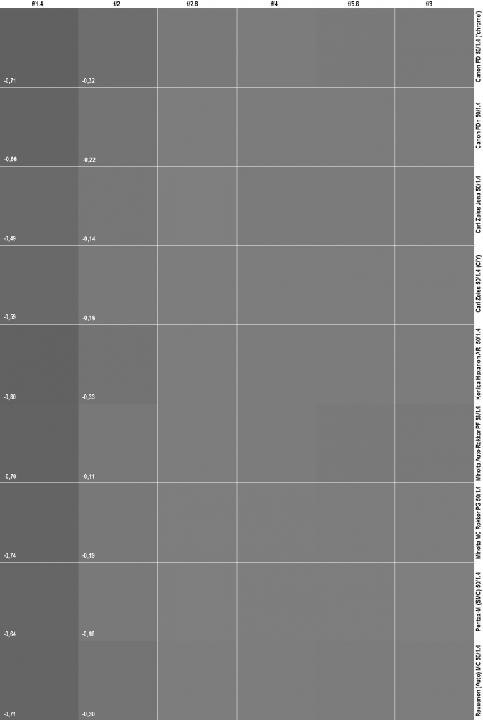
(Procedure, for the technically minded:
Based on the above composite of corner crops:
• Each layer selected individually and averaged (Filter->Blur->Average) and desaturated (Image->Adjustments->Desaturate) in Photoshop
• Color picker (in HSB-mode) to inspect the brightness value of the samples
• f/1.4 and f/2 swathes lightened using Exposure (Image->Adjustments->Exposure) until HSB value matches that of vignette-free samples. Relative difference noted.)
Quick summary:
• There is basically no vignetting past f/2.8. More vignetting may show up in brighter pictures and at infinity.
• With the exception of Canon FD chrome nose, Konica Hexanon and Revuenon, vignetting is not field-relevant at f/2
• Wide-open vignetting is evident and field-relevant in all lenses. Inter-lens differences are comparably minor.
But this is as much information as can practicably be gained
Next…?
• Part 1: Introduction, the lenses: pedigree and handling
• Part 2: IQ-comparison I – The Brick wall test (you are here)
• Part 3: IQ comparison II – Urban vistas
• Part 4: IQ-comparison III – Bokeh and blur
• Part 5: IQ-comparison IV – Night-time vistas
• Part 6: Summary and conclusions