Welcome to part 3 of the JAPB comparison of nine fast 35 mm focal length lenses.
This is a big article, which has been subdivided into several parts for convenience and the sake of humane loading times. See table of contents below.
• Part 1: Introduction, the lenses: pedigree and handling
• Part 2: IQ-comparison I – The Brick wall test
• Part 3: IQ comparison II – Urban vistas (you are here)
• Part 4: IQ-comparison III – Bokeh and feel
• Part 5: IQ-comparison IV – Night-time vistas
• Part 6: Summary and conclusions
Urban landscape
One of the typical uses of a moderate wide angle is to take landscape shots. Due to its angle-of-view, and less pronounced wide-angle distortion effect (like you’d get on a 24 pr 28 mm lens), many feel a 35 to be especially suitable to urban landscapes. Also, as a 35 is more easily controlled for distortions, than significantly wider lenses, many consider a 35 mm to be especially suitable for architecture photography.
Problematically, when you set out to do such a shot (more exactly 70 shots) for testing purposes, you will focus on setting up your tripod in a position where you will neither disturb nor be disturbed, focusing on a shot that will remain relatively stable and (most importantly) be liable to highlight differences in lenses. Getting a great shot is really secondary. All these test shots will therefore evidence a quite distinct lack of artistic merit.
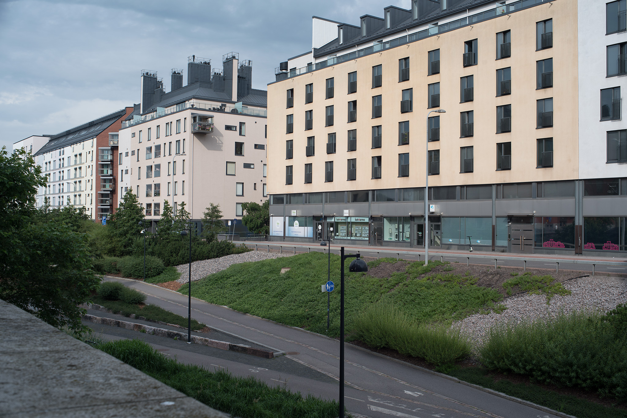
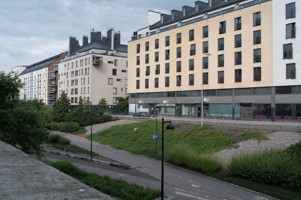
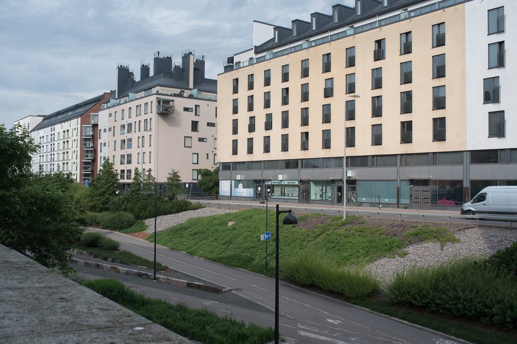
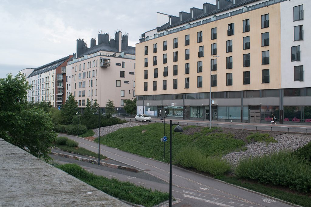
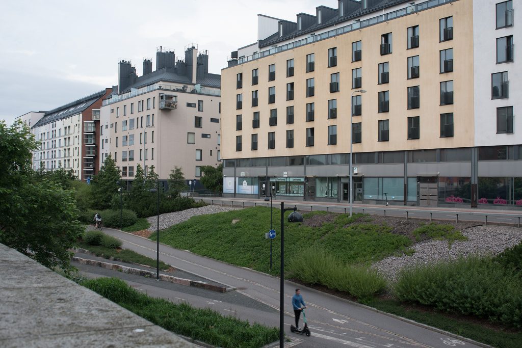
This shot was set up across the “Baana” in central Helsinki, focusing on the line of facades on the other side. Although the day was cloudy/overcast and I thus hoped to have relatively stable lighting conditions, this did not turn out perfectly (as you will see in the varying brightness of the clouds).
Overview and feel of shots
One of the central arguments often offered for the use of legacy lenses is that they offer a different feel than modern lenses. Thus, we will start with a gallery of shots at f/11 (the kind of aperture you would use when aiming for a sharp landscape shot).
Note! All shots were taken on the 21st of July 2020 between 9:30 and 9:53 a.m., on a tripod with a two-second timer and at ISO 100. In contrast to all other test shots, these were taken using AWB, because I wanted to have one one set of pictures to show how AWB may compensate (or aggravate) the differences created by different optics. Instead, I’ve reported the colour temperatures AWB arrived at. All RAW-files converted using ACR default (no adjustments).

(For bigger version, right-click and open picture in new tab)
(For bigger version, right-click and open picture in new tab)
(For bigger version, right-click and open picture in new tab)
(For bigger version, right-click and open picture in new tab)
(For bigger version, right-click and open picture in new tab)
(For bigger version, right-click and open picture in new tab)
(For bigger version, right-click and open picture in new tab)
(For bigger version, right-click and open picture in new tab)
(For bigger version, right-click and open picture in new tab)
Some short remarks: the overall level of cloudiness has – in situations like these – a dramatic impact on the entire picture. Not only is the overall timbre of the picture effected by the clouds in the background (in this sense the MIR and three Nikkor’s drew the short straw), but also the amount of sunlight seeping through the cloud cover may vary significantly. Even if we discard the Hexanon as an obvious outlier, shutter speeds varied by more than one and a half stop (1/160s to 1/60s). Hence, those pictures which are most pleasing (warning: subjective) are those where the lighting worked the best.
Secondly, with this series shot with AWB, looking at the colour temperatures the camera’s AWB computed show significant variance (not all of which can be explained away by variations in lighting). Even so, AWB does not manage to correct for the warmer, more yellow cast of the thoriated (and yellowed) Canon FD lens.
Three, one argument for the setup of this shot was in the fact that the rooflines of the three buildings in the shot are perfectly aligned (that’s urban planning for you), thus allowing testing for optical distortion on a subject nearer to infinity than MFD. In this, it is noteworthy, that while all other lenses had the same distortion characteristics in this shot as when shooting the brick wall at near-MFD, the Nikkor 35/1.4 could not be corrected with the same settings. Instead of +1,5 a value of +2.8 was needed. This is probably based on that while all other lenses adjust focus by moving the whole objective (all lens elements as one static group), the Nikkor 35mm f/1.4 features Nikon’s close range correction system (CRC), which effectively splits the objective in two parts which move differently while focusing. Even so, all shots could be easily corrected (no moustache distortions).
Finally, the point with using an aperture like f/11 in a landscape shot like this is to attain a sufficient depth of-field to get at least the entire row of facades into focus. With focus being on the protruding balcony (≈50 m away), at f/11, using a 35 mm focal length lens on a Sony a7R2, the effective depth-of-field ranges from ≈3,5 meters to infinity. Naturally that does not mean that sharpness would be uniform throughout that entire range, but that it should be ‘decent’ already at ≈10 meters (see the leaves on the tree at the right-hand edge).
Across-the-frame sharpness and why CA’s matter more than you’d think.
Incidentally, such DOF-overkill also means that sharpness should be so high throughout the facade (30 meters at the right edge of the frame to 100 meters at the left edge), that a significant lack of sharpness there would indicate either a severe degree of field curvature or that (due to the quality of the optics) aberrations creep in which destroy the lens’ ability to resolve. In short: looking at center and corner crops (at f/11) of something that should be in focus, can reveal a great deal about a lens’ theoretical resolving power. This is therefore a potentially fruitful and (more importantly) real-life relevant approach to testing a 35 mm lens.
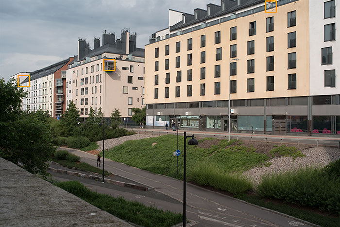
(Due to variance in actual field-of-view between lenses, these sample areas vary somewhat in how close to the corners they reside.)
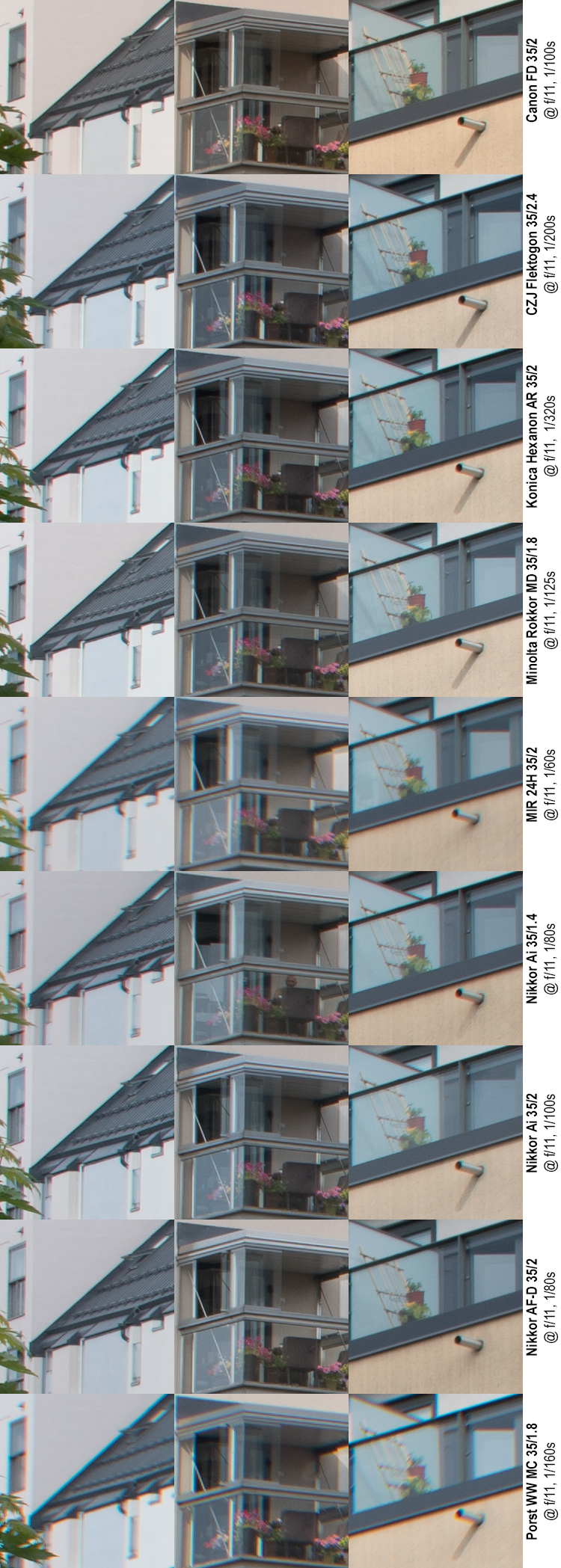
Again, I will not underestimate your Mk I eyeballs, but let me make a few remarks: Remember, that while focus can only be perfect at one distance from the imaging plane (here, the mid-column), both the leftmost column and the rightmost column are comfortably within the depth-of-field of these shots. Therefore, while left and right columns can be expected to be less sharp than the centre column, looking at the way in which they are not sharp is be revealing.
Side note! In more general terms, shooting at a facade running diagonally to the focal plane would also allow for testing significant field curvature. For example: If the right-of-centre (closer) would be consistently sharper than left-of-centre (farther) this might indicate either a de-centred lens or a field curvature where the plane of focus turns toward the camera toward the edges. If the same area (closer) remains sharper when the camera is used upside down, it would be field curvature (and not de-centering). This is a side note here, because none of the lenses showed field-relevant field curvature at these distances.
All of the samples here (for the left- and right-hand columns) show some softness, and visible chromatic aberrations (CA’s). While chromatic aberrations are most visible at high-contrast borders, assuming that CA’s would only affect those high-contrast borders is nonsense. In fact, CA’s effect sharpness by spreading some light from one point to adjacent pixels. While this effect naturally is slighter in areas of lower contrast, it has a pervasive effect. These samples clearly show that lenses which produce wider bands of chromatic aberrations (remember, we’re at f/11 here) also produce a lower overall definition/resolution. This correlation is especially obvious when looking at the leftmost samples – comparing the width of the purple diagonal band between dark roof and light wall and the definition of the snow-guards on the dark roof.
Looking at the right-hand column of samples, there are a couple of areas to pay attention to: The definition of the trellis and especially the twine or braid circulating around the trellis’ middle horizontal bar. The definition available to discern the braid is again largely corresponding to the level of CA’s visible in the shot.
In general, the Minolta MD and Konica Hexanon lens show amazing performance, followed closely by the three Nikkors, the Canon and the Flek. The MIR and Porst are in some ways a different story altogether, as they are not only unsharp off-centre, but also show clearly less sharpness in the centre shot. Whether this is due to a sample-specific issue or endemic to these lens designs cannot be deduced from the data.
However – as they say – resolution is not everything: Also contrast matters. Sadly – due to the changing lighting conditions in these shots, they are not optimal for comparing the various lenses’ ability to offer contrast or micro-contrast. In fact, as those shots which benefited more from the contribution of sunlight than others seem more contrasty, analysing these shots for contrast may lead to wholly erroneous conclusions. This we’ll have to return to in another set of shots.
One final thing: Is sharpness crucial to a shot like this?
Mind you, I’m not trying to say that a lens that has the ability to produce sharpness is not preferable over one which has not, merely that sharpness is – in my opinion – quite often overrated, especially if sharpness is allowed to come at the expense of other qualities.
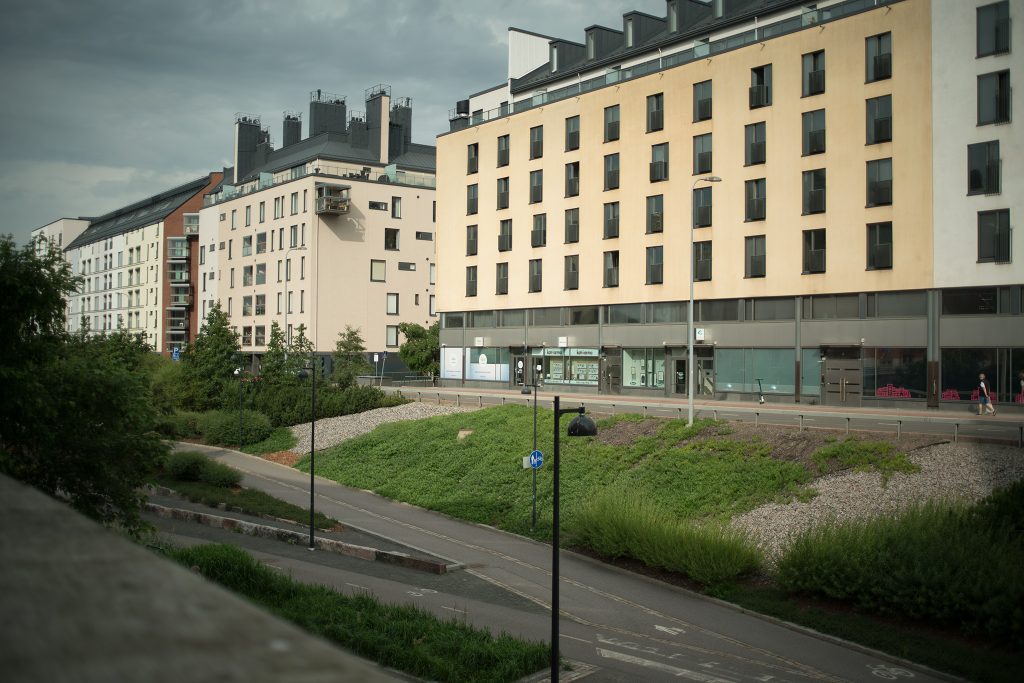
See below for two shots with the same lens: the first at f/11 (aiming for maximum across-the-frame sharpness, lack of vignetting etc.), the other at wide open (f/2). Neither image has any post processing except ACR’s default conversion. I know which one of these I prefer, but our mileages may vary.
(For bigger version, right-click and open picture in new tab)
(For bigger version, right-click and open picture in new tab)
CA’s (purple fringing), contrast and resolution
The previous set of shots already examined CA’s, especially through their effect on resolution and contrast, but did so only at f/11. Therefore, returning to a broader inspection of chromatic aberrations is worthwhile.
Moreover, it is a known fact that a lens’ resolution at near distances and farther distances need not at all be the same, which means that after looking at resolution at near MFD (and in a low contrast situation) does not really reveal everything. Therefore, we return to the question of resolution with an eye towards combining that assessment with an investigation of contrast and CA’s.
Therefore, we will look at a series of pictures of this urban landscape, focusing on three things:
• the first column shows the point of focus, which (while not dead-centre), is sufficiently close to the images centre, that a good lens should be able to render it sharply.
• The second column shows a stack of chimneys (air vents, actually), which are within the section of image which one should hope to be free from corner- and extreme corner aberrations at most apertures. This is basically a test for visible CA’s (purple and other coloured fringing).
• The third column is a repeat of the second, except in grayscale. The point of this is to eliminate the eye-catching effect of the coloured fringes, and focus on showing the lens’ ability to resolve contrast and sharpness and the effect CA’s have on those .
NOTE, please: Visible CA’s (purple and green fringes) are always also a function of contrast: the higher the contrast, the more stronger and visible the CA’s. Herein, this comparison is definitely biased against those four lenses (The three Nikon’s and the MIR), which had the bad luck of a (relatively) lighter sky. I long debated whether to publish these samples, because they do tend favour some lenses over others, but with the whole point of the test being a comparison using real-life photographic material, I in the end decided to go ahead with these pics.
Wide open (f/1.4–f/2.4)
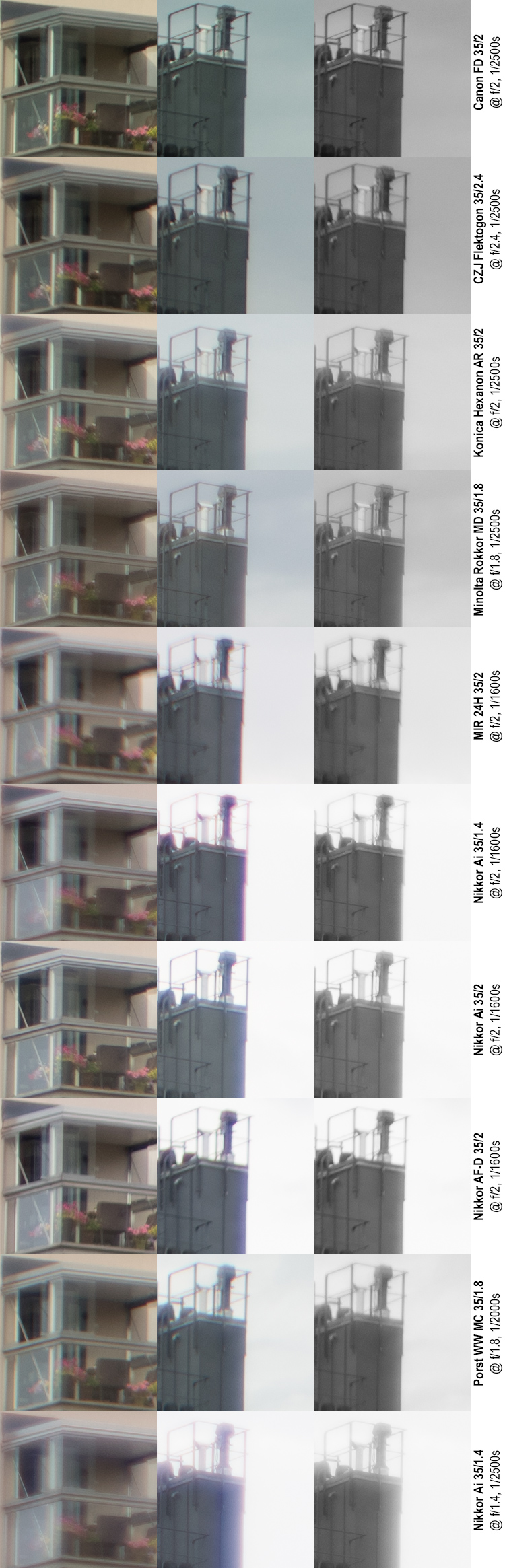
Note that the Nikkor 35 mm f/1.4 has two rows (f/2 at its customary place and f/1.4 as the last row)
“Centre” sharpness and contrast
Looking first at only the leftmost column, it is obvious that these lenses differ somewhat in their ability to be sharp at wide open. Remember that the clips in this column are at the focal plane, and avoid extreme-contrast situations (unlike the other two columns). I will here quickly describe the result of each lens…
Canon FD 35/2 “concave” – surprisingly sharp with only a mild loss of contrast and some softness around contrasty edges. Very good.
CZJ Flektogon 35/2.4 – shows very nice definition and while not as sharp as the Canon FD, the result is not bad at all.
Konica Hexanon AR 35/2 – another very good result, while also not on par with the Canon FD. Very good contrast (for being a wide-open shot), with some washing out of highlights. Highlight bleeding around the white vertical bars.
Minolta Rokkor MD 35/1.8 – very good definition but shows loss of contrast. Slightly dreamy.
MIR 24-H 35/2 – obviously very soft. Usable wide open only for small prints.
Nikkor Ai 35/1.4
At f/1.4 (last row) very dreamy, signs of CA’s even in medium-contrast situations. Manages to resolve detail even so, but with very little contrast.
At f/2, same as above, except better. Not on the level of the first four (FD, Flek, Hexanon or Rokkor)
Nikkor Ai 35/2 – very good sharpness and very good contrast. At least equal to Flek, Hexanon and Rokkor.
Nikkor AF-D 35/2 – not as good as its older sibling, with clearly worse contrast. Even so, manages to resolve a lot of detail.
Porst MC 35/1.8 – a mixed bag. Haloing, some CA’s, but semi-decent resolution and medium contrast. Several cuts above the MIR, and far less dreamy than the Nikkor 35/1.4 (at either f/1.4 or f/2). Usable wide open if some softness is acceptable.
Quick Summary (sharpness and contrast):
This test shows five distinct tiers:
I – At wide open, the Canon FD reigns supreme, and shows very good sharpness and contrast with very few of the typical wide-open maladies.
II – Four lenses make up the second tier: Flektogon, Hexanon, Rokkor and the Nikkor Ai 35/2 all show comparable results. While they all show different performance, all have their strengths and weaknesses and while the Nikkor Ai is a cut above the others, for the remaining it’s impossible to say that one of these would be clearly better or worse than the others.
III – The Nikkor AF-D is clearly not on the level of the ones above, while still being ahead of the rest
IV – Porst and Nikkor f/1.4 @ f/2. Clearly soft and dreamy.
V – MIR and Nikkor f/1.4 @ 1.4 Neither lens produces results which would hold up enlarged.
CA’s and extreme contrast situations
Before commenting on these results, let me reiterate that — especially regarding CA’s – the test gives the three Nikkor’s and the MIR a raw deal. In comparable lighting, the results would’ve be more even. Also, given that these samples are from somewhat behind the focal plane, extreme sharpness cannot be expected wide open.
That said, it terrifyingly obvious that the f/1.4 Nikkor struggles in such high-contrast situations. Struggles and loses. Not only is the result at f/1.4 extreme (to put it mildly), but the CA’s shown are combined and made worse by haloing – a sign that when hit with too much light, the optics are unable to effectively limit its straying. In effect, for the f/1.4 to be able to resolve detail, that detail has to be far from a high-contrast border. On the other hand, when that distance is available, it manages to render a lot of impressive detail (look at the horizontal railing at the lower left corner of the 3’rd column clip). At f/2 (stopped down by a whole f-stop), the f/1.4 lens shows worse CA’s than its compatriots (the other Nikkors), while still showing some good detail. Of the f/2 Nikkors the f/2 Nikkor Ai fares somewhat better than the Nikkor AF-D: while judging by the width of its band of purple fringing there is no big difference, it nevertheless manages to resolve significantly more detail, especially as the AF-D -version loses a lot of horizontal detail.
At the other end of the spectrum, the results from the FD and Rokkor lenses is nothing short of stellar, especially considering that there are wide-open results. However, while the Rokkor’s shot is remarkably free of CA’s the shot suffers a distinct lack of contrast. Thus, while the Flek shows some more CA’s than the Rokkor, the overall impression is – I think – ahead. This top three is followed by the Hexanon and Porst.
f/2.8
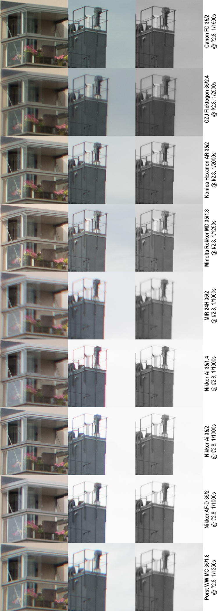
‘Centre’ sharpness and contrast
Not unexpectedly, there is improvement across the board, but while some improvements are minor, others are major. Notably, the FD and Flek improve only marginally, while the Nikkor Ai 35/2 makes a giant leap, and the Hexanon also improves markedly. As a result, the top-three is now made up of the Rokkor, Hexanon and Nikkor Ai 35/2, with the FD and Flek falling behind. The Porst also improves significantly, matching the Nikkor AF-D, while the MIR and Nikkor Ai 35/1.4 continue to underperform badly.
CA’s and extreme contrast situations
At f/2.8 the story is in many ways similar, while – on a detailed level – also showing some differences. Again, it make sense to treat the two groups (Nikkor’s and MIR; the rest) separately.
Among the Nikkor’s and the MIR, the Nikkor f/1.4 continues to struggle. While it shows a marked improvement from f/2 to f/2.8, it continues to suffer compared to all other lenses. Interestingly, the AF-D’s CA-characteristic has changed from purple to green fringing, and its ability to resolve horizontal (in this case, meridional) structures remains very poor. The Nikkor Ai f/2 seems to fare somewhat better than the other Nikkors, and while it is still not on par with the other lenses, it is the best of this bunch. Problematically, the MIR is so soft, that CA’s are hard to discern with any certainty.
Among the other five lenses, the FD remains at the top, showing basically no CA’s at all. The Rokkor, while showing slight CA’s, has a marked improvement from wide open and shows very good performance here. While the Hexanon also shows a significant improvement, the Flek’s result show very little improvement (admittedly, the Flek is only mildly stopped down), allowing the Hexanon to surpass the Flek. The Porst shows a similar performance to the MIR – softness overshadowing CA’s – albeit being significantly ahead of the MIR in both.
f/4
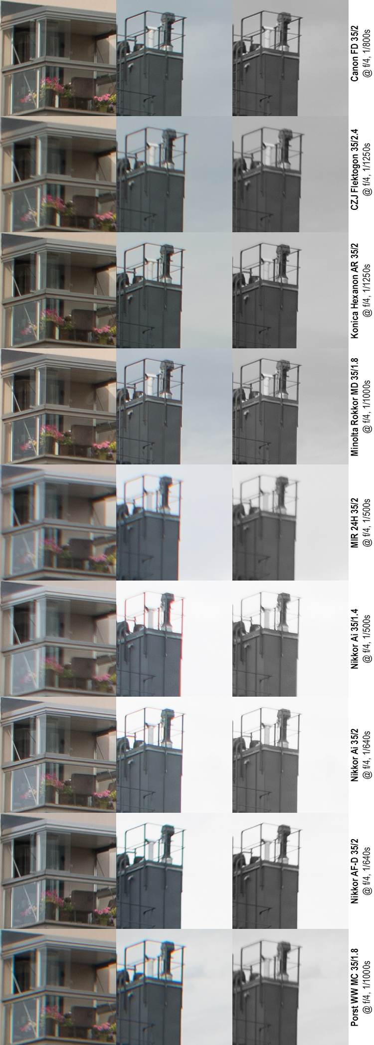
‘Centre’ sharpness and contrast
After a relatively lacklustre performance at f/2.8, the FD recovers significantly. Also the Nikkor AF-D makes a major improvement, while the Flek is falling behind.
Rokkor, and Nikkor Ai 35/2 show essentially flawless performance, with FD, Hexanon and Nikkor AF-D following closely. Flek and Porst als show very decent performance, with the Nikkor 35/1.4 remaining soft. The MIR is a totally other issue as it seems unwilling to sharpen up.
CA’s and extreme contrast
At f/4 the story is largely the same throughout, except that all lenses show some improvement. The top three (FD, Rokkor, Hexanon) remains, as does their internal order, but the Hexanon almost looks as if it had been sharpened: edge definition is amazing, but the Rokkor shows overall a more balanced result. The Flek keeps lagging behind these three, and starts to show some signs of softness, but has very little CA’s.
The Porst and MIR remain soft. Considering that we’re now two stops below wide open, this is both surprising and disappointing.
While the MIR, Porst, and even Flek are somewhat soft, All the Nikkor’s have sharpened up very well. The f/1.4 Nikkor continues to show significant purple fringing, while the AF-D shows its green fringing and lack of meridional definition. While the f/2 Nikkor Ai at this stage still has more CA’s than the top four (FD, Rokkor, Hexanon and Flek) its overall performance is creeping ahead of the Flek.
f/5.6
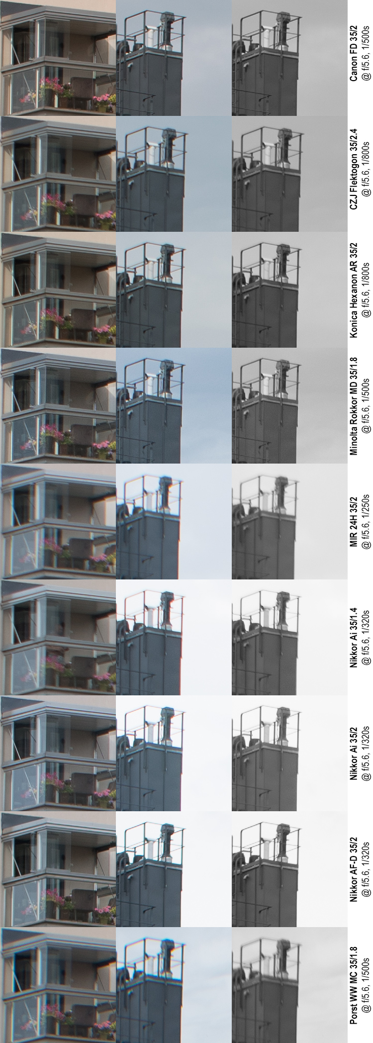
‘Centre’ sharpness and contrast
As before, all lenses sharpen up, while some do so more than others. FD, Hexanon, Rokkor, and the two f/2 Nikkors (listed in top-down order) now all show essentially flawless performance. Even the Nikkor 35/1.4 has sharpened and approaches the Flek (which continues to improve slowly). The Porst improves only very slightly, but manages to keep ahead of the MIR, which remains quite dismal.
CA’s and extreme contrast situations
Unsurprisingly, going from f/4 to f/5.6 shows incremental improvements, with only a few remarkable developments. We’re continuing to treat the MIR and Nikkors apart from the rest.
In group 1, the Rokkor shows no real improvement from f/4 to f/5.6. Also, while at f/4 the Flek seemed to start falling behind the top-three, it seems to have taken a spurt and is now again solidly in the top four. The Porst is clearly not on par with this group.
Finally, while the extreme contrast between chimney and sky still makes it hard to compare the three Nikkors with the others, it is obvious that they now all perform on par with (albeit not identically) with each other. The MIR’s softness is still at such a level that it makes discerning CA’s difficult.
f/8
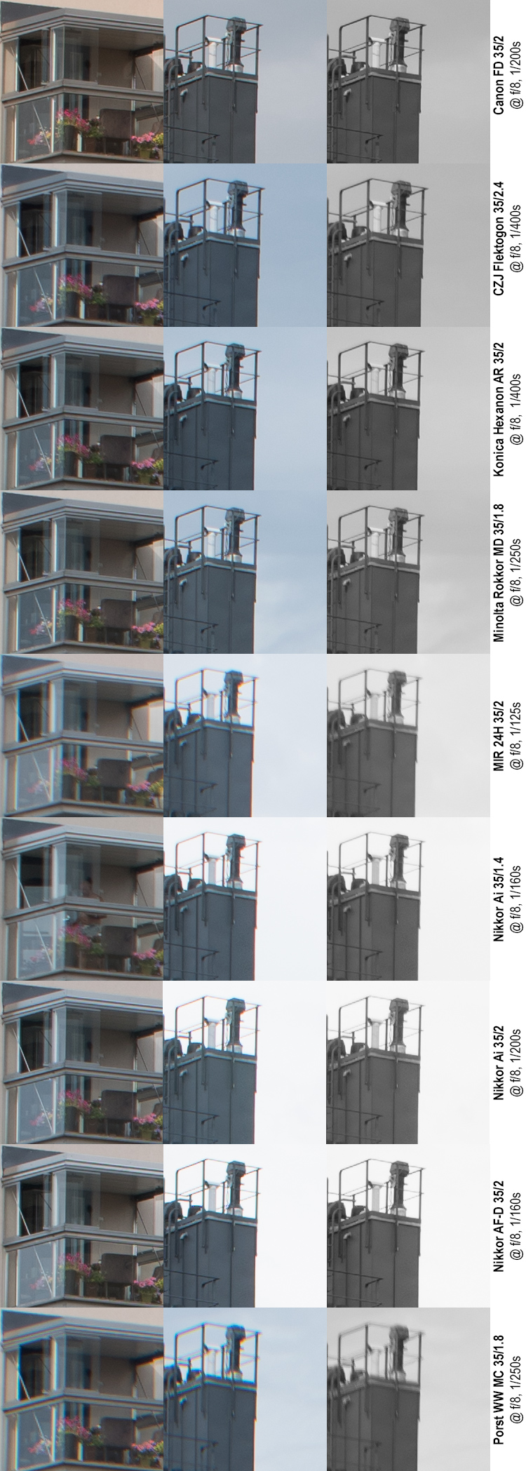
‘Centre’ sharpness and contrast
All lenses keep improving in centre performance, nevertheless, clear differences remain. Hexanon and Rokkor show bigger improvements than the FD and Nikkor Ai 35/2, but with very small differences. The Nikkor AF-D improves until it essentially joins the leading pack, followed by the Flek. These differences are so minor, that sub-diving the top six would be liable to accentuate essentially very small differences. Nikkor f/1.4, Porst and MIR also improve, but remain behind.
CA’s and extreme contrast situations
The Nikkors all still show remnants of CA’s, but whether this is purely due to their shots’ higher contrast is probable. In any case, whatever CA’s remain are hardly field-relevant. The MIR continues to be too soft to be certain on the level of CA’s while the Porst’s CA performance seems to become worse past f/5.6.
All the other lenses (FD, Flek, Hexanon, Rokkor) are essentially free of colour fringes.
f/11
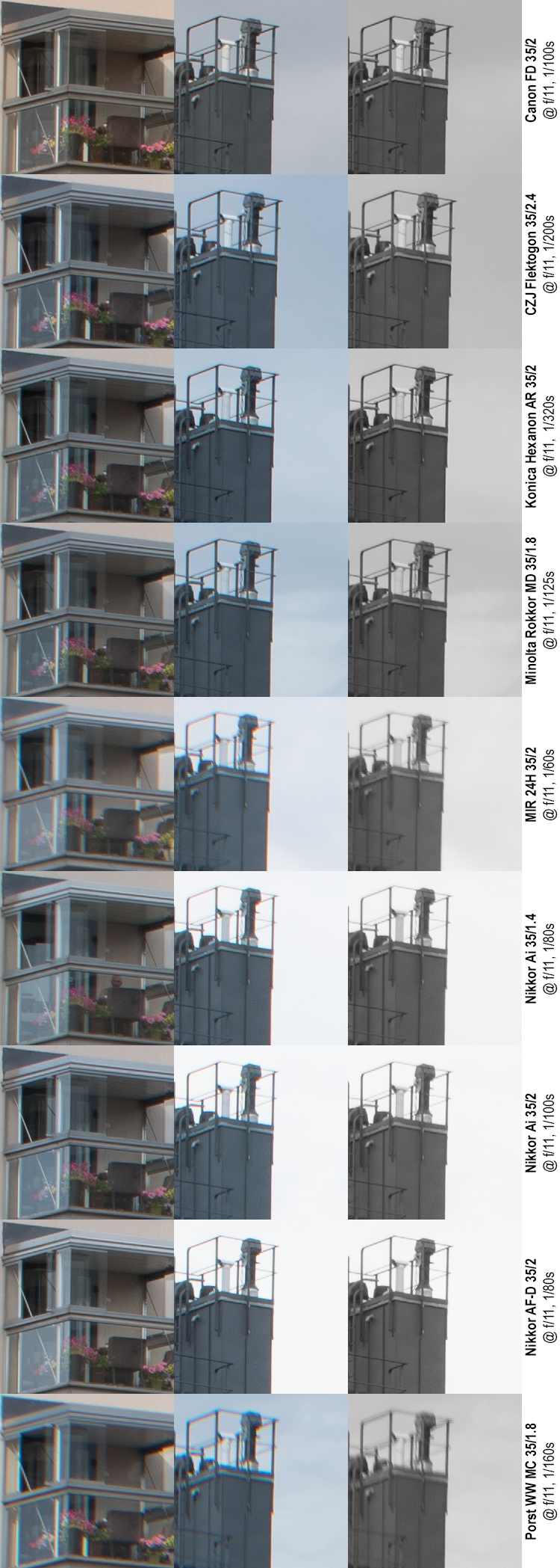
Sharpness, contrast and CA’s
First off, f/11 is largely the same as f/8 was, except that while some lenses manage to show a minor improvement, others start to degrade. Most notably, the FD and MIR are now past their peak sharpness, while any improvement in the Porst’s resolution is overshadowed by an increase in CA’s. In essence, the MIR and Porst now make up a clear bottom group, as they not only show distinct CA’s but are also significantly behind in sharpness and contrast.
But make no mistake, at f/11 all these lenses are essentially capable of producing big blow-ups.
f/16
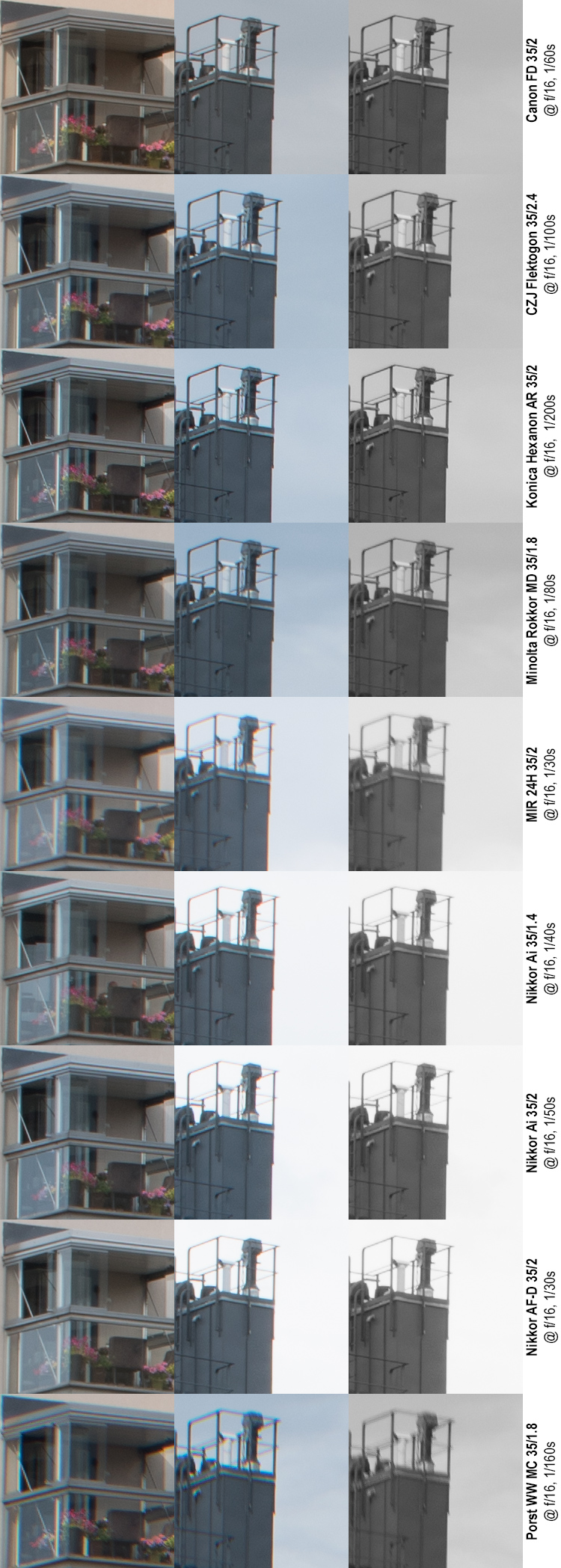
Unsurprisingly all lenses show deteriorating performance at f/16. Moreover deterioration is throughout so significant, that all lenses performed better at f/8 than at f/16. Hence, f/16 should be used only when the added depth-of-field or the lengthened shutter speed is definitely worthwhile.
Notably, five of these lenses allow closing down past f/16, and while the f/22 settings of those lenses may offer benefit in some situations, those will not be reviewed here (but rest assured, the results are as expected, i.e. increased softness across the board.)
Next… or back?
• Part 1: Introduction, the lenses: pedigree and handling
• Part 2: IQ-comparison I – The Brick wall test
• Part 3: IQ comparison II – Urban vistas (you are here)
• Part 4: IQ-comparison III – Bokeh and blur
• Part 5: IQ-comparison IV – Night-time vistas
• Part 6: Summary and conclusions