Welcome to part 4 of the JAPB comparison of nine fast 35 mm focal length lenses.
This is a big article, which has been subdivided into several parts for convenience and the sake of humane loading times. See table of contents below.
• Part 1: Introduction, the lenses: pedigree and handling
• Part 2: IQ-comparison I – The Brick wall test
• Part 3: IQ comparison II – Urban vistas
• Part 4: IQ-comparison III – Bokeh and feel (you are here)
• Part 5: IQ-comparison IV – Night-time vistas
• Part 6: Summary and conclusions
This part of the comparison covers two quite diverse aspects. The first aspect is bokeh and the other is the general feel or rendering of the lenses. While disparate, these two aspects have one central commonality – both are very much subjective and hard to quantify.
“Bokeh”
Thus far, this comparison review has focused on sharpness, but one of the things you expect from a large-aperture lens is to enable selective sharpness, in other words: subject separation. Therefore, we will next have a look at what type of blurriness one can expect from these lenses. But before we go on, two paragraphs of theory and another one of meta:
What is ‘Bokeh’ and what is it not?
The sheer amount of background separation is defined by only four things: The actual focal length, the used aperture, the distance the lens is focused at and the distance to the background.
• Longer focal length => more blur potential;
• Wider aperture => more blur potential;
• Shorter focusing distance =>more blur potential;
• Longer distance to background (or foreground) => more blur potential.
Thus, any two lenses used on the same camera on the same tripod produce the same amount of background blur as long as their focal length and aperture are the same. But that is not what is commonly referred to as ‘Bokeh’
Instead, ‘Bokeh’ is typically used to indicate the characteristics or qualities of blur. This is by no means an insignificant topic, because as the primary function of a blurred background (and, sometimes, foreground) is to direct the viewer’s eye away from that background (and onto the subject), a background which – while out of focus – is nervous or jagged, runs counter to the purpose of blurring the background in the first place. That much basically everyone agrees on.
From that point onward, ‘bokeh’ is a notoriously difficult topic to discuss, because what is considered ‘good bokeh’ seems to be subject to taste. One need only have a look at discussions about ‘swirly’ bokeh or ‘soap bubble’ bokeh to see that opinions both run the gamut and those reasonings put forward in defence of one or another type of bokeh are more personal than universal. Therefore – instead of me passing judgment on the bokeh evident in a series of perfectly boring test shots, I’ll let you judge for yourselves.
The setup
The setup is typical for a comparison: all shots on a tripod with a self-timer. All shots in unchanging (read: as stable as possible) lighting conditions, all taken within 15 minutes of each other. ISO 100, aperture priority, fixed WB (4900K, tint +12). All RAW files processed in ACR (default) and resized to 2048×1366, and saved as JPG (quality 90).
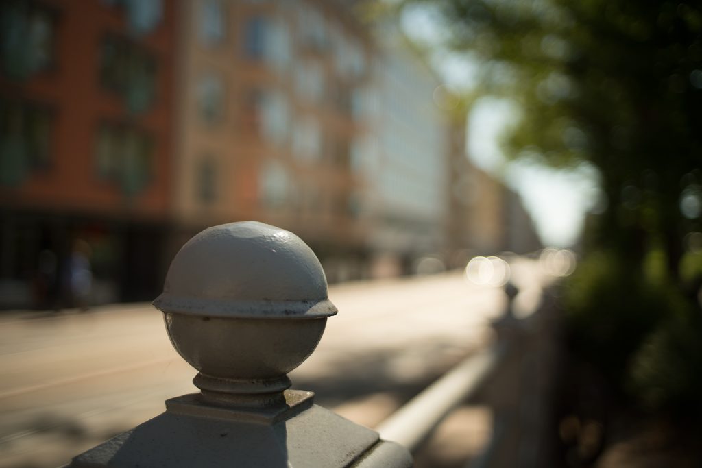
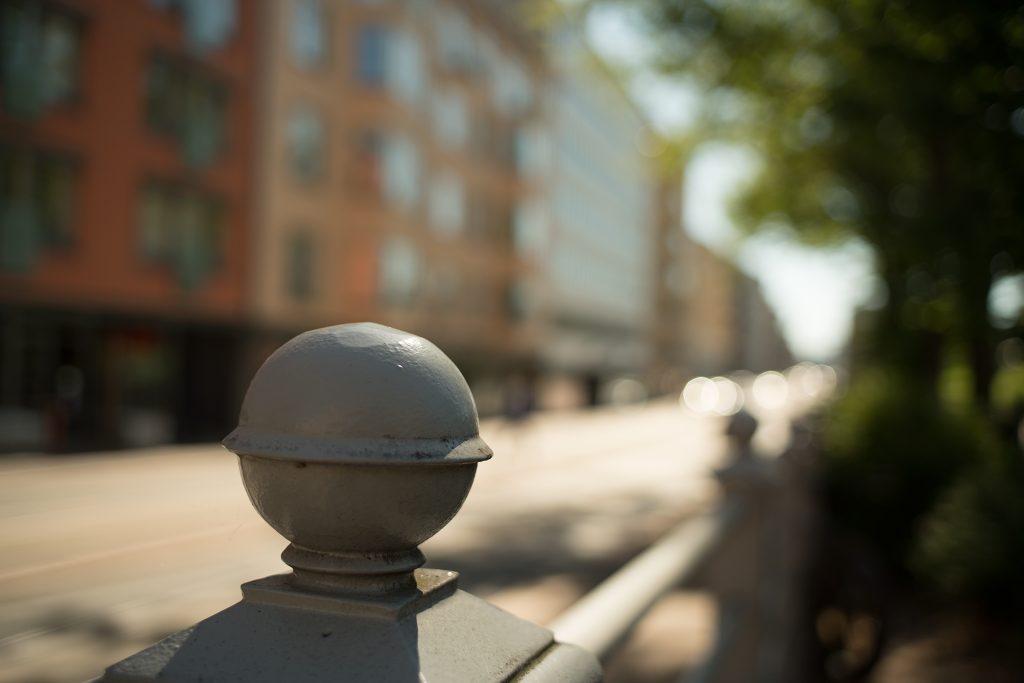
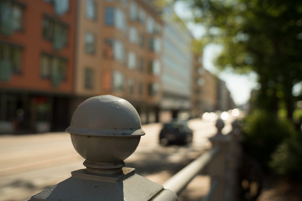
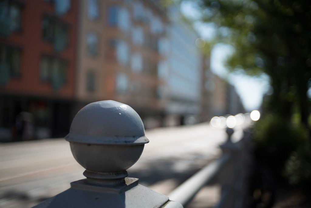
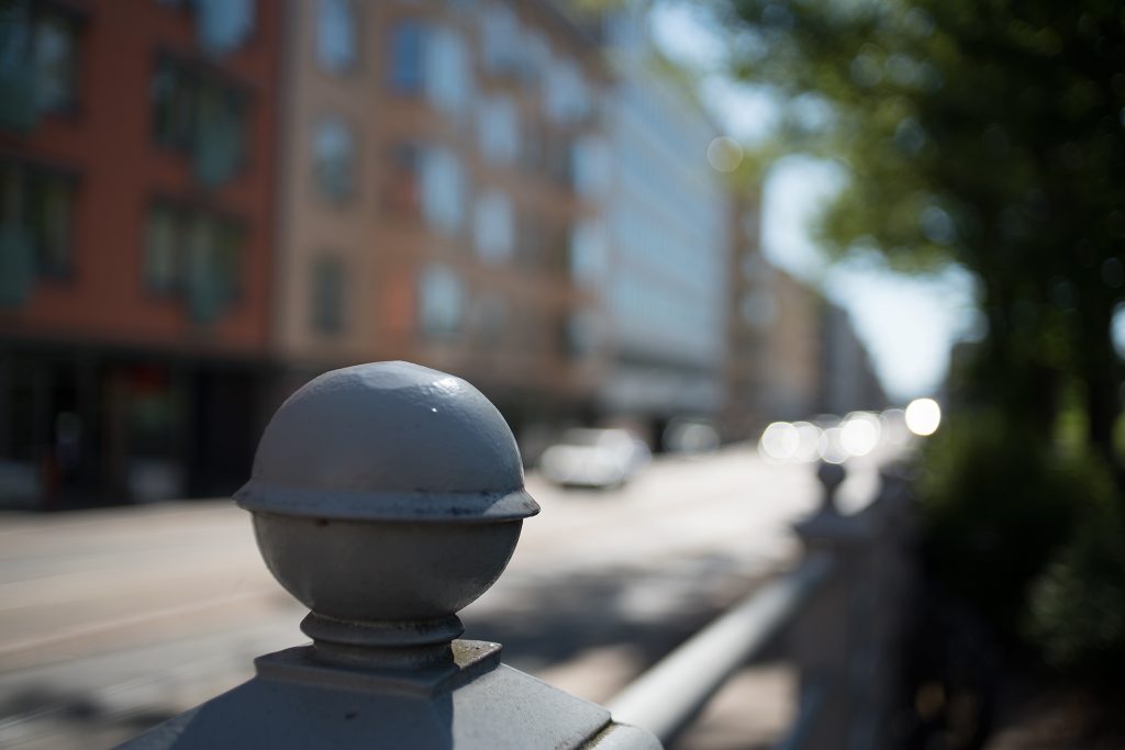
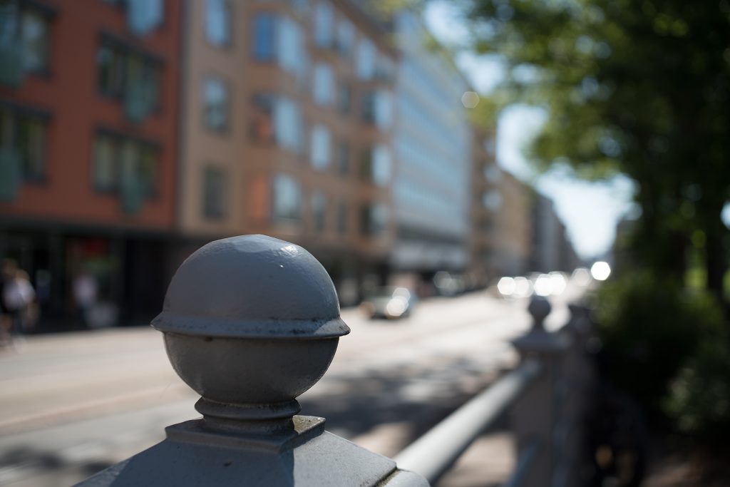
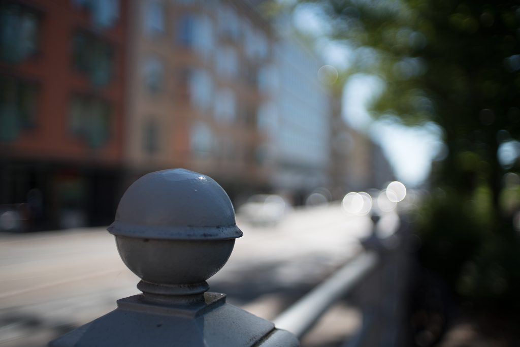
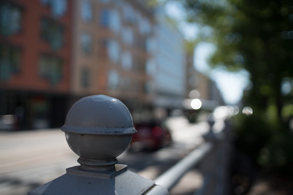
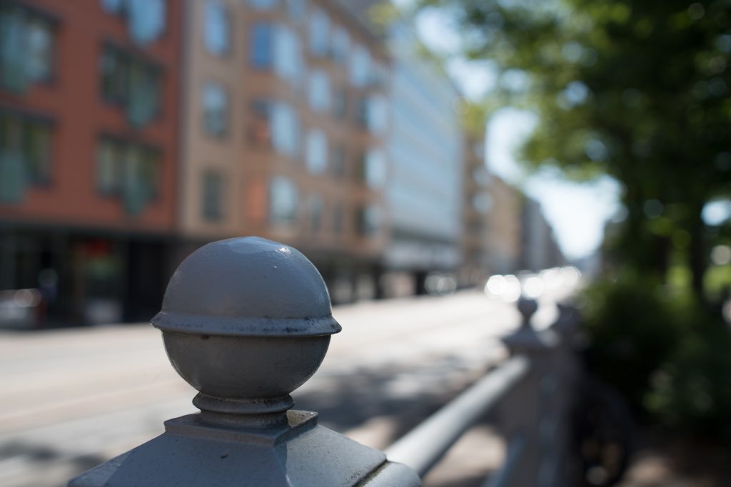
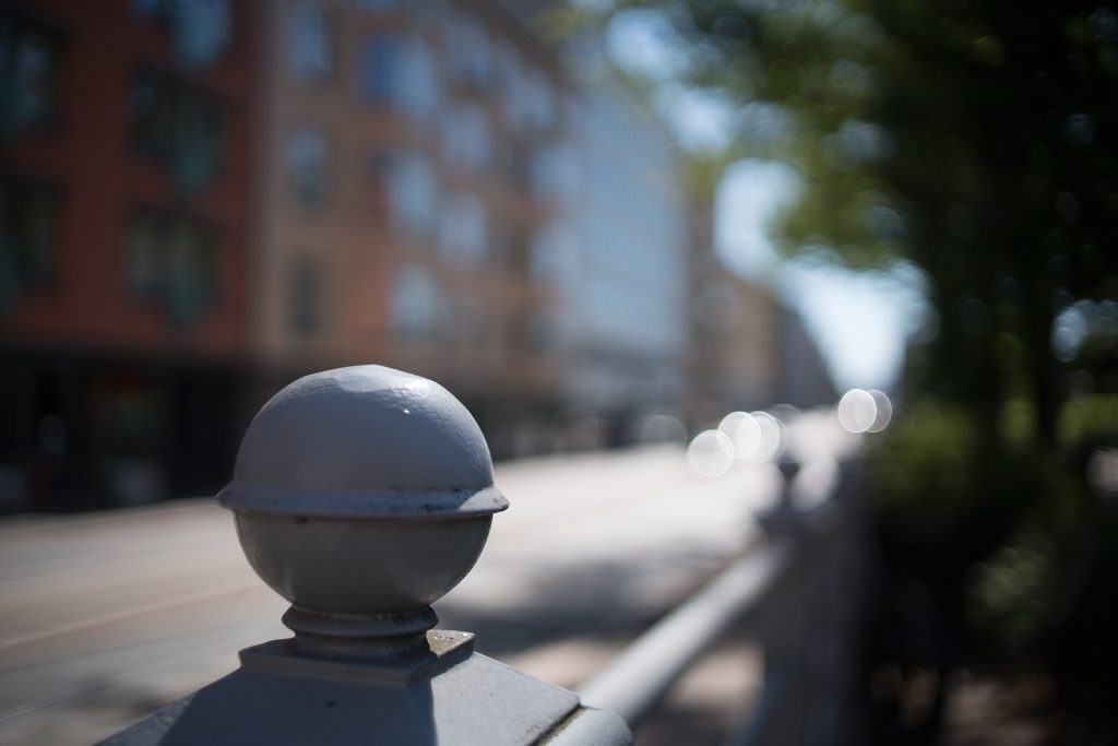
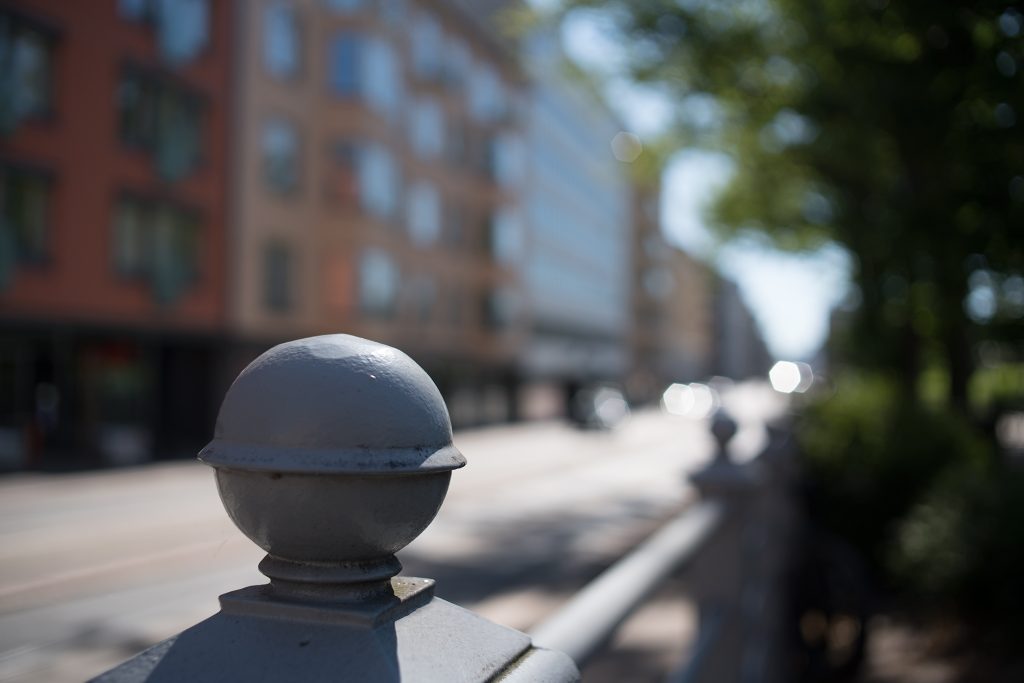
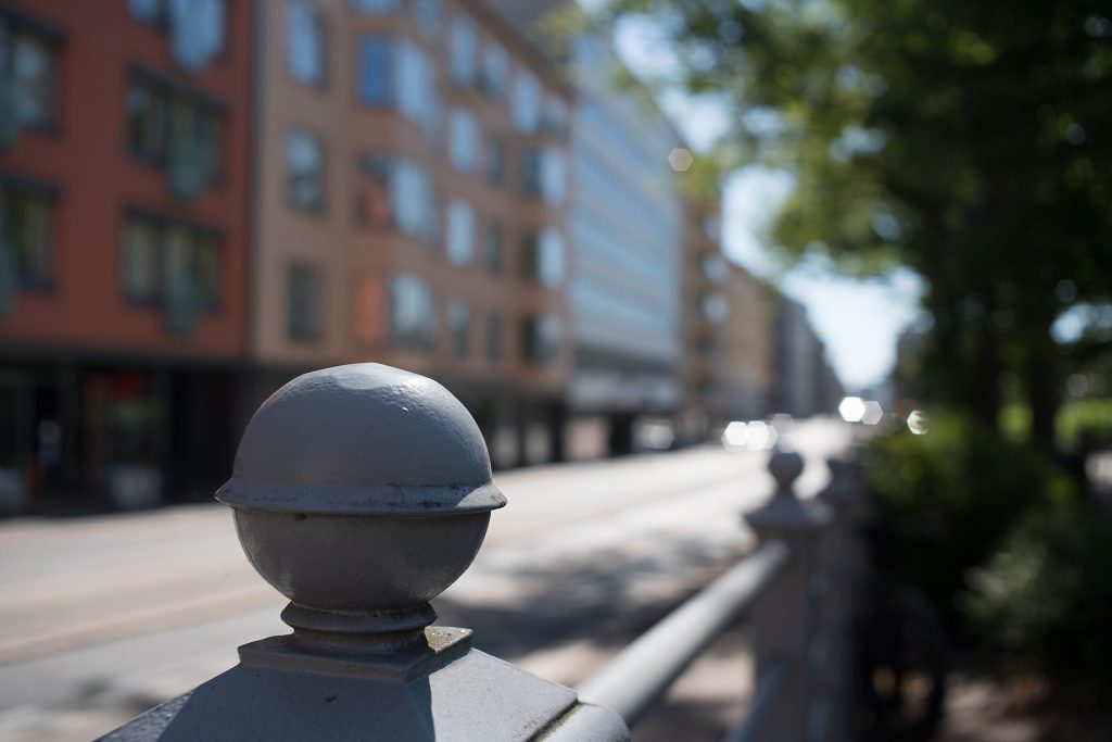
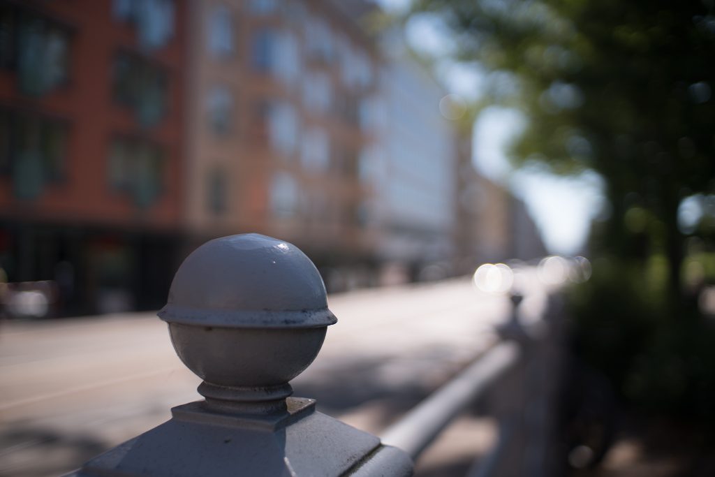
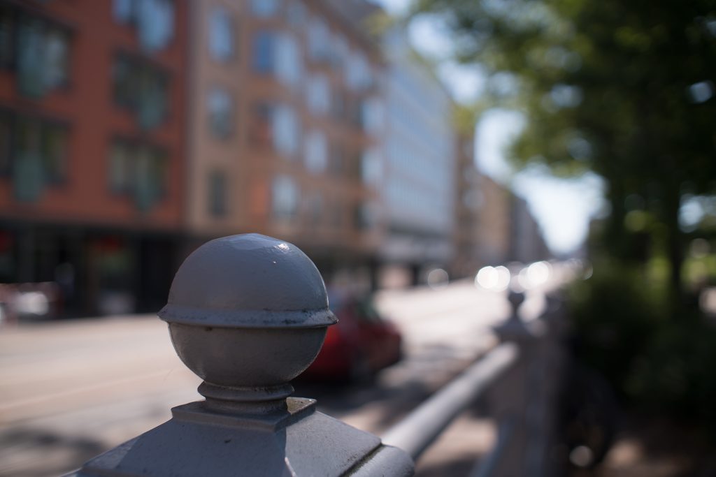
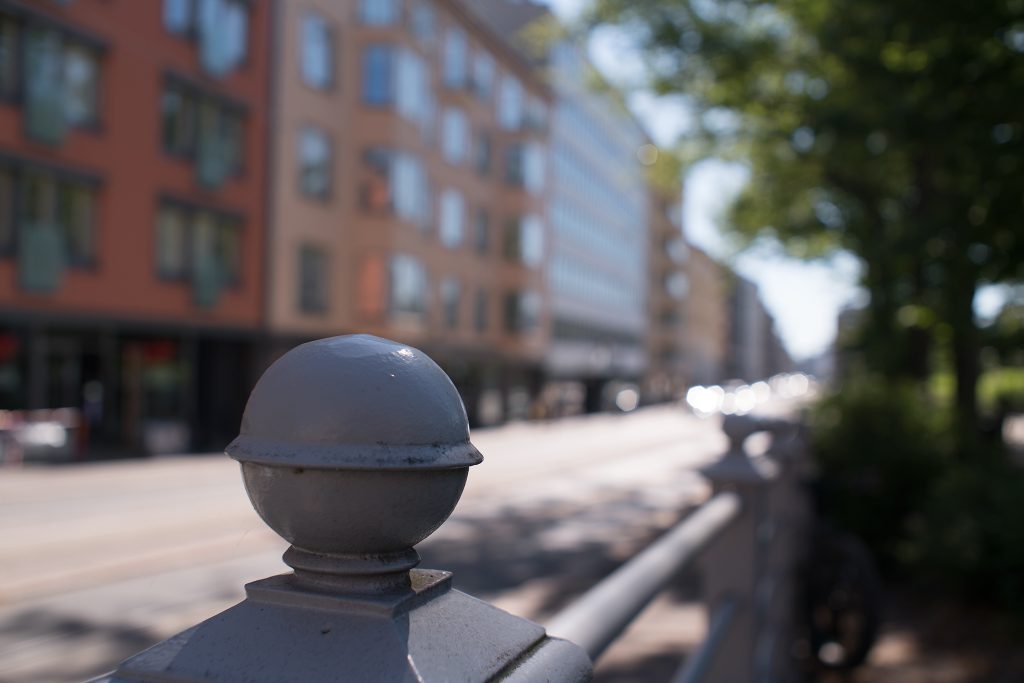
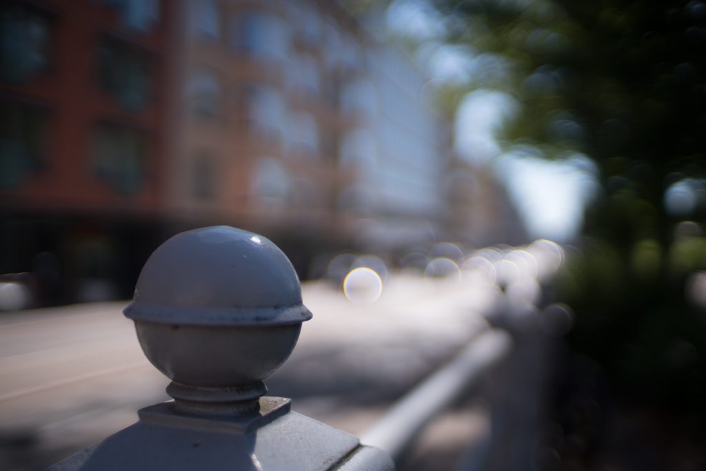
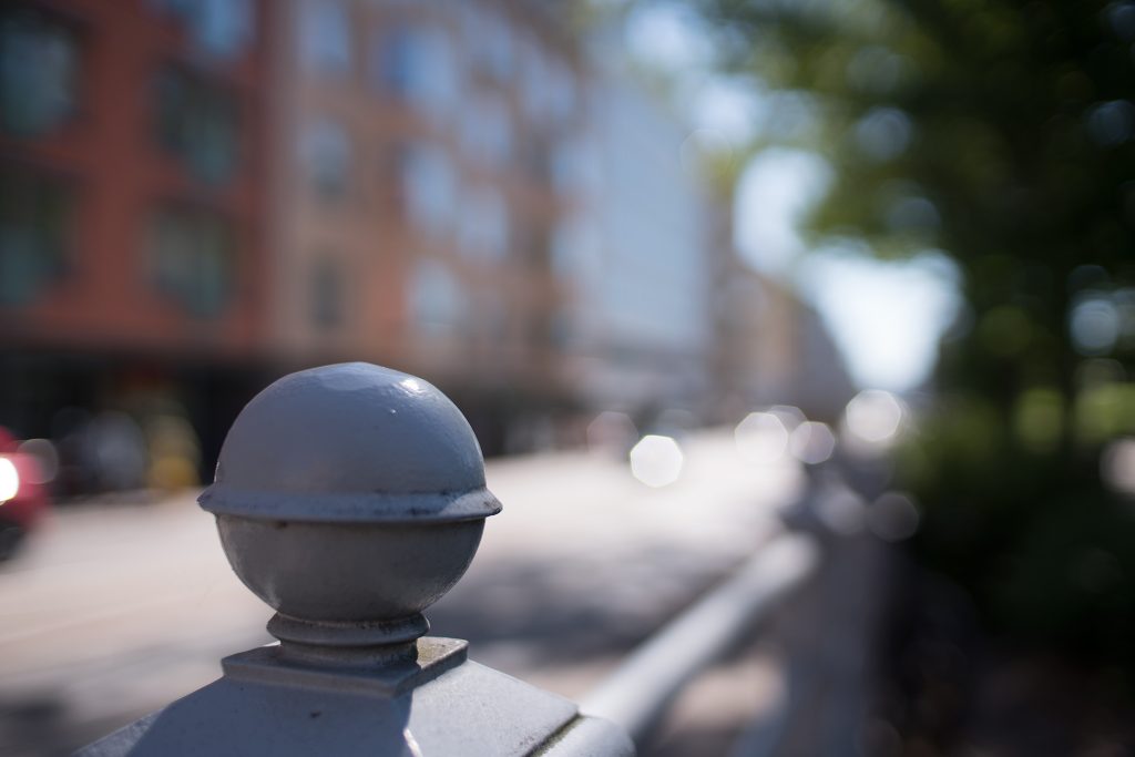
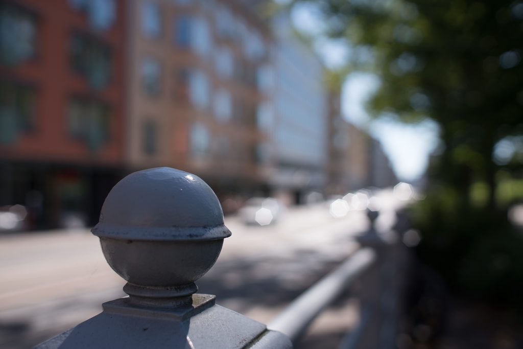
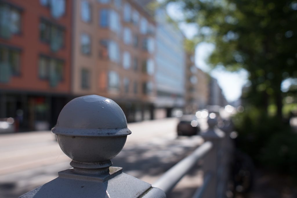
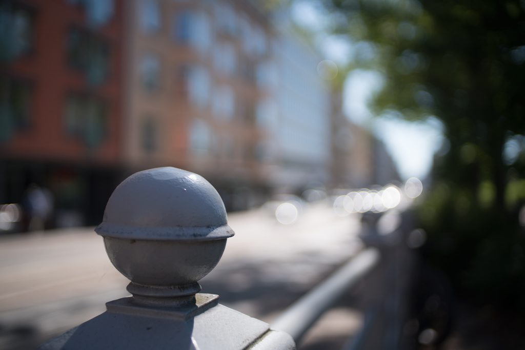
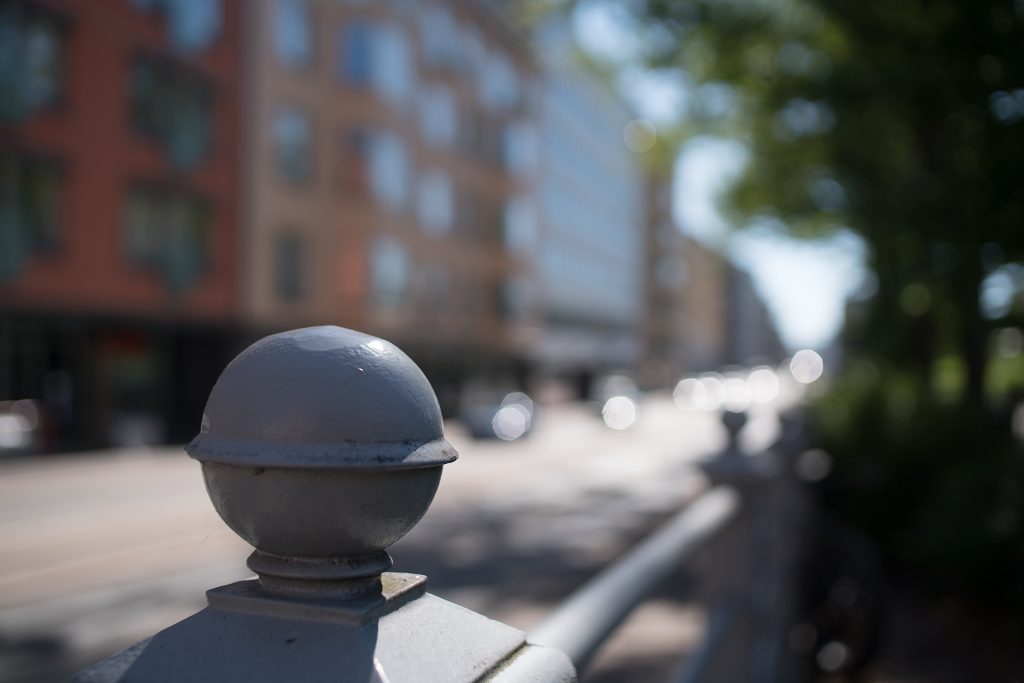
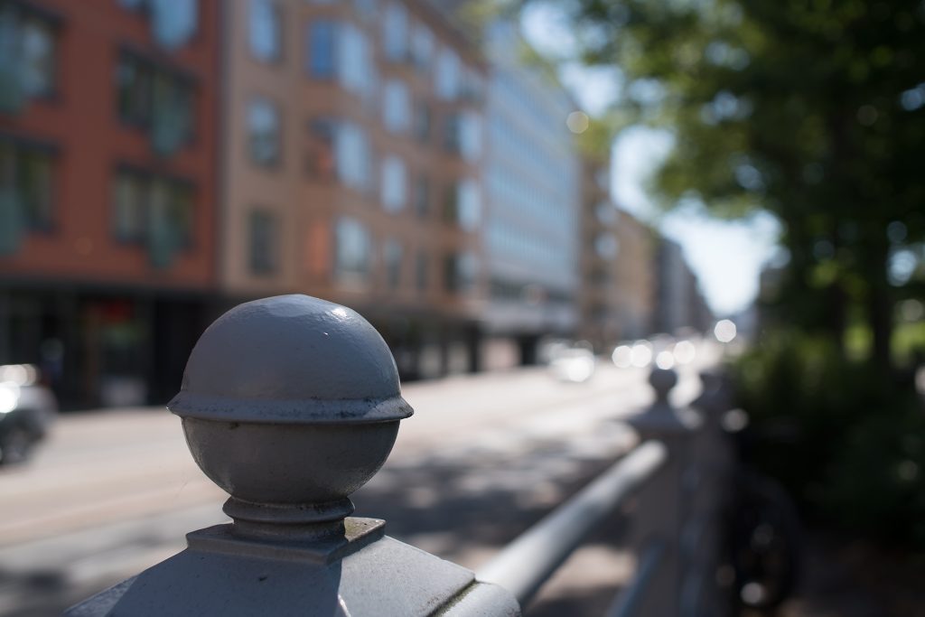
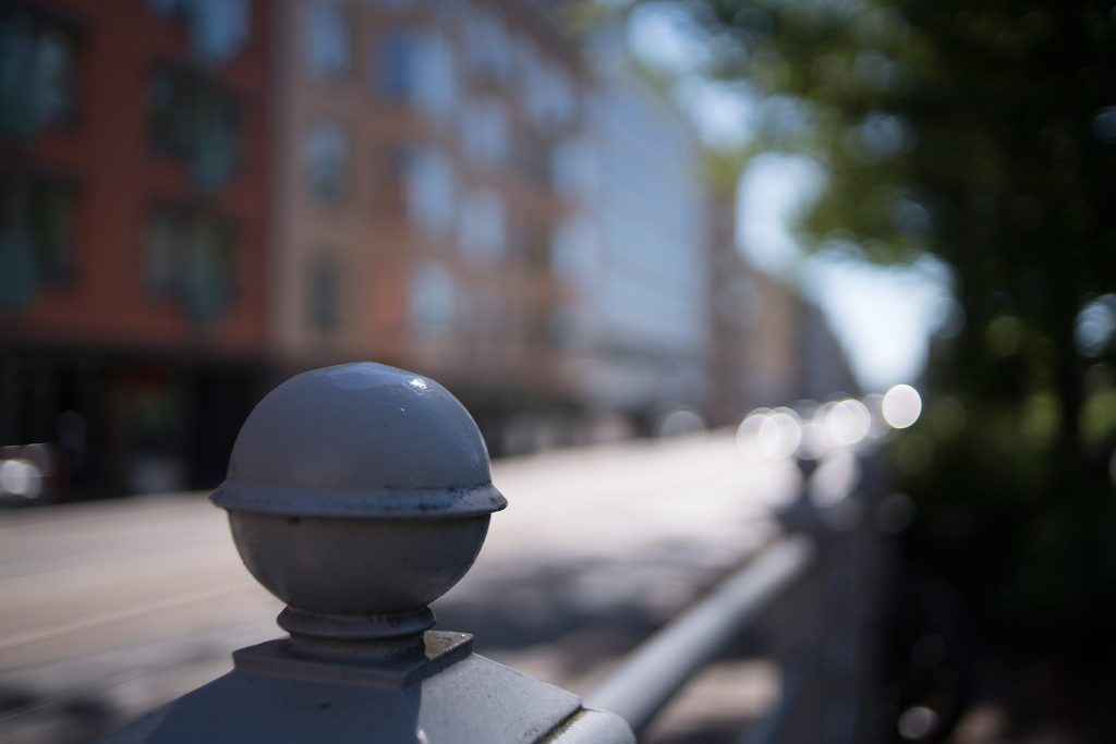
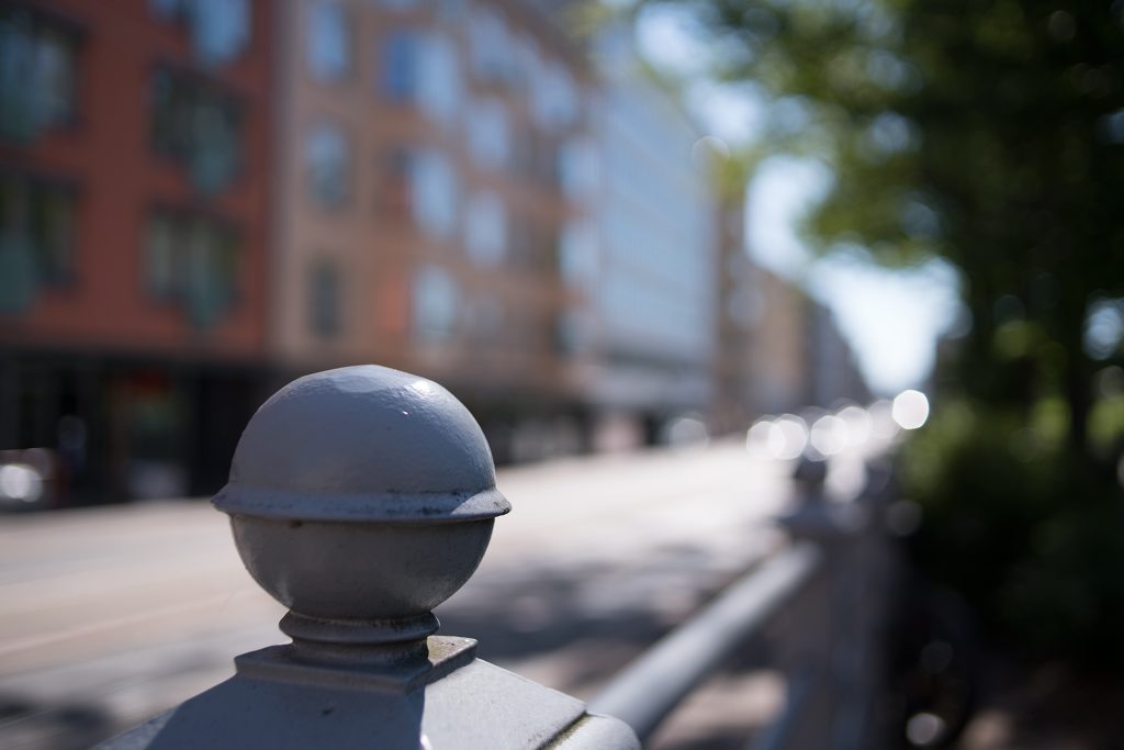
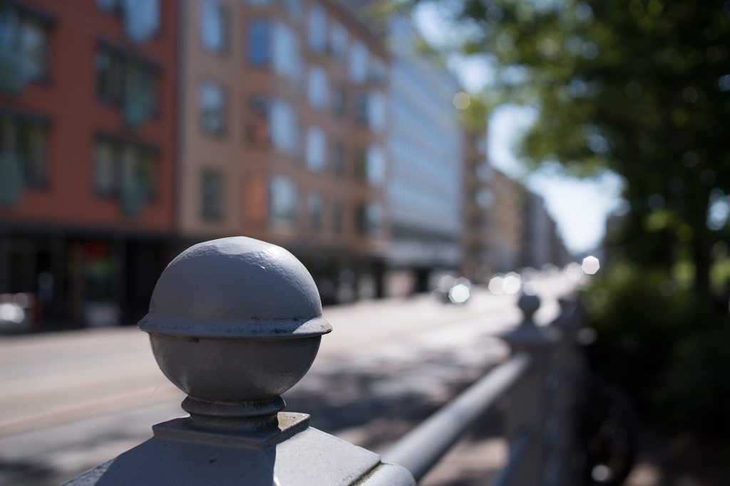
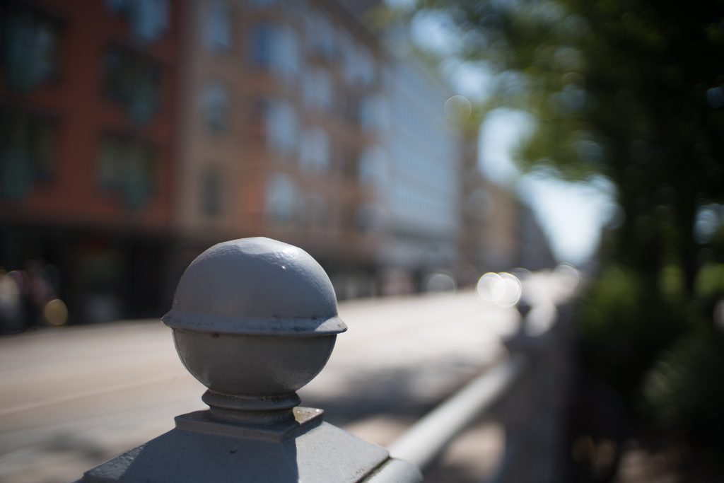
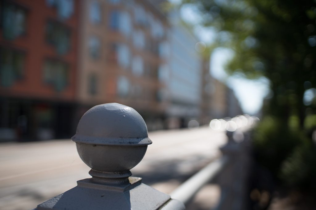
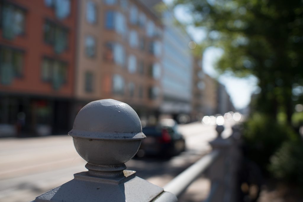
Importantly (with these shots being taken during the COVID-pandemic) no humans were endangered by having them stand less than 1 meter from another person for 15 minutes: The fencepost (surrogate for ‘model’) is at 0,6 meters, while the background is, well … in the background. The placing for the shot (across Ruoholahdenkatu in central Helsinki) was chosen because the reflections of oncoming cars allowed for bokeh balls, because the foliage would show swirly blur if the lens should have such tendencies (none was expected), and the railing allows assessment of the smoothness of the focus-background transition. Focus was achieved using maximum focus magnification and on the right slope of the fencepost knob just above the equator.
The pics
(For bigger version, right-click and open picture in new tab)
(Open in new tab for bigger version)
(Open in new tab for bigger version)
(For bigger version, right-click and open picture in new tab)
(Open in new tab for bigger version)
(Open in new tab for bigger version)
(For bigger version, right-click and open picture in new tab)
(Open in new tab for bigger version)
(Open in new tab for bigger version)
(For bigger version, right-click and open picture in new tab)
(Open in new tab for bigger version)
(Open in new tab for bigger version)
(For bigger version, right-click and open picture in new tab)
(Open in new tab for bigger version)
(Open in new tab for bigger version)
(For bigger version, right-click and open picture in new tab)
(For bigger version, right-click and open picture in new tab)
(Open in new tab for bigger version)
(Open in new tab for bigger version)
(For bigger version, right-click and open picture in new tab)
(Open in new tab for bigger version)
(Open in new tab for bigger version)
(For bigger version, right-click and open picture in new tab)
(Open in new tab for bigger version)
(Open in new tab for bigger version)
(For bigger version, right-click and open picture in new tab)
(Open in new tab for bigger version)
(Open in new tab for bigger version)
Quick comments
I lied. I won’t refrain from offering some observations, but I will try to keep them to observable facts and desist from offering opinions (I’ve been staring at these shots far longer than I expect you will, so it would be foolish for me not to point out some titbits).
Firstly, these lenses were made before rounded aperture blades became the rage they are today, and at f/4, all ‘specular out-of-focus highlights’ (more commonly known as ‘bokeh balls’) clearly show the blade count: 8 on the FD; 7 with the Nikkor’s; and 6 with the rest. That said, there are big differences regarding the roundness of the bokeh balls at wider apertures: At wide open, all bokeh balls are perfectly circular near the centre of the frame, while most lenses also show some cat-eyeing of bokeh balls towards the corners. Also, at f/2.8, some bokeh balls remain essentially circular (Especially the Konica’s), whereas others are distinctly polygonal (Minolta and Nikkor 1.4 more than most).
Secondly, bokeh balls come (in theory) in three types: corrected, under-corrected and overcorrected.
• Corrected bokeh balls have an even brightness distribution throughout;
• Over-corrected are brighter around the edges; and
• Under-corrected have a bright centre.
Problematically a lens which produces under-corrected highlights in the background produces over-corrected highlights in the foreground, and vice versa (see more here), so you cannot design a lens for utterly uniform bokeh ball behaviour.
In this sample, none of the wide-open (background) bokeh balls were under-corrected, whereas the majority were clearly over-corrected, most prominently the f/1.4 Nikkor and the Porst. Significantly, a lens which produces over-corrected bokeh balls wide open, may produce perfectly corrected bokeh balls only half a stop later. Which brings us to the next point:
Thirdly, (and now we’re no longer focusing only on bokeh balls) the bokeh characteristics of a lens may change significantly from one stop to another. While obviously the sheer amount of blur decreases for every stopping down of a lens, some backgrounds also become less restless as you stop down. IMO, this is strikingly evident in some of the shots above.
Especially when your background contains harsh contrasts and geometric structures (as the row of houses & windows in the background here), one should investigate whether a slight stopping down of the aperture could not produce an overall more pleasing background.
“Feel”
As said: feel, ‘3D-pop’ and ‘micro-contrast’ are notoriously hard to quantify – especially as the concept is fragile: even when a lens is known to be able to produce micro-contrast, there are no guarantees that every shot will show it. On the other hand, while a shot might seem like it does not have much micro-contrast, a skilful post-productionist may be able to dig up a lot of detail which initially did not seem to be there.
Moreover, while sharpness is easy to quantify, and even coarser contrast structures are relatively easy to discern, micro-contrast seems to be really hard to quantify in a meaningful sense (i.e. in a way various people would agree on).
Playing the devil’s advocate, there are five potential variables which together define whether a shot (of the same object in identical lighting) is deemed to have good micro-contrast, and we’ll take these elements in the order in which they affect the perception of a shot: lens, sensor (including in-camera software), post-production, reproduction medium, and viewer.
Thom Hogan does a good job of covering the effects of the first three, while I want to add one more obvious (in hindsight) element to the equation: the quality and calibration of your reproduction medium (your monitor or your prints). Finally, let’s not kid ourselves and pretend we all have perfect eyesight or that we all agree on what makes a picture ‘pop’.
In these pictures I have tried to eliminate as much of that variance as possible. You are you (and not someone else) and your monitor is unlikely to change between the first and last picture. Also, I have in no way edited these pictures (ACR default + resize in Photoshop, but nothing else). The lenses I have obviously changed, and while the sensor has stayed the same, it is not inconceivable that the circuitry’s logic would do things (de-mosaicing etc.) differently depending on changes in the light inundating the sensor, but one must assume those changes are minor.
Thus, whatever differences you see in the following pictures is most likely caused by the various lenses. The approach I take here is largely the same as above, meaning that I show you some shots and let you make up your mind. I am sorry that my bandwidth does not (for the moment) allow me to offer you the RAW-files for download, but if you really want them, be in touch.
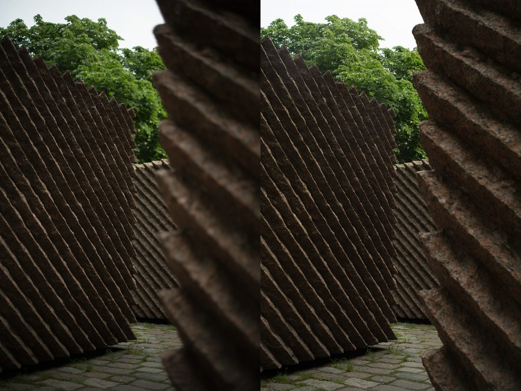
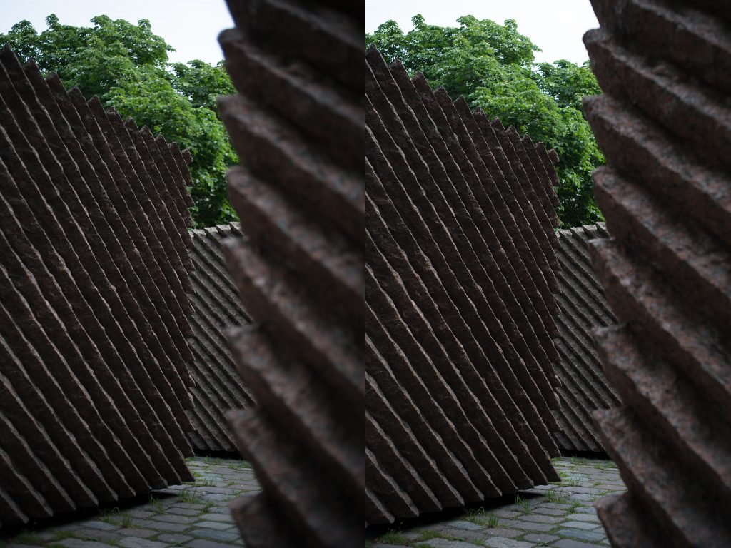
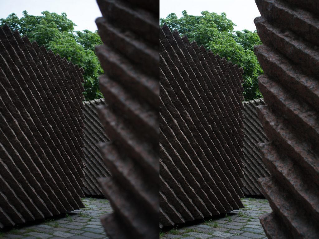
The setup
As above: all shots on a tripod with a self-timer. All shots in unchanging (read: as stable as possible) lighting conditions, all taken within 15 minutes of each other. ISO 100, aperture priority with -2 exposure compensation , fixed WB (4200K, tint +9). All RAW files processed in ACR (default) and resized to 1024×1365, and saved as JPG (quality 85). Each doublet shows the same lens at wide open (f/1.4–f/2.4) on the left and at f/8 on the right (I managed to accidentally trip the Porst’s aperture control into ‘auto’, thus missing the f/8 shot). Incidentally, these doublets also show the real-world significance of vignetting, especially in the respective upper left corners
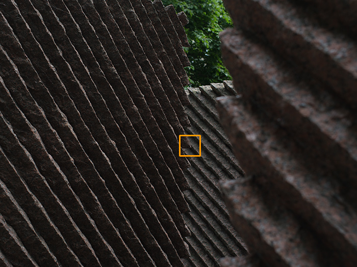
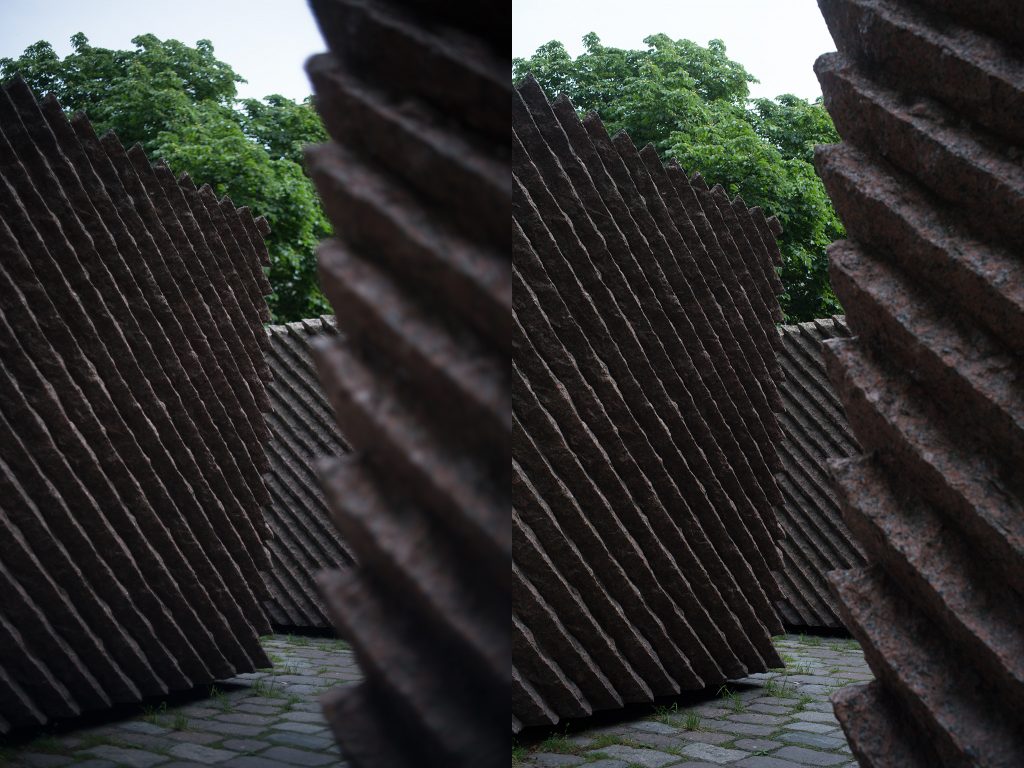
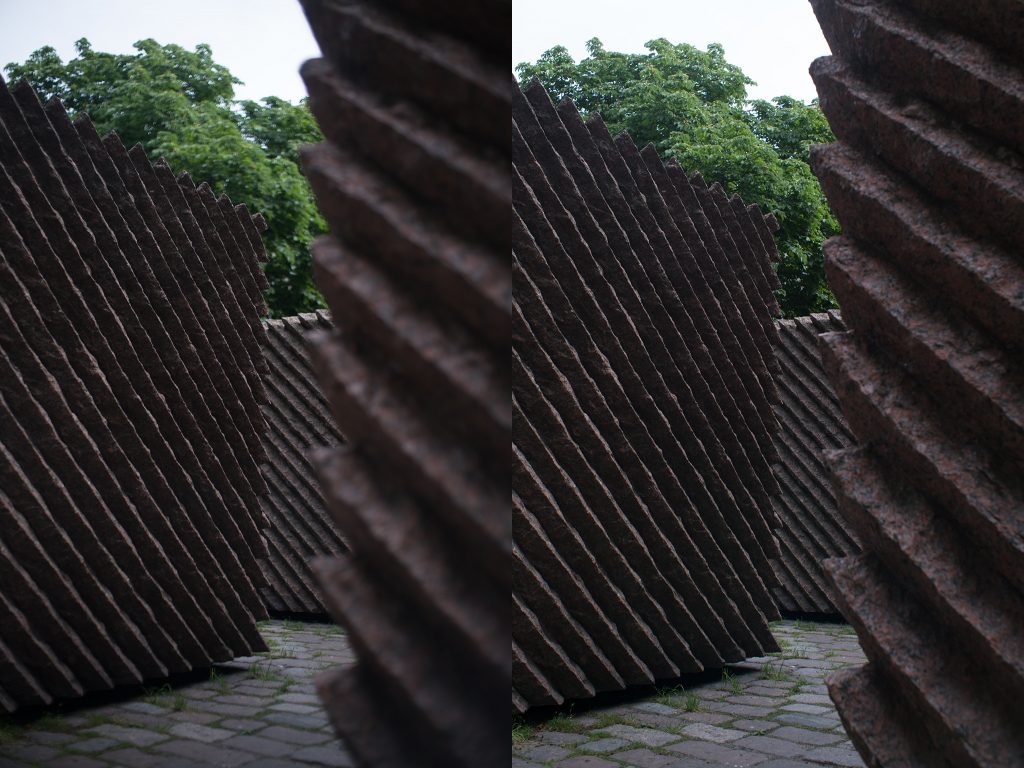
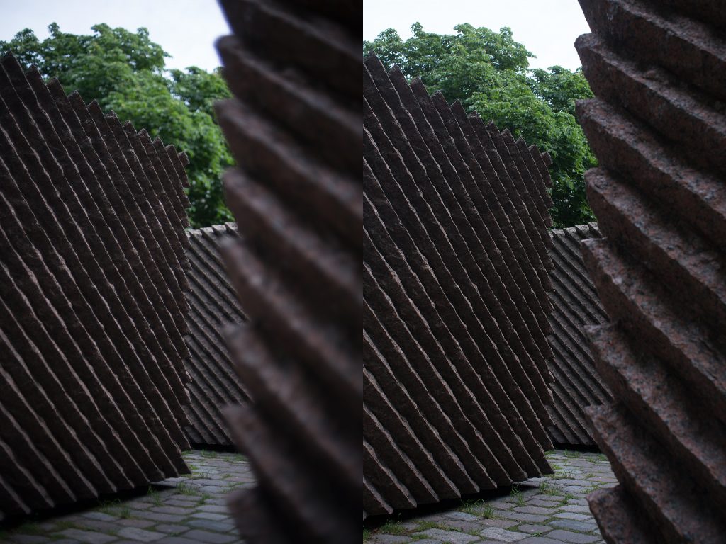
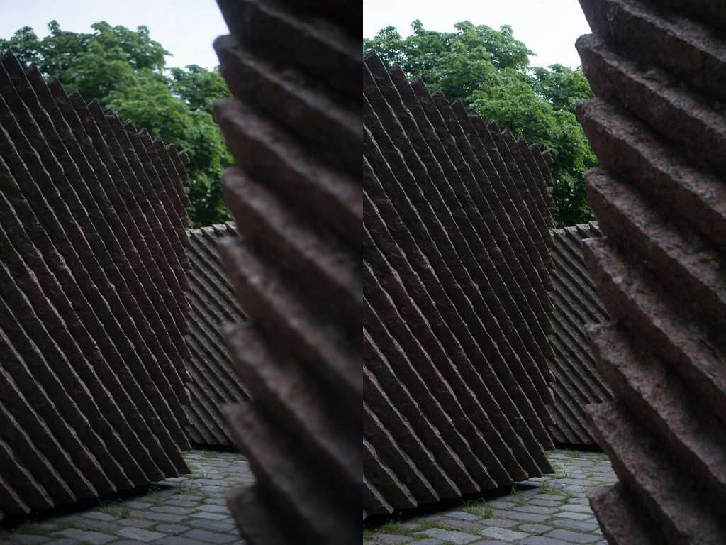
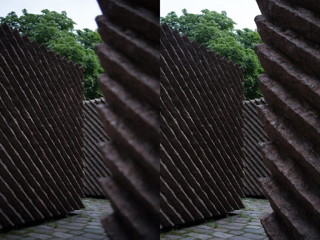
The motif of the pictures is a partial of a statue. The statue in question, is dedicated to Lauri K. Relander, who served as the second president of the republic of Finland from 1925 to 1931. As of this writing, Finland has had 11 former presidents, eight of whom are no longer with us and have official statues dedicated to them in the centre of Helsinki – all within a kilometre radius. Four of these statues are classic figurative statues (showing the person in an artist’s rendition), while four are abstract statues ranging from a pond (with accoutrements) to four blocks of granite (this statue). While I find this statue to be (artistically) somewhat average, it is one of my favourite motif’s because I find it to be a very good test for how lenses render depth and various shades.
The crop below shows the point of focus for all shots (focus was manual, achieved using max. focus magnification with aperture wide open), about 2,5 meters from the imaging plane. Shots were not refocused after stopping down.
The pics
(For bigger version, right-click and open picture in new tab)
(For bigger version, right-click and open picture in new tab)
(For bigger version, right-click and open picture in new tab)
(For bigger version, right-click and open picture in new tab)
(For bigger version, right-click and open picture in new tab)
(For bigger version, right-click and open picture in new tab)
(For bigger version, right-click and open picture in new tab)
(For bigger version, right-click and open picture in new tab)
(For bigger version, right-click and open picture in new tab)
Quick comments
No comments this time.
Instead, unless you know what to look at, let me offer a couple of suggestions, because: Remember, we’re not looking at sharpness (definition), but instead looking at micro-contrast and its effects on feel (especially depth-perception). Thus it would make sense to open the pictures in separate tabs or even download them and look at them with your favourite picture viewer.
Depth perception: On detailed inspection any picture is flat, because that’s what it is: a two-dimensional projection onto a flat plane. To be able to gain an impression of depth by looking at a flat picture, you have to help fool your brain, which basically means working by looking at pictures at-a-glance (not through studying it in detail). Also, in pictures such as the wide-open pictures (offering out-of-focus areas both ‘behind’ and ‘in front of’ the point of focus), your perception of depth is often generated by the selective focus, so the real test is whether you can fool you brain even with a more closed-down shot (the right-hand shot).
Contrast: Remember that you’re not looking for sharpness (definition) but contrast. Obviously whites should be white and blacks should be blacks, but having a good range of grays is most important to fostering depth-perception. While these pictures are a good test of contrast (the diagonal ridges on the granite blocks vs the valleys in between). In those ‘valleys’ one should look for the level of detail and range of tones. Also, some clips show obvious signs of haloing around those ridges, while some other clips show signs of light veiling (probably caused by light scattering or internal reflections) which lightens the shadow areas and lessens contrast. (Also, converting the images to B&W might help those viewers who are easily distracted by colour information)
Next or back?
• Part 1: Introduction, the lenses: pedigree and handling
• Part 2: IQ-comparison I – The Brick wall test
• Part 3: IQ comparison II – Urban vistas
• Part 4: IQ-comparison III – Bokeh and feel (you are here)
• Part 5: IQ-comparison IV – Night-time vistas
• Part 6: Summary and conclusions